
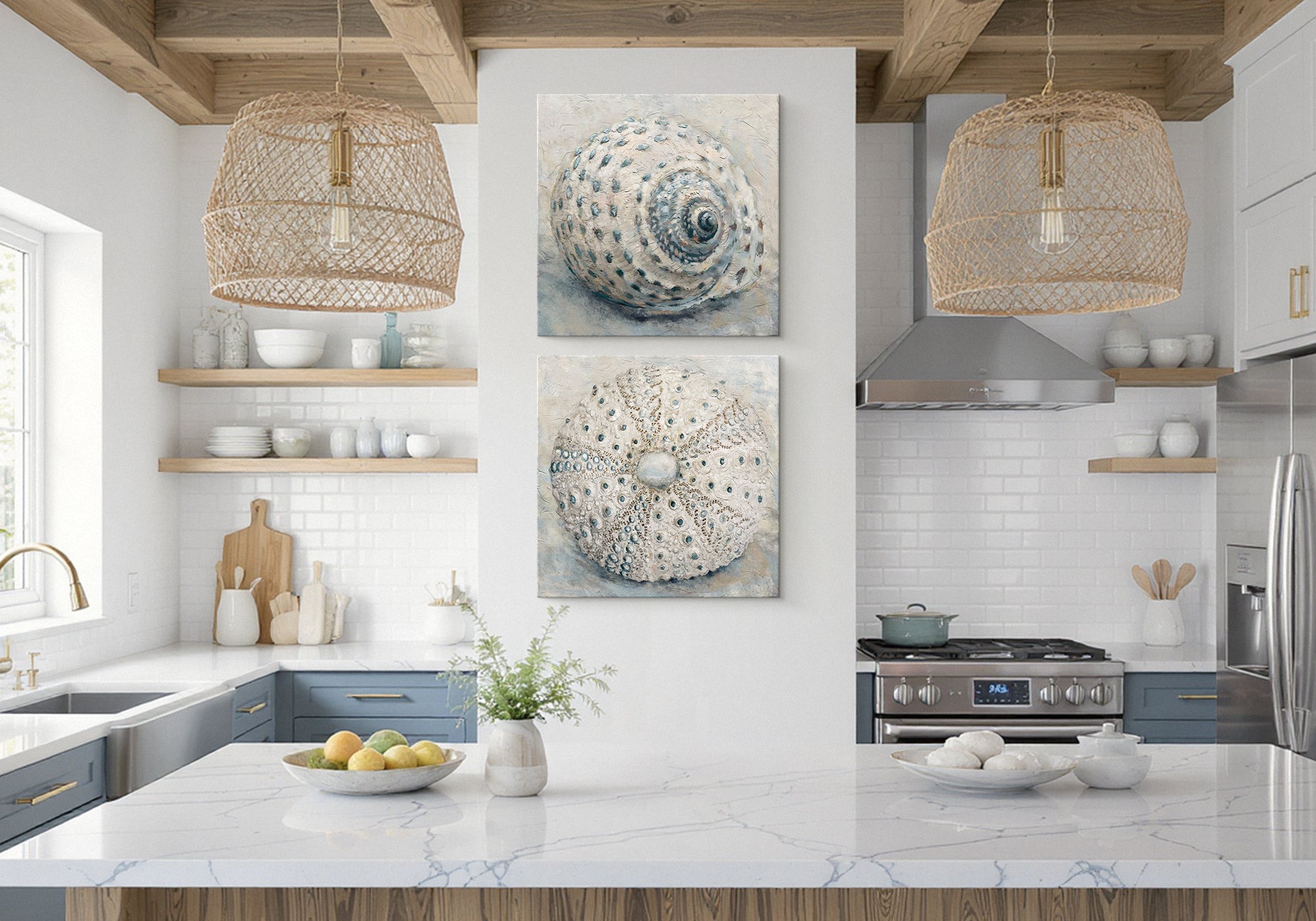
Coastal Nautical Wall Art for the Kitchen
The kitchen's hardest-working pause is the sink. You stand there every day, glancing up, often wishing there were a better view out the window. Coastal art is that view — the light and water you'd want to look at while your hands are busy. The trick is to choose the feeling of the coast, not its props. Soft light on water reads as calm and timeless. Anchors, rope, and "beach" signs read as a theme. Pick the horizon, skip the souvenirs.
At Fine Art Canvas, every piece is designed in California and hand-made to order — we've been making canvas art since 1989, and each canvas is hand-stretched before it ships with free U.S. shipping over $100, free 90-day returns, and a 1-year warranty. Coastal art lives or dies on its light, which is exactly why the quality of the print matters: a faithful, made-to-order canvas keeps the water luminous instead of flat.

Coastal Nautical — At a Glance
- Best for: Bright kitchens, the wall by the sink window, and white, blue, or sand-toned rooms.
- The feeling: Airy and calm — a held breath of sea light.
- Palette: Soft water tones — white, sand, sea-glass, faded blue.
- Watch out for: Literal nautical props (anchors, rope, signs) and over-saturated postcard blues.
- The key: The kitchen's most-used pause is the sink window — coastal art is the view you wish were outside it.
When Coastal Nautical Is the Right Answer
This is the calm choice for a bright kitchen — the one with a sink window, good morning light, or a white-and-blue palette already in play. If Clean Contemporary settles a busy modern room with pure abstraction, coastal does the same job with a horizon: restful, but with somewhere for the eye to travel. It's especially at home on the wall beside the sink, the spot you look at more than any other.
How to Recognize It
Coastal art is light-filled and soft: gentle seascapes, quiet harbors and boats, shorelines, and sea-glass abstraction. The best of it feels sun-bleached rather than saturated. If a piece reads as calm water and open light — not a gift-shop motif — it belongs in this family.
Is This Style Right for Your Kitchen?
It's for You If
- Your kitchen is bright, with a sink window or a well-lit wall
- Your palette leans white, blue, or sand
- You want calm — but with a horizon, not pure abstraction
- You love the sea without wanting a nautical theme
Look Elsewhere If
- You want calm with no subject at all — try Clean Contemporary
- You want warmth and Mediterranean romance — try European Style
- You want soft, rustic florals — try Cottage Core
How to Use It Well
Aim it at the light — coastal art belongs where you already look out, the sink window wall, or wherever the kitchen is brightest. Choose light over props: a luminous shoreline beats an anchor motif every time. Keep the blues soft — faded, sea-glass tones read calm; postcard-saturated blues read souvenir. Echo one tone, a sandy neutral or soft blue, into the room so the piece feels of a piece. And mind the splash: beside the sink, not in the spray — keep a hand's width from the splashback.
Beside or above the sink, scale the piece to the wall rather than the faucet, and keep it clear of direct spray; on an open wall, one piece at about two-thirds the width, centered around 60 inches, reads best. See the Wall Art Size Guide for the full breakdown.
Coastal pieces are made to order, so the light stays true to what you choose. Picture it on the wall you look at most — usually the sink — and take your time; it's backed by free U.S. shipping over $100, free 90-day returns, and a 1-year warranty.
Why These Six Pieces Work


Prefer to browse the rest yourself? See the full Coastal Nautical collection.
Ready to find the right piece? Browse the full Coastal Nautical collection — every piece is made to order, with free U.S. shipping over $100.
Shop Coastal NauticalCommon Mistakes (and the Fix)
Going nautical instead of coastal. Anchors, rope, and ship's wheels turn a calm room into a theme. Choose light and water instead.
Over-saturated blues. Postcard color reads as souvenir. Faded, sea-glass tones read as calm.
Hanging it in the spray. Beside the sink is perfect; directly in the splash line is not. Shift it a hand's width clear.
Fighting the light. Don't bury a luminous piece on the kitchen's darkest wall — give it the bright spot it was made for.
Matching the whole room to the sea. One echoed tone is enough; a fully themed blue kitchen tips into pastiche.
Coastal Kitchen Art Questions, Answered
What coastal art works in a kitchen without looking like a theme?
Choose light over props. Soft seascapes, quiet harbors, shorelines, and sea-glass abstraction read as calm and timeless, while anchors, rope, and "beach" signs read as a gift-shop theme. The simplest test: if the piece is mostly about the quality of the light on water, it will age well on a kitchen wall.
Is coastal the same as nautical?
Not quite, and the difference matters in a kitchen. Coastal is about light, water, and air — a feeling. Nautical is about objects — boats, anchors, knots, signal flags. Coastal stays calm and current; literal nautical motifs date quickly and tip toward theme. When in doubt, lean coastal.
Where should I hang coastal art in a kitchen?
On the wall by the sink window, or wherever the kitchen gets the best light — coastal art is built to be looked at the way you look out a window. Keep it beside the sink rather than in the direct splash line, and clear of the cooktop.
What colors work for a coastal kitchen?
Soft water tones: white, sand, sea-glass green, and faded blue. Pull one of those into the room — a linen, a ceramic, a tea towel — so the art feels connected. Steer away from bright, postcard-saturated blues, which read more souvenir than serene.
What size should coastal art be by the sink?
Scale it to the wall, not the faucet. One piece at about two-thirds the available wall width, hung clear of the spray and centered around 60 inches where you stand, reads best. On a wider open wall, size up so the horizon has room to breathe.
Can canvas handle the area near the sink?
Yes, with a little distance. A hand-stretched canvas wipes clean and holds up well a hand's width or more from the splashback. For a spot that takes regular spray, choose a framed piece under glass, and run your range hood to keep humidity moving.
In a kitchen, coastal art works when it brings the light of the water — not the props of the sea.


Leave a comment
This site is protected by hCaptcha and the hCaptcha Privacy Policy and Terms of Service apply.