
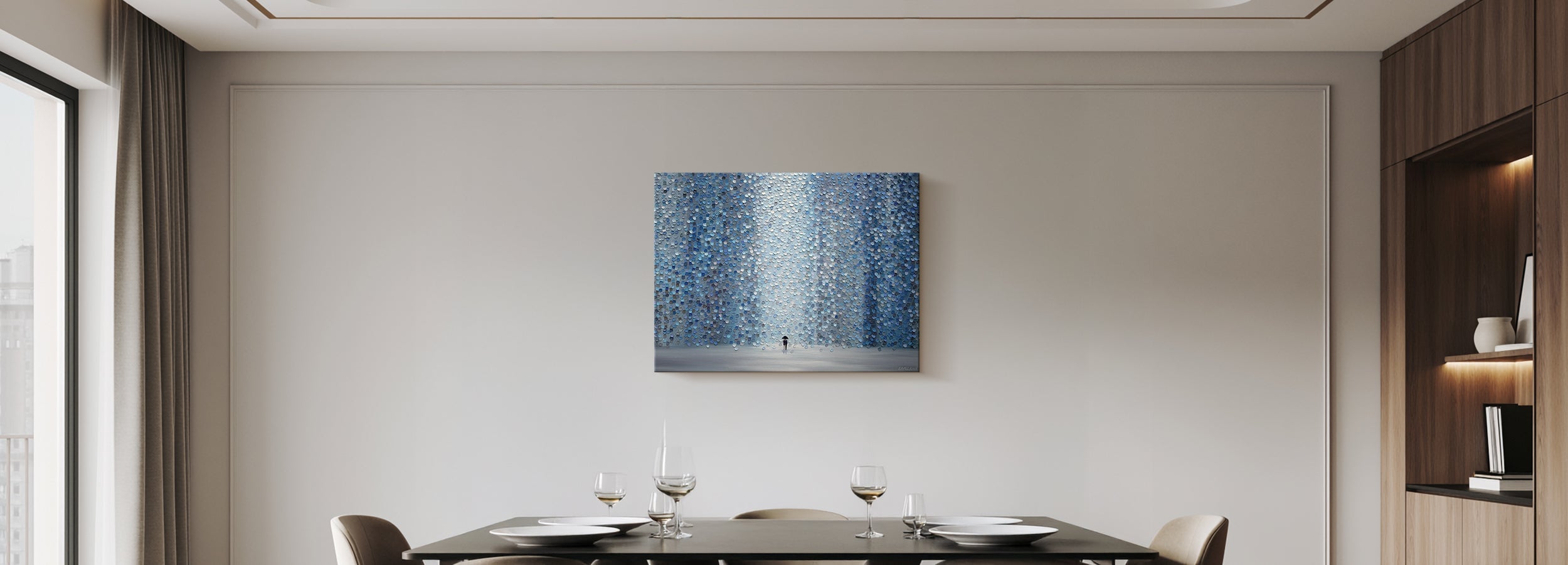
Conversation Art for the Dining Room
The best conversation pieces aren't the loudest things on the wall. They're the ones that reward attention over time — a painting a guest reads one way, then another; a scene that implies a story; a place that pulls a memory loose. Across a long dinner, the eye keeps coming back to it, and so does the talk. The art doesn't make the conversation — the people do. A good piece simply gives a willing table something to land on: a reason to look up, and a reason to keep looking.
Conversation art isn't loud — it's art that rewards attention over time. Choose the piece people notice something new in on the second look, not the one that shouts on the first.
Every piece is designed in California and hand-made to order by Fine Art Canvas, making canvas art since 1989. A conversation piece earns its place slowly, over many dinners, so it's worth choosing one whose depth is real — the kind a made-to-order canvas holds better than a flat, mass-printed poster. Free U.S. shipping over $100, 90-day returns, and a 1-year warranty on every order.

Conversation Art — At a Glance
- Best for: The focal wall everyone faces from the table — homes that host
- The feeling: Curiosity that lasts — a piece you don't use up in a glance
- What to look for: Layered, interpretive, or evocative subjects — a story implied, a place remembered, an image read more than one way
- Watch out for: One-note pieces that say everything instantly; loud color mistaken for depth
- The test: Is there something here to come back to, or is it fully read in a second?
When Conversation Art Is the Right Answer
This is the route for the home that hosts — where the dining room is meant to open up and stay open. It suits anyone who would rather a piece earn a second look than match the chairs, and who has one focal wall the whole table faces. If you want the room to give people a reason to linger rather than simply look finished, conversation art is where to start.
Once you've settled that the evening you want is one of curiosity and connection — the Dining Room Wall Art Guide walks through choosing the evening first — conversation art is the route that delivers it. If you want refined depth and formal occasion instead, that's Elegant Classic. If you want a specific place to travel to, that's Italian Countryside.
How to Recognize It
Conversation art rewards attention in a few recognizable ways. You only need one of them — pick the kind that fits your table:
It reveals more on a second look — depth, detail, or a little ambiguity you didn't catch the first time. It implies a story — a scene caught mid-moment, so the mind wants to finish it. It returns you to a place — somewhere specific enough that someone asks, "have you been?" Or it reads more than one way — two guests see different things, and talk about which is right.
None of these needs loud color or a big gesture. Some of the quietest pieces in a room are the ones people keep returning to — which is exactly the point. The test isn't "is it bold," it's "is there something here to come back to."
✓ Conversation Art Is for You If…
- You host, and want the room to open up and stay open
- You'd rather intrigue people than match the furniture
- You have one focal wall the whole table faces
- You like art you can read more than once
✗ Look at Another Style If…
- You want refined depth and formal occasion — try Elegant Classic
- You want a specific place or travel pull — try Italian Countryside
- You want warmth and ease over curiosity — try Modern Farmhouse
How to Use It Well
Five moves make conversation art earn its place at the table:
Hang It Where Everyone Faces
A conversation piece only works if it's seen — put it on the focal wall in the table's sightline, not a side wall guests sit with their backs to.
Give It Presence
One generous piece, about two-thirds the width of the wall or table — it should be the thing the eye returns to, not a small frame it skips past.
Let It Stand Alone
Resist the gallery wall here. A single piece holds attention; ten competing ones scatter it.
Keep the Surroundings Quiet
Calm walls and simple framing let the subject do the talking.
Hang It for Seated Eyes
A little lower than usual, so it meets people at the table rather than floating above them.
Over the table, size to about two-thirds the table width and hang lower for seated viewing; on a sideboard wall, two-thirds to three-quarters the furniture width. The Wall Art Size Guide has the full breakdown.
Every piece is designed in California and hand-made to order in the size and format you choose — canvas, framed canvas, or framed print. The depth that rewards a second look arrives true rather than flattened. Free U.S. shipping on orders over $100, 90-day hassle-free returns, and a 1-year warranty on every order.
Why These Six Pieces Work
Each one rewards attention over time — the kind of art a dining table keeps coming back to, dinner after dinner. Every piece is hand-made to order in the size and format you choose.


Common Mistakes (and the Fix)
Mistaking loud for layered. Bold color grabs the first glance and gives nothing on the second. Fix: Choose depth over volume.
Choosing a one-liner. If the piece is fully read in a second, there's nothing to return to. Fix: Pick something with more to find.
Hanging it out of the sightline. On a side wall, no one faces it — and a conversation piece no one sees starts no conversation. Fix: Keep it on the focal wall.
Going too small. A small frame gets skipped. Fix: Give the piece the scale to hold the room.
Crowding it. A gallery wall splits attention; one strong piece holds it. Fix: Let a single piece own the wall.
Every piece is designed in California and hand-made to order, backed by free U.S. shipping over $100, 90-day returns, and a 1-year warranty.
Shop Dining Room ArtFrequently Asked Questions
What makes art a good conversation piece?
It rewards attention over time. The strongest conversation pieces reveal more on a second look, imply a story, return you to a place, or read more than one way — so the eye keeps coming back across the evening. What it doesn't need is loud color or a big gesture; the real test is whether there's something here to come back to, not how much it shouts on the first glance.
Does conversation art have to be abstract or bold?
No — and some of the best examples are quiet. An impressionist field, an atmospheric landscape, or a moody street scene can reward attention every bit as much as an abstract. Bold work can be conversation-worthy too, but only when it has real depth behind the color. Judge the piece by what it gives you on the second look, not by how loud it is on the first.
Where should I hang conversation art in a dining room?
On the focal wall the whole table faces, so it sits in everyone's sightline and can actually be seen and discussed. Hang it a little lower than you would elsewhere, because the room is experienced seated. A conversation piece on a side wall that no one faces can't do its job.
How big should a conversation piece be?
Give it presence: about two-thirds the width of the wall or the table beneath it, as a single generous piece rather than a cluster. A conversation piece needs to be the thing the eye returns to, and a small frame simply gets skipped. When in doubt, size up.
Will artwork actually start conversation at dinner?
It helps — but the people make the evening, not the painting. A good piece gives a willing table something to look up at and land on: a prompt, not a performer. Choose one with genuine depth and it will quietly do its part, dinner after dinner, without ever trying to be the center of attention.
What's the difference between dining conversation art and kitchen abstract art?
Same family, different job. In the kitchen, a calm abstract settles a busy working room and often pulls its color from the cabinets — it's there to resolve. In the dining room, conversation art is chosen to reward the seated table's attention, so depth and a second-look quality matter more than fitting in. If your kitchen is the sleek, modern one, our Clean Contemporary kitchen guide covers that side.
The best conversation art rewards a second look — choose the piece people keep coming back to, not the one that shouts first.


Leave a comment
This site is protected by hCaptcha and the hCaptcha Privacy Policy and Terms of Service apply.