 Contemporary
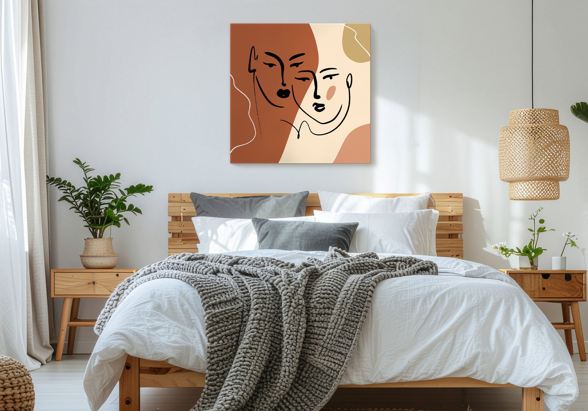
 Fashion
 Sports
 Halloween
 Memorial Day
 Mother's Day
 Summer
 Thanksgiving
 Farm Animals
 Architecture
 Barns & Farms
 Places
 Minimalist
 Modern
 Grand Millennial
 Reimagined Masterpieces
 Typography
 Impressionism
 Black
Black
 Blue
Blue
 Green
Green
 Orange
 Pink
Pink
 Teal
Teal
 Yellow
 Bronze
 Burgundy
 Copper
 Neutrals
 Black & White
 Tan & Beige
 Very Peri
 Georges Seurat
 Oliver Jeffries
 Synthia Saint James
 Tom Quartermaine
 Dean Russo
 Farida Zaman
 Jane Slivka
 Mark Chandon
 Nan
Nan
 Sylvie Demers
 Georgia O'Keeffe
 Gustav Klimt
 Leonardo da Vinci
 Pierre-Auguste Renoir
 Vincent Van Gogh
Hygge Wall Art for Bedrooms
The quick answer
Hygge bedroom wall art (hygge is the Danish idea of cozy contentment, said HOO-ga) means choosing art for atmosphere — soft natural light, muted nature, and the warmth of wool, wood, and candlelight. Favor warm, low-contrast scenes that feel like a slow evening at home, and size one or two to the bed. It’s the right style if you want the bedroom to feel cozy and Nordic-calm, the kind of room you exhale in.
The one idea: hygge is a feeling, not a color
This is the member of the three calm styles defined by a cultural aesthetic. Calming neutrals is a palette and cozy minimalism is a composition — but hygge is a mood: the Danish art of cozy contentment, all soft light, natural texture, and warmth. So the question isn’t “is this piece neutral enough?” or “is this spare enough?” — it’s “does this make the room feel like a place to slow down?” Choose art that adds warmth and soft light, and the hygge follows.
The hygge bedroom checklist
- ✓ Atmosphere over subject — soft light and warmth come first
- ✓ Warm, muted tones: oatmeal, soft amber, sage, sepia, candle-glow gold
- ✓ Gentle nature: trees, grasses, soft florals, quiet winter light
- ✓ Texture that echoes wool, wood, and linen
- ✓ Low contrast — nothing sharp or loud above the bed
- ✓ Scaled to about two-thirds of the headboard, hung 6–10 inches above it
Hygge is less a look you buy than a feeling you build — the cozy contentment of a candle-lit evening, a soft blanket, and nowhere you need to be. The art’s job is to carry that warmth onto the wall. This guide is about choosing pieces that do. Fine Art Canvas has been making canvas art since 1989, and every piece is designed in California and hand-made to order, so the size, format, and finish are yours to match to the room.
When hygge is the right answer
Once you’ve decided what you want the room to feel like — the Bedroom Wall Art Guide starts there — reach for hygge when you want the bedroom to feel like a retreat from a cold, busy world: soft, warm, and unhurried. It suits natural materials, layered bedding, and warm lighting, and it’s perfect if your idea of a perfect evening is staying in.
This is the aesthetic member of the three calm styles. If what you actually want is just a soft, tonal palette, that’s Calming Neutrals. If you want a spare, pared-back composition rather than a cozy, layered mood, that’s Cozy Minimalism.
How to recognize it
You’re probably looking at hygge art when:
- the piece feels like soft, late light — early morning or candle-lit evening, never harsh midday;
- the subject is gentle nature: bare trees, grasses, a quiet winter field, a soft bloom;
- the tones are warm and muted — oatmeal, amber, sepia, sage — with a cozy, lived-in feel;
- it makes you want to slow down rather than look closer.
Where calming neutrals can be cool and minimalism can be crisp, hygge always leans warm and soft.
Is this style right for your home?
Hygge is ideal if…
- you want the bedroom to feel warm, cozy, and unhurried;
- you love natural materials — wool, wood, linen, candlelight;
- layered, lived-in comfort appeals more than crisp minimalism;
- your favorite evenings are the ones spent at home.
Look at another style if…
- you prefer cool, crisp, gallery-clean rooms;
- you want bold color or a striking focal point;
- you like a sleek, modern look over a soft, layered one.
If you’re close but want to dial the warmth up or down, two neighboring calm styles help: Calming Neutrals for the same softness in a cooler, more tonal palette, or Cozy Minimalism for a simpler, more pared-back version of the same calm.
How to use it well in a bedroom
Five moves make a bedroom feel genuinely hygge:
Choose atmosphere over subject. Ask what light the piece feels like, not just what it shows. Soft morning haze, a candle-warm glow, the quiet of a winter afternoon — that mood is the whole point. A technically pretty piece with cold light isn’t hygge.
Lean into warm, muted tones. Oatmeal, soft amber, sage, sepia, and candle-gold carry the coziness. Keep saturation low and warmth high; nothing icy or bright.
Bring nature in, gently. Bare trees, grasses, a soft floral, a misty field — the Nordic outdoors, quieted. Natural subjects are what tie hygge to the wider world outside the cozy room.
Echo the textures of the room. Pieces with visible canvas grain and soft brushwork rhyme with the wool, wood, and linen hygge depends on. Texture on the wall makes the whole room feel warmer.
Scale it to the bed, then stop. Span about two-thirds to three-quarters of the headboard and hang it 6–10 inches above. For the full method, see the Bedroom Wall Art Guide and our Wall Art Size Guide.
Hygge lives in warmth and scale, so check both first. Use View in Your Room on any product page to see the exact piece on your wall at true size in your own light, or tape the dimensions above the headboard and live with the outline for a day.
Why these six pieces work
A few from our Hygge Style collection that earn their place above a bed — each chosen for the warmth it brings, not just the way it looks. Every piece is hand-made to order in your size and finish.

Bare trees in soft, muted light — the Nordic outdoors brought quietly indoors. Pure hygge above a bed.

Low winter sun in warm sepia — it reads as soft, late light, the exact atmosphere hygge is built on.

Warm, candle-gold tones in a wide, calm format — it sits beautifully above a headboard and glows in low light.

A companion to Evening Glow — together they make a warm, symmetrical pair above a wide bed.

A soft, muted floral that feels gathered rather than arranged — gentle nature with a lived-in warmth.

Warm, hazy blooms with soft edges — nature kept quiet and cozy, exactly the hygge register.
Every piece is designed in California and hand-made to order, backed by free U.S. shipping over $100, 90-day returns, and a 1-year warranty.
Common mistakes (and the fix)
- Cold light masquerading as calm. A grey, icy piece reads quiet but not cozy. Fix: choose warm, soft light — amber, sepia, candle-gold.
- Too much contrast or sharpness. Crisp, high-contrast art breaks the soft mood. Fix: keep it low-contrast and gently blurred above the bed.
- Flat, textureless prints. Hygge depends on the feel of natural materials. Fix: real canvas grain and brushwork echo wool, wood, and linen.
- Going too small. A modest piece over a wide bed looks lost. Fix: span about two-thirds of the headboard and size up when in doubt.
- Treating hygge as just “neutral.” Beige alone isn’t cozy. Fix: lead with warmth and soft light, not just a muted color.
Frequently asked questions
What is hygge wall art?
Hygge (a Danish word for cozy contentment, said HOO-ga) wall art is art chosen for warmth and atmosphere: soft natural light, gentle nature, and warm, muted tones that make a room feel like a calm place to slow down. Think bare trees, quiet winter light, and candle-gold abstracts rather than bold, high-contrast scenes.
What size should bedroom art be above the bed?
Span about two-thirds to three-quarters of your headboard width and hang it 6 to 10 inches above the headboard, centered around 57 to 60 inches from the floor. That puts a 48×32 over a queen and a 60×40 over a king. When you’re between sizes, size up.
How is hygge different from calming neutrals and minimalism?
Each leads with a different thing. Hygge is a cultural aesthetic — a specifically Nordic, candle-soft coziness. Calming Neutrals is a palette — soft, tonal color. Cozy Minimalism is a composition — one simple piece with lots of space. Hygge is the warmest and most atmospheric of the three.
What colors and subjects suit hygge?
Warm, muted tones — oatmeal, soft amber, sage, sepia, candle-gold — and gentle natural subjects like bare trees, grasses, soft florals, and quiet winter light. The unifying thread is a warm, soft, lived-in feeling.
How do I make my bedroom feel hygge?
Layer warmth and soften the light. Choose art with warm, soft light and natural texture, pair it with wool, wood, and linen in the room, and keep the lighting low and warm. The art sets the mood; the materials and lighting carry it through.
Does hygge art work in a modern bedroom?
Yes — it’s a good way to warm up a sleek, modern room. A single soft, warm-toned piece above the bed balances clean lines and hard surfaces, so a contemporary bedroom still feels cozy rather than cold.
Should hygge art match my bedding?
It should harmonize, not match. Let the art and the bedding share a warm undertone, then carry that warmth through a throw or a wood detail. Related warmth, rather than an exact color match, is what makes the room feel layered and cozy.
Hygge isn’t a palette you buy — it’s an atmosphere you build. Choose art that adds warmth and soft light, and the room starts to feel like a place to slow down.
%20means%20choosing%20art%20for%20atmosphere%20%E2%80%94%20...)
Leave a comment
This site is protected by hCaptcha and the hCaptcha Privacy Policy and Terms of Service apply.