
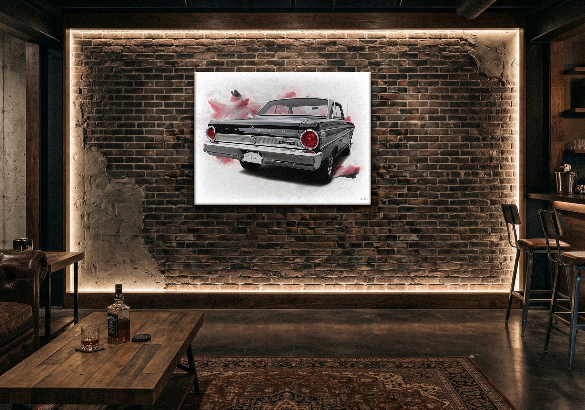
Automotive Wall Art for Man Caves and Garages: How to Build a Collector's Gallery, Not a Showroom Floor
Automotive Wall Art
The short answer: An automotive room built around one era — the specific shapes, colors, and culture of that chapter — feels like a private collector's gallery. An automotive room with pieces from every decade and every country feels like a showroom floor. The decorating decision is simpler than it looks: choose your era, then commit to it.
In This Guide

Two garages. Both belong to people who genuinely love cars.
The first has pieces from six different eras — a 1950s tail-fin Cadillac next to a 1980s Ferrari poster next to a modern supercar photograph next to a vintage racing print. Every piece is technically automotive. None of them relate to each other. The room looks like a calendar of automotive history rather than a space that belongs to anyone.
The second is built entirely around 1960s American muscle. The colors — deep blues, chrome, oxidized reds — run through every piece. The shapes are consistent. A stranger walking in could describe the owner's taste in thirty seconds.
The difference isn't passion. It's focus.
Gallery vs. Showroom: The Difference One Era Makes
A car showroom displays inventory. It has to represent every model, every year, every price point because its job is to sell to everyone. Comprehensiveness is the point.
A private gallery is the opposite. It represents a specific collector's eye — a particular period, a particular aesthetic, a particular story about what these machines meant. The narrower the focus, the more it reads as a deliberate collection rather than an accumulation.
Buying automotive art for every car you admire — a 1957 Chevy here, a 1970 Mustang there, a Le Mans racer, a modern hypercar — produces a room that represents automotive history in general rather than your specific relationship with it. Pieces that don't share an era, a palette, or a visual language compete with each other rather than building toward something.
The editing test: stand back from your automotive room (or imagine it completed) and ask whether the pieces are in conversation with each other or just occupying the same wall. Pieces from the same era share a design language — the proportions, the palette, the cultural moment — that makes them feel like a cohesive collection even when they're different subjects. Pieces from different eras don't share that language, no matter how individually excellent they are.
Three Approaches to Automotive Wall Art
Most successful automotive rooms are built around one of three organizing ideas. Any of them works. The key is choosing one and staying committed to it.
Era — Build Around a Decade or Movement
The clearest approach, and often the most visually cohesive. Each era of automotive design has a distinct visual language — the tail fins and chrome of the 1950s, the long hoods and muscle of the late 1960s and early 1970s, the wedge shapes and turbo culture of the 1980s, the stripped-down purposefulness of vintage racing.
When you commit to an era, the pieces choose themselves. A room built around 1960s American muscle wants deep blues, oxidized reds, chrome highlights, and the particular silhouette of a car designed before aerodynamics took over. A room built around 1980s European performance wants cleaner lines, primary colors, and the graphic energy of that period's motorsport culture.
The era also determines the texture of the room. Classic American muscle tends toward warm, nostalgic tones that suit darker woods and leather. Vintage racing tends toward graphic boldness that suits cleaner, more industrial spaces. Know your era and let it shape more than just the art.
Subject — Build Around a Manufacturer or Model
Some car people aren't era people — they're marque people. Everything Ford. Everything Porsche. Every generation of Corvette. If a specific manufacturer represents something to you — a family connection, a personal history, an ongoing love — building around that manufacturer gives you natural cohesion even across different eras.
The key with a manufacturer focus is treating the collection like a retrospective rather than a catalog. You're not trying to document every model — you're showing how a particular aesthetic or engineering philosophy evolved over time. Choose the pieces that represent the manufacturer at its most itself, not every variation it ever produced.
Mood — Build Around a Feeling
For some automotive rooms, the organizing principle isn't a specific era or manufacturer — it's a consistent mood. Rusted, weathered, patina-heavy pieces that evoke time passing and machines aging gracefully. Clean, graphic, high-contrast work that reads more like design than nostalgia. Dark and brooding photography that treats cars as sculptural objects.
A mood-based approach is the hardest to execute well because the cohesion isn't automatic — you have to develop an eye for which pieces share the same emotional register even when they're different subjects. But when it works, it produces rooms that feel genuinely designed rather than just decorated.
Era and mood often work together naturally. 1960s American muscle has a mood — the warmth, the chrome, the particular weight of that design era. Vintage racing has a mood — the graphic boldness, the primary colors, the sense of mechanical exposure. If you're drawn to a specific era, its mood is usually built in. If you're drawn to a specific mood, it often points toward an era.
Three Questions Before You Browse
Before You Browse Automotive Art
- What's your era or subject? The specific decade, manufacturer, or mood that you're building around. Not a list of cars you admire — the one organizing story the room will tell.
- What's the palette? Automotive eras have characteristic palettes. Know yours before you start selecting pieces — it's what lets you mix subjects within an era while still maintaining cohesion.
- What's the anchor piece? The primary wall needs one strong image that establishes the room's point of view. Everything else is supporting art once you've found the piece that does that job.
Featured Automotive Art
These are among the strongest-selling pieces in the automotive collection — each chosen to anchor a zone, not just fill a wall.


Every piece is handcrafted to order — Designed in California. Hand-made to order. We've been making canvas art since 1989, with free 90-day returns and a 1-year warranty on every piece.
Size Guide for Automotive Wall Art
Automotive art — especially wide-format photography and panoramic shots — benefits from scale. A car at 20 inches is a decoration. The same car at 48 inches commands attention. If you're building around a specific vehicle as an anchor piece, size up.
| Wall / Zone | Recommended Size | Why |
|---|---|---|
| Primary focal wall (garage or basement feature wall) | 48–60 inches wide | Automotive subjects need scale to read as art rather than decoration |
| Above a workbench or tool wall | 30–48 inches wide | Anchors the zone without competing with functional elements below |
| Garage wall with high ceilings | 48 inches or larger | High ceilings require scale — standard sizes disappear |
| Supporting or corner piece | 20–30 inches wide | Secondary presence — reinforces the primary story, doesn't compete |
The rule of thumb: automotive art should be sized to the wall it occupies, not the furniture beneath it. A bare garage wall needs a piece that fills it with intention. Leave breathing room — a 48-inch piece with 12 inches of wall space on each side reads better than a 60-inch piece jammed edge to edge. For room-specific sizing guidance, see the Wall Art Size Guide.
Frequently Asked Questions
What automotive wall art looks best in a garage or man cave?
Art that commits to one era, manufacturer, or mood rather than representing automotive history in general. The rooms that read as personal and deliberate are built around a specific visual language — the shapes, colors, and culture of a particular chapter. One well-chosen 48-inch piece anchoring the primary wall does more work than six smaller pieces from different eras covering every surface.
How do I make my automotive room look like a gallery instead of a garage?
Three things: consistent era or mood across pieces, correct scale (automotive art needs to be larger than you think), and breathing room between pieces. A gallery gives each piece space to be seen. A garage covers every surface. If you want the gallery effect, choose fewer pieces and hang them larger, with intentional space around each one.
Can I mix different car eras in the same room?
You can, but give one era the primary wall. If 1960s American muscle is your anchor story, a secondary zone with a 1980s piece works as long as the muscle cars clearly dominate the room's visual identity. When two eras share equal wall space, neither reads as primary and the room looks assembled rather than curated.
What size automotive art should I use in a garage?
Larger than instinct suggests — especially in a garage with high ceilings. A piece that looks impressive in a living room often disappears against a garage wall. For a primary feature wall, start at 48 inches wide. For high-ceiling garages, 60 inches or wider. The automotive subject needs scale to read as art; at smaller sizes it reads as a poster.
Does automotive art work in a finished basement man cave?
Yes — especially when it's treated as the room's dominant story rather than one element among many. A finished basement with an automotive theme reads best when the art is the primary decorating statement: one anchor piece, correctly scaled, with other automotive pieces in supporting zones. Layer in leather, dark wood, or industrial textures and the automotive theme carries the whole room.
Find the piece that anchors your garage. Every canvas is handcrafted to order — Designed in California. Hand-made to order.
Shop Automotive Art



Leave a comment
This site is protected by hCaptcha and the hCaptcha Privacy Policy and Terms of Service apply.