
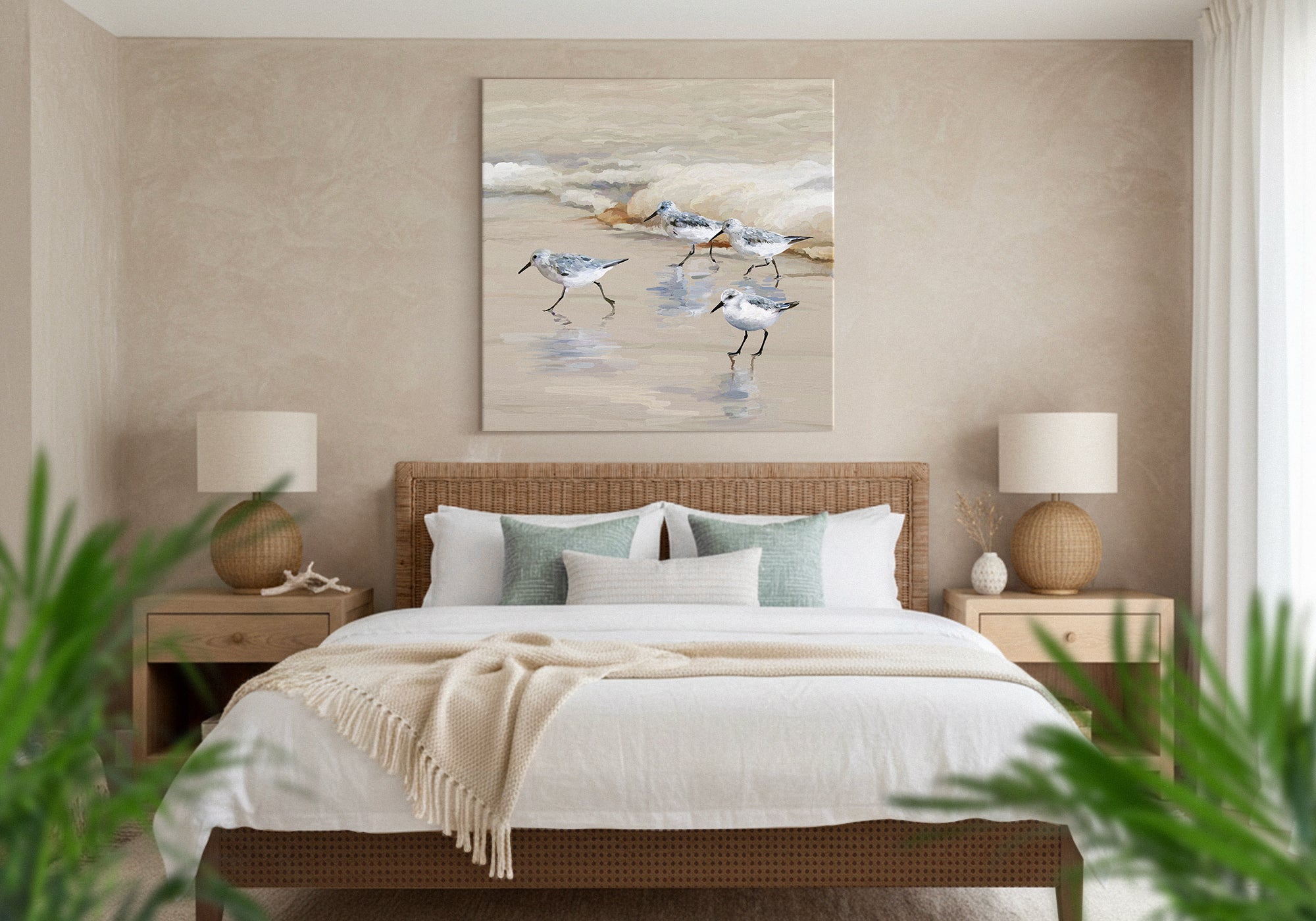
Coastal Calm Guest Bedroom Wall Art
Coastal and nature art is one of the best choices for a guest bedroom — not because it’s a “safe” pick, but because a shoreline, a horizon, or a calm stretch of water requires no shared memories, no shared experiences, and no shared taste to feel welcoming. A guest doesn’t need to know you to feel at ease looking at it. That’s the difference between art that says “come into my world” and art that says “you’re already welcome here.”
Nature doesn’t ask for shared tastes or shared memories — that’s why it works for guests.
- The feeling: calm, open, quietly welcoming — a room that never asks a guest to decode it
- The core move: quiet nature, not literal beach theme — water and light, not anchors and signage
- Best for: any guest, because it needs no shared context to feel at home
- Palette: soft blues, sea greens, sand, and warm neutral light
- The trap to avoid: tipping from coastal calm into beach kitsch, which reads as a costume the guest has to go along with
When you decorate a guest bedroom, you make every choice on behalf of someone who isn’t there yet — someone whose memories, experiences, and taste you can’t predict. So the reach for “coastal” makes sense. It feels calm, easy, and unlikely to offend. But the reason it works is more specific and more useful than “it’s a safe bet,” and understanding that reason is what separates a guest room that feels genuinely welcoming from one that feels like a themed rental.
Here is the real mechanism. A personal piece of art — a family beach photo, a print that reflects your particular sense of humor or style — quietly asks the guest to step into your world. To appreciate it, they have to know something about you. A landscape asks for none of that. A stretch of shoreline, a horizon, a quiet tide is legible to anyone on sight, whether they grew up by the sea or have never seen it. Nature is the one subject that carries no inside references. That’s why it never makes a guest feel like an outsider.
At Fine Art Canvas, we’ve been making canvas art since 1989. Designed in California. Hand-made to order. Every piece comes with free 90-day returns and a 1-year warranty, so choosing for someone else carries no risk. This guide is about choosing coastal art for the right reason — and keeping it on the right side of the line between calm and cliché.
Why nature works for a guest room
Think about what a guest actually experiences walking into a room decorated for them by someone else. They’re reading the space for signals: is this comfortable, is this for me, am I allowed to relax here? Art is one of the loudest signals in the room — and the kind of art you choose changes the answer.
“Come into my world.”
“You’re already welcome here.”
Personal art can be beautiful, and in your own bedroom it belongs. But it works by invitation — the viewer has to accept a little of your story to feel its warmth. In a guest room, that quiet demand is exactly what you want to remove. Nature removes it completely. A calm coastal scene doesn’t depend on knowing your family, sharing your taste, or getting the reference, because there is no reference. Everyone who looks at it already belongs.
This is a more durable reason than “coastal is popular.” Trends move; the fact that a horizon requires no shared context to feel calming does not. It’s the same reason hotels, which host strangers every night, lean on landscape and abstract nature rather than personal photographs. The art has to welcome someone it has never met.
When coastal calm is the right answer
This style is the right call when you want a guest to exhale the moment they walk in — and to feel that ease without having to know a thing about you. It suits rooms used by a rotating mix of visitors: family one month, friends the next, and occasionally people you’re meeting for the first time. It’s also ideal when the rest of the room is soft and neutral and you want the art to open the space up rather than fill it with personality.
Coastal calm is not about recreating the beach. It’s about borrowing the one quality the coast has in abundance: a wide, quiet openness that asks nothing of the person standing in front of it.
How to recognize it
Coastal calm art shares a few consistent traits. They’re what keep it on the calm side of the line, not the costume side:
- Nature over objects. Water, sky, sand, and horizon — not anchors, ship wheels, or lettered signs. The subject is a place, not a prop.
- Soft, natural light. Early morning, late afternoon, overcast calm. Restrained color rather than postcard saturation.
- Open composition. Room to breathe. A horizon or a wide shoreline reads as spaciousness, which is why it calms a room.
- Quiet, not literal. An abstract in sea tones, a distant coast, a tide line — suggestion works better than a labeled beach scene.
The line that keeps coastal from feeling dated
Almost every guide to coastal decor tells you to avoid cliché. Very few tell you how to know where the line is. Here is a test that actually works, and it comes straight from the mechanism: does the piece ask the guest to share something, or not?
A framed “LIFE’S BETTER AT THE BEACH” sign asks the guest to share a sentiment. A wall of anchors and rope asks them to play along with a theme. A cartoon or an in-joke asks them to share your sense of humor. Each one quietly turns the guest into an outsider who has to go along with it. The cliché problem isn’t really about taste — it’s about whether the art makes a demand on someone who never agreed to it. A quiet seascape makes no such demand, so every guest can simply feel that they already belong.
Keep the art on the “asks for nothing” side and it will never feel dated, because it was never leaning on a trend to begin with.
Is coastal calm right for your guest room?
- Your guest room hosts a range of different people
- You want the room to feel welcoming to someone you’ve never met
- You like calm, open, water-and-light imagery
- You want warmth that doesn’t depend on the guest knowing you
- You want the room to actively signal personal care — see Warm Welcome
- You want one spare, decided statement piece — see Simple Minimalist
- You prefer calm through soft warm tone over coastal imagery — see Relaxed Neutral
- You love a literal, playful beach theme (a different look than calm coastal)
If you’re deciding between styles: Warm Welcome is the closest cousin and the cleanest contrast — where coastal asks nothing of the guest, Warm Welcome offers something to them, a deliberate signal of care. Simple Minimalist shares coastal’s quiet but gets there through spare composition rather than open nature. And Relaxed Neutral creates calm through soft, warm tone if coastal blues feel too cool for your room. When in doubt, start at the Guest Bedroom hub, which routes you to the right style by feeling.
How to use it well
Five moves keep coastal calm welcoming rather than themed:
- Choose a place, not a prop. A horizon or shoreline over any object-based beach decor. The scene should read as somewhere calm, not as a collection of beach things.
- Let the light stay soft. Muted, natural tones age better and calm a room more than bright, saturated beach color.
- Scale it to the wall. A wide coastal piece over the bed reads as openness; size it to span roughly two-thirds to three-quarters of the bed width.
- Keep the palette cohesive. Echo one or two tones from the art in the bedding or a throw, so the room feels composed rather than matched to a theme.
- Stop before the theme. One calm coastal piece welcomes. Add anchors, rope, and signage and you’ve built a costume the guest has to wear.
For exact dimensions by bed size and wall, see the Wall Art Size Guide. The short version: measure the wall, aim for two-thirds to three-quarters of its width, and center the piece around 57–60 inches from the floor.
| Where it hangs | Recommended piece | Best orientation |
|---|---|---|
| Above a queen or king bed | Wide coastal piece, 40–60″ across | Horizontal / panoramic |
| Above a twin or narrow wall | Single piece, 24–36″ across | Vertical or square |
| Standalone feature wall | One large horizon, 30″+ across | Landscape or square |
Made to order, in your size. Designed in California. Hand-made to order. You choose the exact scale your wall needs, so a calm horizon can open up the whole room. Backed by free 90-day returns and a 1-year warranty, making canvas art since 1989.
Why these six pieces work
Each of these is quiet nature a guest can read on sight — no theme to go along with, no reference to get. Read them as six ways to say “you’re already welcome here.”

Clouds Over the Sea
Panoramic Images
Pure sea and sky. The clearest example of art that needs no context — just a wide, calm horizon anyone reads as peace. A natural fit spanning a headboard wall.
Shop this piece ›
Cannon Beach Sea Stacks
Panoramic Images
A calm coastal landscape. Wide and open, with the quiet grandeur of a real shoreline — welcoming without a single beach prop in sight.
Shop this piece ›
View of the Sea Pier
DP Gallery
A quiet vantage over calm water. Atmospheric and restful — the kind of view that lets a guest’s eye settle the moment they arrive.
Shop this piece ›
Under the Sea Pattern IA
Gia Graham
Mood over place. A soft abstract in sea tones — coastal calm without a literal scene, proof you don’t need a recognizable location to feel the water.
Shop this piece ›
Blue Sea Waves at Sunset
Eszra Tanner
Water and warm light. Gentle waves under a soft sunset — calming, open, and legible to anyone, with no beach clutter to date it.
Shop this piece ›
Pink Sunrise Over the Sea
Eszra Tanner
A quiet dawn. Soft pinks over still water — the calmest register of coastal, and a warm, welcoming note for a guest’s first morning.
Shop this piece ›See the full range in the Coastal Calm & Harmony collection to find the piece that fits your wall.
Common mistakes (and the fix)
Mistake: Choosing coastal because it’s “safe” and stopping there.
Fix: Choose it for the real reason — it needs no shared context. That reason also tells you which pieces to pick: quiet nature, not beach props.
Mistake: Layering in anchors, rope, and signage until the room becomes a theme.
Fix: One calm coastal scene welcomes; a theme asks the guest to play along. Stop at the art.
Mistake: Reaching for a personal beach photo because it means something to you.
Fix: It means nothing to your guest yet. A landscape welcomes them without asking them to know your story.
Mistake: Bright, saturated postcard color that fights the room’s calm.
Fix: Choose soft, natural light. Muted tones read as restful and age far better.
Frequently asked questions
Is coastal art a good choice for a guest bedroom?
Yes — and for a specific reason. Coastal and nature art requires no shared memories, experiences, or taste to feel welcoming. A guest doesn’t need to know you to feel at ease looking at a calm shoreline or horizon, which is exactly what you want in a room decorated on someone else’s behalf. Choose quiet nature over literal beach theme and it welcomes anyone.
Does coastal wall art look too themed or dated?
Only when it tips into literal beach decor — anchors, rope, lettered signs. Those date because they lean on a theme. Quiet nature (water, sky, horizon, soft light) doesn’t, because it was never a trend to begin with. A simple test: if the piece asks the guest to go along with a theme or a sentiment, it will feel dated; if it asks for nothing, it stays timeless.
What kind of coastal art works for guests who don’t share my taste?
Calm, open nature scenes: a horizon, a shoreline, a distant coast, or a soft abstract in sea tones. These are legible to anyone on sight and carry no personal reference, so a guest never has to share your taste or your memories to feel welcome. Avoid personal beach photos and anything built on an in-joke or a specific style statement.
How big should coastal art be over a guest bed?
Aim for a piece that spans about two-thirds to three-quarters of the width of the bed below it, centered roughly 57 to 60 inches from the floor to the middle of the piece. A wide horizontal or panoramic coastal scene works especially well over a bed because its openness reads as calm. Because every Fine Art Canvas piece is made to order, you can choose the exact size your wall needs.
What’s the difference between coastal and beach-theme decor?
Coastal calm evokes the feeling of the coast (openness, soft light, water and sky) through quiet nature. Beach theme recreates the beach with literal objects: anchors, ship wheels, seashells, and signage. Coastal welcomes any guest because it asks for nothing; beach theme asks the guest to go along with a look. For a guest room, coastal calm is the more durable and more welcoming choice.
What colors work best for a coastal guest bedroom?
Soft blues, sea greens, sandy neutrals, and warm natural light. Keep the palette muted rather than bright and postcard-saturated, since restrained tones read as calm and age better. Echo one or two colors from the art in the bedding or a throw so the room feels composed and intentional rather than matched to a theme.
Personal art says “come into my world.” Nature says “you’re already welcome here” — which is exactly what a guest needs to hear.


Leave a comment
This site is protected by hCaptcha and the hCaptcha Privacy Policy and Terms of Service apply.