
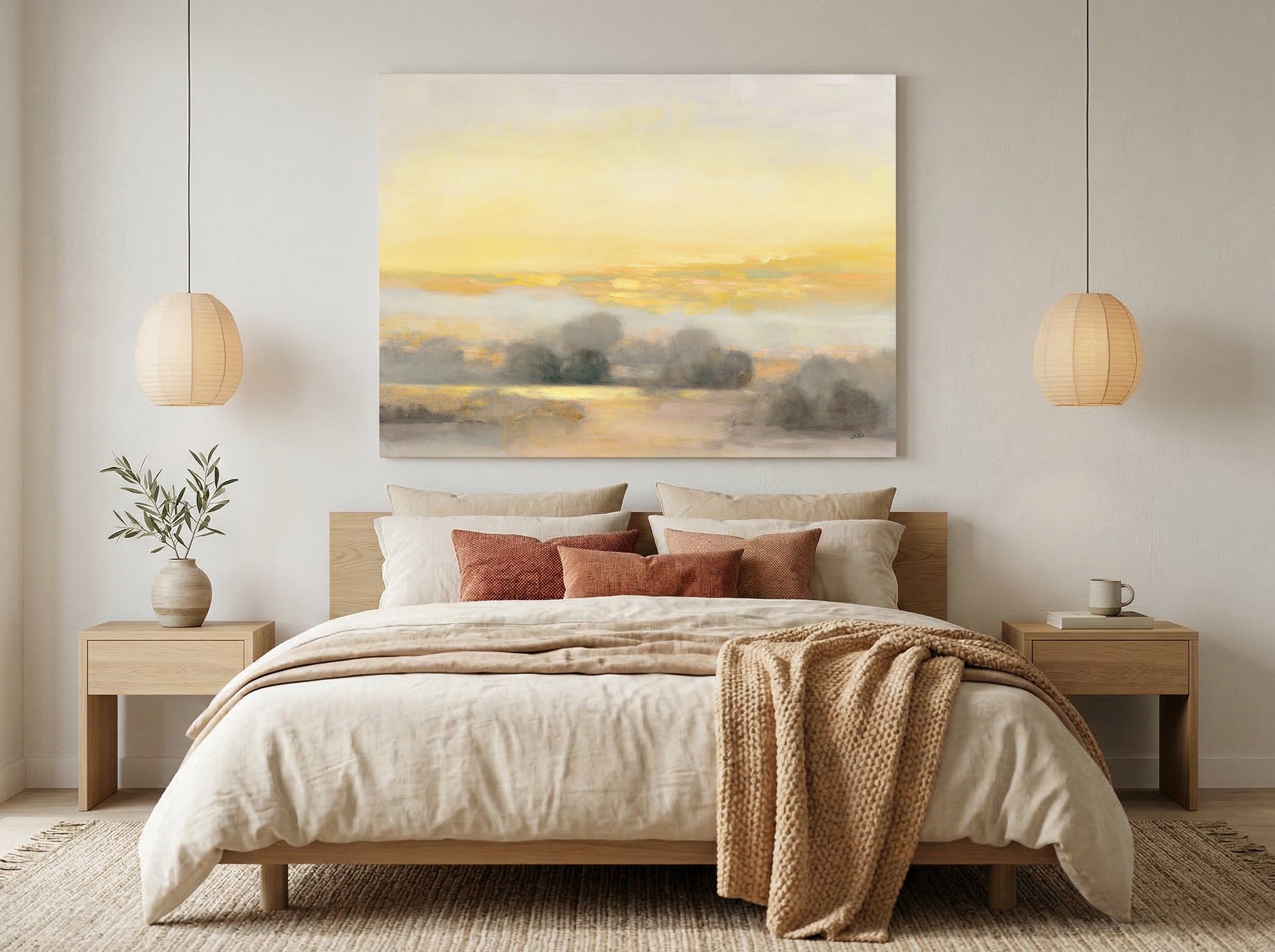
Guest Bedroom Wall Art: The Complete Guide
The best guest bedroom wall art is chosen for how it makes your guest feel — rested, welcomed, at ease — not for what it means to you. A guest room is the one room in the house you decorate entirely for someone else, so the right art leans toward restful subjects and calm, easy tones over personal statements. Start from the feeling you want the room to give: a warm welcome, a designed refresh, coastal calm, minimalist quiet, or relaxed neutral ease.
Every other room in your home, you decorate for yourself. You choose what you want to look at, in the space where you live. The guest bedroom is the one exception. It is the only room in the house designed entirely for someone else's private experience — and you choose all of it while they aren't there. The owner chooses everything; the guest experiences everything.
That changes the question you should be asking. Choosing art for your own bedroom asks, “What do I want to rest with?” (our Bedroom Wall Art Guide is the companion for that decision). The guest room asks something different: “What will make a visitor feel welcomed and at ease in a room that isn't theirs?” Same calm aesthetic can serve both rooms — but for a different reason. Your bedroom is about your rest. The guest room is about a stranger's ease.
At Fine Art Canvas, we've been making canvas art since 1989 — Designed in California. Hand-made to order. The pieces in this guide are built for real rooms people sleep in, not showrooms. Everything ships with free 90-day returns and a 1-year warranty, so you can choose for your guest with confidence.

Why the Guest Room Is a Different Decision
Most people decorate the guest room the way they decorate everywhere else: by reaching for what they like. A favorite print left over from a redecorating project. Family photos that didn't fit in the hallway. A piece that means something to you personally. It feels generous — you're giving the room your good taste.
But a guest doesn't share your history. They walk into the room tired, often late, in an unfamiliar house, and the walls are the first thing that tells them how to feel. Art chosen for what it means to you quietly tells the guest that this is your space and they're borrowing it. Art chosen for how it makes them feel tells them the room was made ready for them. Those are two different messages, and the guest reads them instantly.
The whole guide comes down to one shift: decide with the guest in mind, not yourself. Everything below is how to do that well.
The Two Mistakes Almost Everyone Makes
When you decorate for yourself instead of the guest, the result usually lands in one of two ditches. They look like opposites. They come from the same root.
The room becomes an extension of your own taste: your family photos, your travel souvenirs, the bold piece you loved but couldn't place elsewhere. The guest ends up sleeping inside a portrait of your life. It can feel less like a room prepared for them and more like they've wandered into a private part of the house.
Overcorrecting, you strip the room bare for “universal appeal” — blank walls, or one small generic print hung to fill a gap. The intention is neutral. The effect is a motel. A bare room doesn't read as calm; it reads as unfinished, as if no one thought about the person staying there.
Both mistakes make the same error: they choose art with the wrong audience in mind. One centers your taste; the other centers no one at all. The fix isn't somewhere in between — it's a different starting point entirely. Choose for the guest's feeling, and both ditches disappear.
Before you hang anything, stand in the doorway, then lie on the bed. A guest experiences the room from both positions. Choose the piece that reads as welcoming from the door and restful from the pillow — and put the calmest piece where it's the last thing they see before sleep.
What the Right Art Actually Does
The right guest room art is chosen for how it makes a visitor feel — rested, cared for, comfortable — rather than for what it says about you. In practice, that points in a consistent direction: restful subjects over personal statements, calming tones over stimulating ones, and a room that reads as an invitation rather than a self-portrait.
This is a long-standing interior-design convention for rooms meant for rest, not a scientific claim: quieter subjects and softer palettes tend to settle a space, while high-energy or highly personal imagery tends to keep it active. In a guest room — where the goal is to help someone unwind in an unfamiliar place — the calmer direction is almost always the safer, more welcoming choice.
None of this means bland. Care shows in the choosing. A single considered landscape, a soft botanical, a coastal scene with real depth — these do genuine work: they make a guest feel thought of without demanding that they share your particular taste. That's the balance the guest room needs: warmth without intrusion, calm without emptiness.
The art you choose for a guest bedroom isn't about you. It's about them.
Find Your Style: Six Approaches
There isn't one right look for a guest room — there's one right intention, expressed six ways. Each approach below starts from a feeling you might want the room to give a guest, then names the decision that gets you there. Use the guide that matches the feeling you're after.
Which Approach Fits Your Guest?

Modern Refresh
Contemporary, current, intentionally styled. For the host who wants the room to feel designed — just not designed for anyone in particular.
Shop the Collection
Warm Welcome
Gentle, inviting subjects that say “we thought of you.” Care without intrusion — warmth that welcomes the guest instead of introducing the host.
Shop the Collection
Simple Minimalist
One considered piece, not a bare wall. For the host who believes the right single work — correctly scaled and placed — reads as calm and complete.
Shop the Collection
Coastal Calm & Harmony
Restful coastal and natural scenes anyone can enjoy. Nature asks nothing of a guest — no shared tastes, no shared memories — which is exactly why it works.
Shop the Collection
Hotel Comfort
The calm, refined feeling of a thoughtfully designed hotel stay. Balanced compositions and sophisticated neutrals create a guest room that feels restful, polished, and easy to settle into.
Shop the Collection
Relaxed Neutral
Soft tones chosen for their warmth, not by default. For the host who wants calm to come from color temperature, not the absence of a color decision.
Shop the CollectionFeatured Pieces From the Collection
These five pieces aren't a gallery to browse — they're five answers to five different guest-room goals. Each one solves a distinct problem: the piece that makes a tired room feel current, the one that greets a guest warmly, the single work that carries a minimalist wall, the natural scene anyone can enjoy, and the quiet neutral. Find the goal you're solving, then the piece. Every one is hand-made to order and available as gallery-wrapped canvas, framed canvas, or framed print, with live pricing on each product page.


Size and Placement Above a Guest Bed
The wall above the bed is the guest room's main event, and it's where most sizing mistakes happen — almost always a piece hung too small and too high. The standard interior-design rule of thumb (a convention, not a hard rule) is that art above a bed should span about two-thirds to three-quarters of the bed's width, and hang so the center sits roughly 57 to 60 inches from the floor, or about 7 to 10 inches above the headboard.
| Bed Size | Recommended Art Width | Notes |
|---|---|---|
| Queen (60" wide) | ~40-45" wide | One larger piece, or a balanced pair, spanning two-thirds to three-quarters of the bed. The most common guest-bed setup. |
| Full / Double (54" wide) | ~36-40" wide | Keep the same two-thirds-to-three-quarters proportion so the piece feels anchored to the bed below it. |
| Twin / two twin beds | ~24-30" per bed | Center one piece over each bed, or hang a single wider piece centered on the wall between two beds. |
| Above the headboard | Any size in proportion | Center the piece on the bed (not the wall) and leave roughly 7-10 inches of breathing room above the headboard. |
For full room-by-room sizing, orientation rules, and a canvas size calculator, see the Wall Art Size Guide.
Common Mistakes and the Fix
Family photos, personal souvenirs, and the piece that only means something to you turn the room into your space, not the guest's. Fix: choose subjects a guest can enjoy without knowing your story — landscapes, botanicals, coastal or abstract work with broad appeal. Save the photos and mementos for the rooms you use yourself.
Empty walls don't read as considered — they read as unfinished, like the room was an afterthought. Fix: one well-sized piece above the bed is enough to finish the room. Minimal and empty aren't the same thing; the difference is that someone chose.
Bold, busy, or highly stimulating pieces work against the one thing a guest room is for: rest in an unfamiliar place. Fix: favor quieter subjects and softer tones — a long-standing convention for rest spaces, and the safer bet when you can't know a guest's taste.
It's easy to arrange the room to look good from the hall and forget the person who actually lies in the bed. Fix: check the sightline from the pillow, not just the doorway. Hang the main piece where a guest sees it from the bed, and size it to the headboard (see the sizing table above).
Find the Art That Makes Guests Feel at Home
Browse the full Guest Bedroom collection — pieces for every approach in this guide, from modern refresh to relaxed neutral. Each one is designed in California and hand-made to order, and ships with free 90-day returns.
Shop the CollectionFrequently Asked Questions
What wall art looks good in a guest bedroom?
The wall art that looks best in a guest bedroom is chosen for the guest, not the host: restful subjects and calm, easy tones that welcome almost anyone. Landscapes, botanicals, coastal scenes, and soft abstracts all work well because a visitor doesn't need to share your taste or your history to enjoy them. Personal art — family photos, souvenirs, bold statement pieces — belongs in the rooms you use yourself.
Should guest bedroom art be personal or neutral?
Neither extreme works. Too personal (your photos and mementos) makes a guest feel like they're staying in your room; too neutral (bare walls or one generic print) makes it feel like a motel. The better frame isn't personal-versus-neutral at all — it's chosen-for-the-guest. Pick restful, broadly appealing art that shows care without being about you. That reads as welcoming and finished at the same time.
How is choosing art for a guest bedroom different from a regular bedroom?
In your own bedroom, you choose what you want to rest with — the decision is “what do I need?” In a guest bedroom, you're choosing for someone else's rest, so the decision becomes “what will make a visitor feel at ease in a room that isn't theirs?” The same calm aesthetic can suit both rooms, but the reason differs: your bedroom serves your taste; the guest room serves a stranger's comfort. See the Bedroom Wall Art Guide for the other side of that decision.
How do I make my guest room feel welcoming?
Start with how the room should make a guest feel — rested and cared for — and choose art toward that feeling: one or two considered, restful pieces rather than bare walls or a crowded gallery. Warm, gentle subjects signal that the room was prepared for them. Then check the details a guest actually notices: the piece is sized to the bed, hung at eye level, and visible from both the doorway and the pillow.
What size art goes above a guest bed?
As a design convention, art above a bed should span about two-thirds to three-quarters of the bed's width. Over a standard queen (60 inches wide), that's a piece roughly 40 to 45 inches wide, or a balanced pair. Hang it so the center sits about 57 to 60 inches from the floor, or roughly 7 to 10 inches above the headboard, and center it on the bed rather than the wall. Full sizing guidance is in the Wall Art Size Guide.
What art should I put in a guest room?
Choose art by the feeling you want the room to give, then match it to a style: a modern refresh for a current, designed look; a warm welcome for gentle, inviting subjects; simple minimalist for one considered piece; coastal calm for restful natural scenes; or relaxed neutral for soft tones chosen for their warmth. Whatever the style, the test is the same — would a guest who didn't choose it still feel at ease with it?
Your guest may never remember the artwork you chose. They'll remember how the room made them feel. The right art quietly does both.
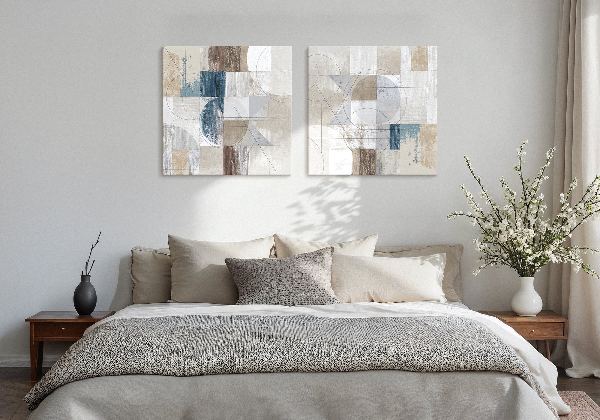
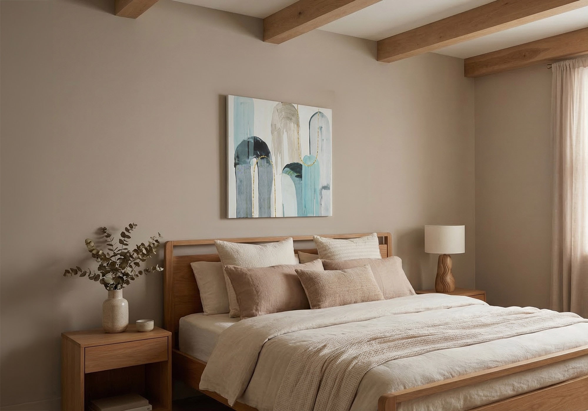


Leave a comment
This site is protected by hCaptcha and the hCaptcha Privacy Policy and Terms of Service apply.