
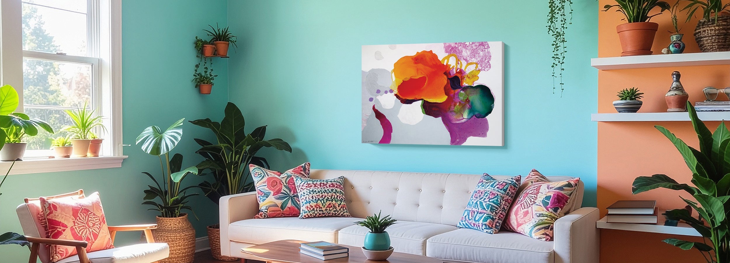
Dopamine Décor Wall Art for Living Rooms
Dopamine décor living room wall art uses bright, joyful color to lift the mood of a room — but it only sparks joy when that color has room to land. Let one joyful piece lead, ground it with calmer neutrals, and give it contrast and breathing space so the brights actually pop. Done right, the room feels happy and energizing. Done wall-to-wall, it feels overwhelming. It’s the right style if you want an uplifting, personality-filled space and you love color.
A dopamine décor living room should feel like a good mood made visible — bright, playful, energizing. But joy is a contrast effect: a burst of color lifts you most when there’s calm around it to set it off. This guide is about using color so it delights instead of overwhelms.
Designed in California. Hand-made to order. Fine Art Canvas has been making canvas art since 1989, and every piece comes with free 90-day returns and a 1-year warranty.

At a Glance
- Joy with room to breathe — delight, not overload
- One joyful piece leads — the room supports it
- Calmer neutrals — to ground the color
- Contrast — so the brights actually pop
- Color as the treat — not wall-to-wall noise
Playful isn’t the same as overwhelming. The mistake with dopamine décor is treating it as “all the color, all at once” — every wall bright, every surface loud — until a look that’s supposed to feel joyful just feels exhausting. Color sparks joy when it has somewhere to land: one joyful piece leading, calmer neutrals around it, and enough contrast that the brights read as a treat instead of noise. Give joy room to breathe and the room lifts you. Cram it in and it wears you out.
When Dopamine Décor Is the Right Answer
Once you’ve decided which wall you’re filling — the Living Room Wall Art Guide covers that, starting with the wall, not the art — reach for dopamine décor when you want the room to feel uplifting and energizing rather than calm and quiet. It’s the natural fit for color-lovers, for bright and personality-filled spaces, and for anyone who wants their living room to actively lift their mood. People choose it because neutral rooms leave them flat — they want a space that makes them smile when they walk in.
How to Recognize It
You don’t need a design vocabulary to spot it. You’re probably looking at dopamine décor when:
The art is bright, saturated, and joyful — color used to make you feel good. The subjects are playful — pop motifs, happy florals, exuberant abstracts. There’s still breathing room — neutrals and space that let the color pop. And the effect is uplifting, not exhausting — the brights feel like a treat, not a wall of noise.
The tell is joy with contrast. Great dopamine décor energizes a room; the failed version just tires the eye.
Is This Style Right for Your Home?
Dopamine Décor Is Ideal If…
- You want a happy, energizing, uplifting room
- You love bright, saturated color
- You want personality and playfulness on the walls
- You’re happy to balance the brights with calm
Look at Another Style If…
- You want a calm, restful, low-key room
- You prefer subtle, grounded, muted tones
- Bright color tires you out over time
If you love color but want it warmer and more grounded, Warm & Earthy gives you richness without the brightness; and if you want a calm, restful room instead, Modern Minimalist is the opposite pole.
How to Use It Well in a Living Room
Let one joyful piece lead. Choose a single bright, happy work to be the star and build the room around it. One confident burst of color does more than five competing ones.
Ground it with neutrals. Calmer walls, furniture, and surrounding tones give the color a backdrop to pop against. Neutrals aren’t the enemy of joy — they’re what makes it register.
Give it breathing room. Leave space around the bright piece so the eye can rest. Joy lands hardest when it isn’t fighting for attention on every surface.
Use contrast on purpose. Set the brights against calmer tones so they actually pop. Color against color cancels out; color against calm sings.
Keep a loose palette. A few colors that play well together read as intentional joy; every color at once reads as chaos. Then size the lead piece right: span about two-thirds to three-quarters of the sofa’s width, hung 6–10 inches above the back. The Living Room Wall Art Guide and our Wall Art Size Guide have the full method.
Bright color reads very differently at full scale on your wall, so check it in your space first. Use View in Your Room on any product page to see the exact artwork on your wall at true size, or tape out the dimensions and live with the outline for a day before you decide.
About Fine Art Canvas. Every piece in this guide is designed in California and hand-made to order. We’ve been making canvas art since 1989. Every order ships with free 90-day returns and a 1-year warranty — so you can see the piece on your wall before you commit.
Available as canvas, framed canvas, or framed print. Custom sizes available on most pieces.
Why These Six Pieces Work
A few from our Dopamine Décor collection that bring real joy — bright enough to lead a room, with the kind of contrast that lets color pop. Every piece is hand-made to order in your size and finish.

Dachshund Silhouette Pop Glam Rainbow Grid
Willowbrook Fine Art

Flowers By The Beach
Jane Slivka

Deluge de Couleurs 1
Graffi*tee Studios

Blooming Blues
Roey Ebert

Floral No. 3
Ramona Murdock

Cloudyscape
Willowbrook Fine Art
Common Mistakes (and the Fix)
Wall-to-wall color overwhelms instead of delights. Fix: let one joyful piece lead and keep the rest calmer.
Color with no backdrop has nothing to pop against. Fix: add calmer tones so the brights register.
Bright next to bright cancels out. Fix: set the brights against calm so they sing.
Every color and motif competing reads as chaos. Fix: keep a loose, intentional palette.
Volume isn’t the same as joy. Fix: joy needs calm around it — that contrast is the whole effect.
Every piece is hand-made to order in your chosen size and format.
Shop Dopamine Décor Wall ArtFrequently Asked Questions
What is dopamine decor living room wall art?
It’s art that uses bright, joyful color to lift the mood of a room — pop motifs, happy florals, exuberant abstracts. The goal is an uplifting, energizing space, achieved by letting color spark joy rather than overwhelm.
How do I use bright color without overwhelming the room?
Let one joyful piece lead, ground it with calmer neutrals, and give it contrast and breathing room. Joy is a contrast effect — a burst of color lifts you most when there’s calm around it. Wall-to-wall brightness is what tips delight into overload.
What colors work for dopamine decor?
Any bright, saturated, happy colors you love — but keep a loose palette of a few that play well together rather than every color at once. A backdrop of neutrals lets those brights pop instead of competing.
How big should the art be above the sofa?
Span about two-thirds to three-quarters of the sofa’s width and hang it 6–10 inches above the back, centered around 57–60 inches from the floor. One bold, joyful piece at the right scale beats several small bright ones. The Living Room and Size guides have the full method.
Is dopamine decor just a passing trend?
The name is recent, but the idea — using color to lift your mood — is timeless. Build it around art you genuinely love rather than a fad palette, and the room stays joyful well past any trend cycle.
Does dopamine decor work in a small or neutral room?
Yes, and those rooms are ideal for it. A neutral room is the perfect backdrop — start with one joyful piece as the focal point, and the surrounding calm makes the color pop without overwhelming the space.
Dopamine décor works when joy has room to breathe — delight, not overload.


Leave a comment
This site is protected by hCaptcha and the hCaptcha Privacy Policy and Terms of Service apply.