 Contemporary
 Fashion
 Sports
 Halloween
 Memorial Day
 Mother's Day
 Summer
 Thanksgiving
 Farm Animals
 Architecture
 Barns & Farms
 Minimalist
 Modern
 Grand Millennial
 Reimagined Masterpieces
 Typography
 Impressionism
 Black
Black
 Blue
Blue
 Green
Green
 Orange
 Pink
Pink
 Teal
Teal
 Yellow
 Bronze
 Burgundy
 Copper
 Neutrals
 Black & White
 Tan & Beige
 Very Peri
 Georges Seurat
 Oliver Jeffries
 Synthia Saint James
 Tom Quartermaine
 Dean Russo
 Farida Zaman
 Jane Slivka
 Mark Chandon
 Nan
Nan
 Sylvie Demers
 Georgia O'Keeffe
 Gustav Klimt
 Leonardo da Vinci
 Pierre-Auguste Renoir
 Vincent Van Gogh
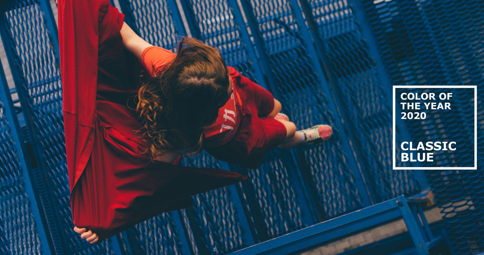
5 Ways to Decorate with Pantone's Color of the Year: Classic Blue
We’re a little late on sharing the big news, but Pantone has chosen the official color of the year 2020, Classic Blue!
The Pantone Color Institute describes this color as a “thought-provoking” shade that’s “solid and dependable” and “can always [be] relied on”. This timeless, slightly warm tone is somewhere between Royal and Cobalt, teetering slightly towards Navy in certain lights.
We’re loving the soothing, serene look of Classic Blue, especially when this quintessential color is styled creatively.

To welcome in the new decade, and the newest addition to Pantone’s blues, we’re dedicating this week’s blog entirely to different ways you can work this stylish shade into your home!
1. Keep it simple
With over seven hundred listings in our blue tag, it’s easy to get a little swamped with choices.

While some of our readers may be tempted to go all out there with their art, sometimes it’s the simplest, even understated, pieces that can make a room truly shine.
This is especially true for rooms with opulent or dark in nature, which can feel weighted down and cluttered by art that’s more intricately detailed. In these cases, we suggest going the minimalist route.
Even if you decide to skip out on the blue trend in your art, which we’ll get into later, we offer a variety of incredible abstract art pieces to suit a variety of different design styles and rooms.
2. Swap out the easy stuff

We’ve said it countless times on this blog, but you should always start with the easy tasks in your room first.
There’s no telling how drastically a few low-cost decor swaps can change the ambiance of a room until you try it, and there’s hardly ever any harm in testing the waters.
If you’re hesitant to dive head-first into Classic Blue why not give it a whirl in your space by switching out your bedding or other, similar, textiles as well as small decor pieces like candles, vases, and other assorted knick-knacks.
These little changes can make a world of difference in your space and may even end up saving you a couple of bucks in the long haul!
3. Be shady
Although Pantone regularly assigns a specific shade as their official color of the year, the design, fashion, and decor worlds always have a way of remixing this principal color into a variety of tints and tones.

Those who are particularly smitten with this wonderful shade of blue might find themselves tempted to plaster it everywhere, and we can’t help but agree.
Rather than risking having your space fall flat with so much of the same tone, try mixing in adjacent shades of blue, cerulean, and teal for variation. Spread these colors across your space by swapping out textiles and artwork to match.
4. Go coastal
It’s easy to think of the coastal style as antiquated or even campy but, fortunately, this simply isn’t the case anymore.
Coastal art can vary from seascapes to stunning illustrations brimming with detail and clarity. Like any other landscape piece, artists have used the genre of coastal art to explore realism, abstraction, color, and their own skills and styles to varying degrees of effect.
Use the Classic Blue trend as an opportunity to broaden the scope of your tastes and explore an often neglected category of art.
5. Play with color
A more advanced way to work Classic Blue into your space is to use it, and your art, strategically instead of solely as a decorative element.
We’ve touched a little bit on color theory in our blog and several of our product entries, but never in full detail.
While we have a whole blog post planned to go into depth on the history and mechanics of color theory, we’ve prepared a little primer on the subject to help you in your interior design endeavors this week.

The traditional color wheel consists of three primary colors and the infinite world of color on the spectrum between them. Usually, color wheels contain no more than 12 shades, which is about as many colors as you need to get started in understanding color theory and the relationships between colors.

Colors adjacent to and in between the primary colors (red, yellow, and blue) are not only characterized as secondary (orange, green, and purple) and tertiary (gold, cyan, and magenta) colors but are also known as analogous colors. These groups of three-to-four colors are similar enough in tone and quality that they can be grouped together and used to create harmonious monochromatic color palettes that are pleasing to the eye and easy to coordinate.

Colors directly across from each other are complementary in nature. These colors tend to make one another standout and appear more vibrant. These shades have traditionally been used to enhance the look of certain elements in a painting, but can also create muted tones of the original colors on a spectrum if mixed together properly.
Why does any of this matter?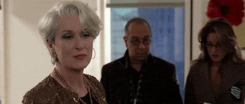
(via Giphy)
Leash your tongue lest you end up on the receiving end of a Miranda Priestly “Cureulean”-style clap-back!
Color theory is as integral to design and decor as it is in fashion and art. Utilizing color theory properly can enhance your style, bolster what pieces and setups you already have, and make your space feel bigger, grander, and bolder than your 700 square foot apartment lets on. Similarly, using color theory incorrectly or failing to consider it at all can shrink a space and can make even the loveliest of pieces and furniture appear gaudy and inappropriate.
To avoid a decor faux-pas and to make the most out of this great color of the year choice, stick either to colors in the following families:

The above color wheel highlights analogous shades of blue and their complementary shades of yellow and orange. Keep this family of relationships in mind when choosing new furniture and art to compliment this season’s serene hue and your decorating will be on par with the best of them.

As Spring draws nearer and as this color looms more greatly over the design and fashion worlds both, it seems only fitting to consider how you can fit this elegant hue into your lifestyle. Studies even suggest that blue may even help you feel calmer, safer, and more productive overall, depending on your emotional connection to the color, so what’s the harm in giving it a try?

1 comment
What an article!! Thank you so much for providing such a valuable information. Most of us spend more time at home than anywhere else and it has a strong impact on our happiness. Definitely will follow these tips to decor my apartment this year.
Thank you!!!
Alejandra
Leave a comment
This site is protected by hCaptcha and the hCaptcha Privacy Policy and Terms of Service apply.