 Contemporary
 Fashion
 Sports
 Halloween
 Memorial Day
 Mother's Day
 Summer
 Thanksgiving
 Farm Animals
 Architecture
 Barns & Farms
 Places
 Minimalist
 Modern
 Grand Millennial
 Reimagined Masterpieces
 Typography
 Impressionism
 Black
Black
 Blue
Blue
 Green
Green
 Orange
 Pink
Pink
 Teal
Teal
 Yellow
 Bronze
 Burgundy
 Copper
 Neutrals
 Black & White
 Tan & Beige
 Very Peri
 Georges Seurat
 Oliver Jeffries
 Synthia Saint James
 Tom Quartermaine
 Dean Russo
 Farida Zaman
 Jane Slivka
 Mark Chandon
 Nan
Nan
 Sylvie Demers
 Georgia O'Keeffe
 Gustav Klimt
 Leonardo da Vinci
 Pierre-Auguste Renoir
 Vincent Van Gogh
Bedroom Wall Art: The Complete Guide
The quick answer
The simplest way to choose bedroom wall art is to decide the feeling first, then size the piece to the bed. Because the bedroom is the last thing you see before you sleep and the first thing you see when you wake, pick art for the mood you want in those moments — calm, romantic, or grounded — then scale it: a 48×32 above a queen, a 60×40 above a king, hung 6–10 inches above the headboard, horizontal or square (not vertical). Every piece is designed in California and hand-made to order, so the size and format you choose are the ones we build.
Most rooms you decorate partly for other people. The bedroom is the one you decorate for yourself — and it is the only room where the art is the last thing you see before you turn out the light and the first thing you see when you open your eyes. That changes the brief. A piece that would energize a living room can quietly keep you up; a piece that feels too quiet in a hallway can be exactly right above a bed. So the question isn’t only “what looks good” — it’s “what do I want to fall asleep and wake up to?”
This guide answers that the way a designer would: choose the feeling first, then size the piece to the bed. Get those two right and the rest — color, subject, frame — becomes the enjoyable part instead of the stressful one. Fine Art Canvas has been making canvas art since 1989, and every piece is hand-made to order, so the size and format you land on are the ones we build for your wall.
- The one idea: decorate for two moments
- Start here: what do you want it to feel like?
- Telling the three calm styles apart
- How to size art above the bed
- Bedroom size chart
- Tricky bedroom walls: no headboard, tall headboards, the dresser
- One piece, a pair, or a set above the bed?
- Common mistakes (and the fix)
- Calming picks for above the bed
- Frequently asked questions
The last thing you see at night, the first thing you see in the morning
Most decorating advice treats the bedroom like any other wall to fill. It isn’t. No other room bookends your day the way this one does — you study the wall above the bed as you drift off, and it’s the first thing your eyes find at dawn. That’s why “make it calming” is the right instinct but the wrong place to stop. The real move is to choose art for the specific feeling you want in those two moments — rest, romance, grounded quiet — and then scale it correctly to the bed. Feeling first, size second. Everything below follows that order.
Start here: what do you want it to feel like?
In most bedrooms the wall is already decided — it’s above the bed. So the real choice isn’t where to hang art, it’s what feeling you’re after. Find the line below that sounds like your room; each one points to a style and an easy place to start.
Start with Calming Neutrals. This is the palette route: soft whites, beige, greige, and taupe that lower the visual volume of the whole room. Choose it when you want the art to settle into the bedding and walls rather than pull the eye.
Start with Cozy Minimalism. This is the composition route: few elements and plenty of open space, but warm instead of clinical. Choose it when “minimalist” appeals to you yet stark, gallery-white rooms leave you cold.
Start with Hygge Style. This is a specific cultural aesthetic — the Danish idea of hygge: soft natural light, muted nature, and the warmth of wool, wood, and linen. Choose it when you want that particular Nordic coziness, not just any neutral.
Start with Romantic Vibes. Soft, expressive pieces — dreamy palettes, gentle florals, tender scenes — for a room that’s shared, or simply for you. Choose it when you want art with feeling, not just a finish.
Start with Modern Boho. Boho on canvas — earthy tones, organic shapes, arches, sun and desert motifs — the bohemian feeling as one anchored piece, without a wall of macramé and baskets to dust. Choose it for personality that still reads calm.
Start with Spiritual Reflective. Contemplative, symbolic imagery chosen for what it says as much as how it looks. Choose it when you want a piece that invites a pause at the start and end of the day.
Want to see all six styles in full room settings before you decide? Browse them side by side on the Bedroom lander.
Telling the three calm styles apart
Three of those routes — Calming Neutrals, Cozy Minimalism, and Hygge Style — all read as “quiet,” and they’re easy to mix up. The difference is what each one is actually about. Get this distinction and you’ll choose with confidence instead of second-guessing in the cart.
| Style | What it’s really about | Pick it when… | The look |
|---|---|---|---|
| Calming Neutrals | The palette | you want the art to disappear into a soft, tonal room | Whites, beige, greige, taupe; low contrast; color-first |
| Cozy Minimalism | The composition | you want one spare piece that still feels warm | Few elements, open space, warm tones; simple, never stark |
| Hygge Style | The cultural aesthetic | you want the specific Nordic, candle-soft mood | Muted nature, soft light, wool-and-wood warmth |
Put simply: Calming Neutrals is a color decision, Cozy Minimalism is a composition decision, and Hygge is a whole aesthetic. Plenty of bedrooms borrow from all three — but knowing which one you’re leading with is what keeps the room from feeling like a compromise.
How to size art above the bed
More bedrooms are thrown off by scale than by style, and almost always in the same direction: the piece is too small for the bed below it. Three rules fix nearly every above-bed wall.
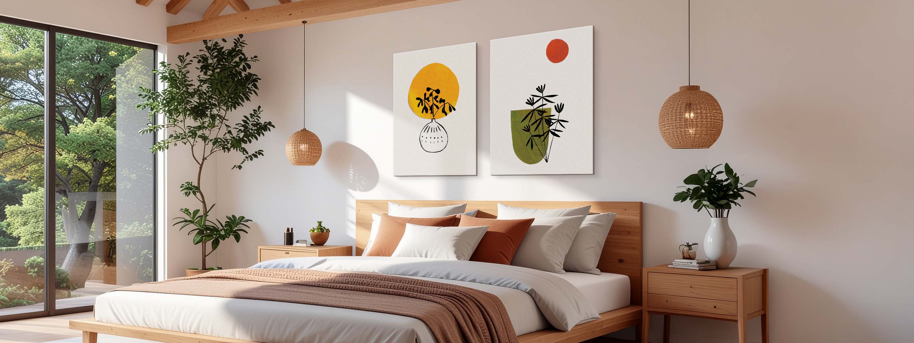
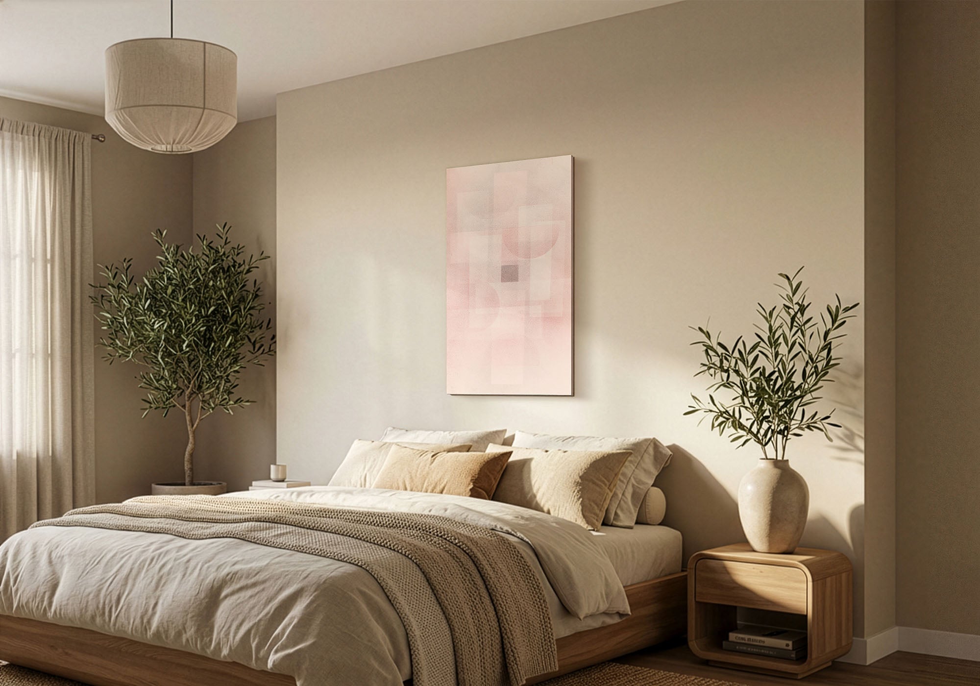
Width: span about two-thirds to three-quarters of the headboard. Measure the headboard — or, with no headboard, the mattress width — and aim for art that covers roughly 65–75% of it. Over a standard queen that lands on a 48×32; over a king, a 60×40; over a full or twin, a 36×24. A wide bed carries real visual weight, and a small piece floating above it is the single most common bedroom mistake.
Height: hang it close to the headboard. Leave about 6–10 inches between the top of the headboard and the bottom of the art, which usually puts the center near 57–60 inches from the floor — average eye level. Resist the urge to “fill” the wall by hanging higher; that is exactly what makes a piece look like it’s drifting toward the ceiling, disconnected from the bed.
Orientation: go horizontal or square, not vertical. A bed is a wide, horizontal shape, and a tall vertical piece above it leaves dead air on both sides and makes the headboard look narrow and unanchored. A horizontal piece mirrors the bed; a square works when you want a softer, centered look. Save verticals for a narrow accent wall beside the bed — never above it.
Not sure a size will work above your bed? Use View in Your Room on any product page to see the exact piece on your actual wall, at true scale, on your phone — before you decide. The low-tech version works too: cut painter’s tape or paper to the size you’re weighing and outline it above the headboard. Either way, you’re checking scale before you commit, not after.
Bedroom size chart
A quick reference for the placements that come up most. These are the sizes we’d recommend first — and above a bed, sizing up is almost always safer than sizing down.
| Placement | Bed or wall width | Best fit | Statement size | Shape |
|---|---|---|---|---|
| Above a queen bed | ~60 in | 48×32 | 60×40 | Horizontal or square |
| Above a king bed | ~76 in | 60×40 | 48×48 | Horizontal or square |
| Above a full or twin bed | under 60 in | 36×24 | 48×32 | Horizontal or square |
| Tall, narrow accent wall (beside the bed) | narrow | 32×48 | 40×60 | Vertical |
Prefer to size straight from your headboard? Aim for the middle of each range, and size up when you’re between sizes.
| Headboard width | Ideal art width (about two-thirds to three-quarters) | Closest FAC size |
|---|---|---|
| 60 in (queen) | 40–48 in | 48×32 |
| 76 in (king) | 50–60 in | 60×40 |
| 54 in (full) | 36–45 in | 36×24 or 48×32 |
Picture it on the wall: a 48×32 spans most of a queen headboard, and a 60×40 reaches nearly nightstand to nightstand over a king. A reliable rule of thumb — when a size feels slightly too big on paper, it’s usually right on the wall.
Want the full room-by-room breakdown, plus how to size a multi-panel set or a gallery wall? See our Wall Art Size Guide for the complete sizing reference.
Tricky bedroom walls: no headboard, tall headboards, and the dresser
A few bedroom situations come up again and again. Here’s how to handle the ones that trip people up.
No headboard or a platform bed
With no headboard, the art does the headboard’s job — it anchors the bed. Hang it a little lower than usual, with the bottom edge around 8–10 inches above your pillows, and size it to the mattress width. Because the piece becomes the visual “headboard,” lean slightly larger; too small here leaves the bed looking like it’s floating in the wall.
A tall or upholstered headboard
A tall headboard already commands the wall, so you have less open space to fill. Close the gap to about 4–6 inches above it and keep the art on the smaller side of the range — or switch to a pair of pieces that sit lower and flank the center. Don’t push a single piece up high to clear the headboard; it’ll look stranded near the ceiling.
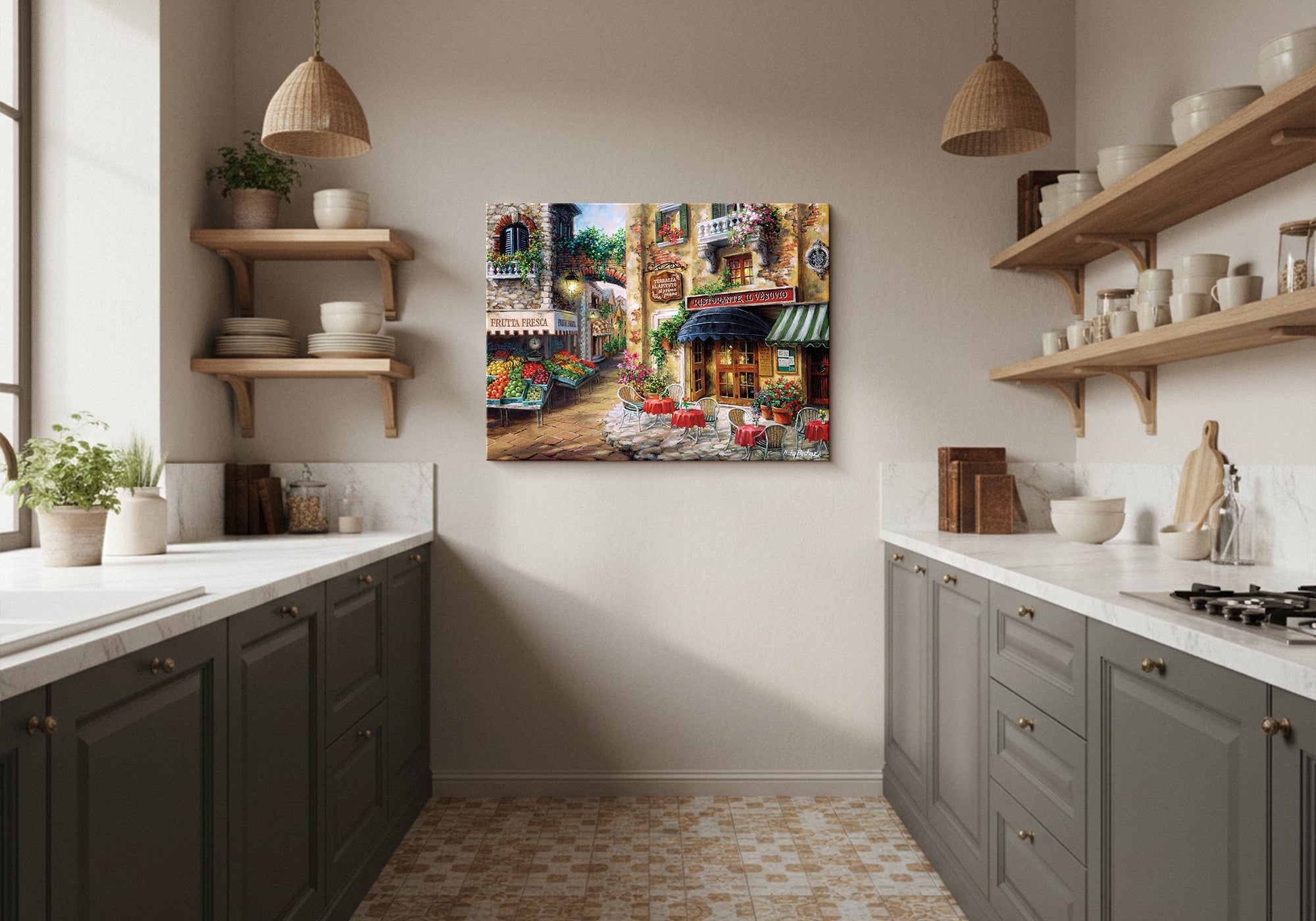
Above the dresser
The dresser is the bedroom’s second-best wall, and an easier one. Scale to the dresser rather than the room — about two-thirds of its width, hung 6–10 inches above the top. It’s also the right home for a slightly bolder piece, since you’re not viewing it from the pillow as you fall asleep.
A pair over the nightstands
If a single piece feels like a lot of pressure to get right, two matching pieces — one above each nightstand, or a balanced pair above the headboard — split the difference and frame the bed symmetrically. Size the pair as one shape: the two pieces plus the gap between them should still land in the two-thirds-to-three-quarters range.
The wall above your bed is the one you study as you fall asleep, so it’s the place for your calmer, quieter piece. Save the more striking, energizing artwork for the wall you face when you wake — opposite the bed, or wherever your eyes land first in the morning. Matching the art to the moment is a small move that makes the whole room feel deliberate.
One piece, a pair, or a set above the bed?
All three work; they solve different problems. Reach for one large statement piece when you want calm and a single clear focal point — it’s the simplest way to make a bedroom feel finished, and it suits the restful mood most people want above a bed. Reach for a matched pair when you want symmetry and a little less pressure on a single choice; two pieces flanking the center read as balanced and quiet. Reach for a two- or three-panel set when the bed is wide — a king or a long platform — and one canvas would have to be enormous; a diptych or triptych spans the width with gentle rhythm. Whatever you choose, size the whole arrangement as one shape, gaps included, and keep it to the two-thirds rule.
Common mistakes (and the fix)
- Going too small above the bed. A modest piece over a wide headboard looks lost. Fix: span 65–75% of the headboard width, and size up when you’re between sizes.
- Hanging it too high. Art pushed up to “fill” the wall looks like it’s floating. Fix: 6–10 inches above the headboard, center near 57–60 inches.
- A vertical piece above the bed. It leaves gaps on both sides and makes the headboard look narrow. Fix: go horizontal or square above the bed; save verticals for a narrow side wall.
- A high-energy subject right where you sleep. A busy, dramatic piece can quietly work against rest. Fix: keep the calmer piece above the bed and put the bold one on the waking wall.
- Matching the art too literally to the bedding. Art that repeats the duvet tends to disappear. Fix: pull one tone from the art into a pillow or throw instead.
- Heavy framed glass directly over the pillows. It’s a comfort-and-safety issue as much as a style one. Fix: favor gallery-wrapped canvas above the bed — lighter, frameless, and made to order in your size.
Calming picks for above the bed
A few best-sellers that suit the spot above a bed — restful, horizontal, and easy to scale to your headboard. Every piece is hand-made to order in the size and format you choose.


Every piece is designed in California and hand-made to order, backed by free U.S. shipping over $100, 90-day returns, and a 1-year warranty.
Frequently asked questions
What size art should go above the bed?
Aim for art that spans about two-thirds to three-quarters of your headboard width. That puts a 48×32 over a typical queen, a 60×40 over a king, and a 36×24 over a full or twin. When you’re between sizes, size up — too small is the more common regret above a bed.
How high should I hang art above the bed?
Leave 6 to 10 inches between the top of the headboard and the bottom of the art, which usually places the center around 57 to 60 inches from the floor — average eye level. With no headboard, hang the bottom edge about 8 to 10 inches above your pillows.
What kind of art is best for a bedroom?
Start with the feeling, since the bedroom is the last thing you see at night and the first thing you see in the morning. Choose calming neutrals or cozy, hygge-style pieces for pure rest; romantic or boho art for warmth and personality; reflective pieces for quiet meaning. Then size it to the bed. A restful subject at the right scale beats a dramatic one that’s too small.
Can you hang vertical art above the bed?
Usually no. A bed is wide and horizontal, so a vertical piece above it leaves awkward gaps and makes the headboard look narrow. Choose a horizontal piece, or a square for a softer centered look. Save vertical art for a tall, narrow wall beside the bed.
Should bedroom art match the bedding?
It shouldn’t match too literally — art that repeats the duvet tends to disappear. Instead, let the art and the room share one tone, and pull that color through a pillow or throw. Related, not identical, is what makes a bedroom feel designed.
How many pieces should I hang above the bed?
One large piece is the calmest, simplest choice and suits most bedrooms. A matched pair adds symmetry with less pressure on a single decision, and a two- or three-panel set works over a wide king or platform bed. Whichever you pick, size the whole arrangement as one shape and keep it to the two-thirds rule.
Leave a comment
This site is protected by hCaptcha and the hCaptcha Privacy Policy and Terms of Service apply.