 Contemporary
 Fashion
 Sports
 Halloween
 Memorial Day
 Mother's Day
 Summer
 Thanksgiving
 Farm Animals
 Architecture
 Barns & Farms
 Places
 Minimalist
 Modern
 Grand Millennial
 Reimagined Masterpieces
 Typography
 Impressionism
 Black
Black
 Blue
Blue
 Green
Green
 Orange
 Pink
Pink
 Teal
Teal
 Yellow
 Bronze
 Burgundy
 Copper
 Neutrals
 Black & White
 Tan & Beige
 Very Peri
 Georges Seurat
 Oliver Jeffries
 Synthia Saint James
 Tom Quartermaine
 Dean Russo
 Farida Zaman
 Jane Slivka
 Mark Chandon
 Nan
Nan
 Sylvie Demers
 Georgia O'Keeffe
 Gustav Klimt
 Leonardo da Vinci
 Pierre-Auguste Renoir
 Vincent Van Gogh
Calming Neutral Wall Art for Bedrooms
The quick answer
Calming neutral bedroom wall art means choosing soft, low-contrast pieces — whites, beige, greige, taupe, soft grey — that quiet the whole room rather than pull the eye. Lead with the palette, choose canvas with real texture so neutral doesn’t read flat, and size it to the bed (about two-thirds of the headboard, hung 6–10 inches above it). It’s the right style if you want the bedroom to feel serene and uncluttered, with art that settles in rather than stands out.
The one idea: let the color do the calming
Of the three calm bedroom styles, this is the one defined by its palette. A calming-neutral piece isn’t trying to be the focal point of the room — its job is to lower the visual temperature of the whole space, so the wall feels like part of the rest you came in for. That single shift explains every choice below: tone over subject, low contrast over drama, texture so the neutral has depth, and a piece that blends with your bedding rather than competing with it. Get the palette right and the calm is automatic.
The calming neutral bedroom checklist
- ✓ A soft, low-contrast palette: white, beige, greige, taupe, soft grey
- ✓ Tone over subject — the color matters more than what’s depicted
- ✓ Real canvas texture so the neutral doesn’t read flat
- ✓ An undertone that matches the room — warm greige in a warm room, cool grey in a cool one
- ✓ Art that blends with the bedding rather than matching it exactly
- ✓ Scaled to about two-thirds of the headboard, hung 6–10 inches above it
A neutral bedroom is the easiest room to make restful and the easiest to make boring, and the difference comes down to a few deliberate choices. The goal isn’t a beige wall with nothing happening on it — it’s a calm that still has depth. This guide is about getting that balance right. Fine Art Canvas has been making canvas art since 1989, and every piece is designed in California and hand-made to order, so the size, format, and finish are yours to match to the room.
When calming neutrals is the right answer
Once you’ve settled what you want the room to feel like — the Bedroom Wall Art Guide walks through choosing the feeling first — reach for calming neutrals when the bedroom is your retreat and you want it to read as one the moment you walk in. It’s also the safe, smart choice when the rest of the room is already doing the talking: patterned bedding, a strong headboard, or a color scheme you don’t want to fight. Neutral art is the quiet that lets the room breathe — and because it’s tied to tone rather than trend, it survives a future repaint or new duvet.
This is the palette member of the three calm styles. If you love the calm but want it through pared-back composition — one simple piece with lots of space — that’s Cozy Minimalism. If you want a specific cozy, candle-lit Nordic mood, that’s Hygge Style.
How to recognize it
You’re probably looking at calming neutral art when:
- the palette is the first thing you notice — soft whites, beige, greige, taupe — more than the subject;
- contrast is low, with no sharp darks or bright accents to snag the eye;
- edges are soft — blended washes, hazy forms, gentle brushwork rather than crisp lines;
- the piece blends into the room instead of announcing itself.
The giveaway is simple: with calming neutrals, you choose the color first and let the subject follow.
Is this style right for your home?
Calming neutrals is ideal if…
- you want the bedroom to feel serene and low-stimulation;
- your bedding or headboard is already patterned or bold;
- you repaint or restyle often and want art that always fits;
- you’d rather the wall whisper than shout.
Look at another style if…
- you want the art to be the clear focal point of the room;
- you love saturated color and high contrast;
- a fully neutral room feels flat or cold to you.
If you’re close to this but want a little more, two neighboring calm styles are worth a look: Cozy Minimalism if you want the same calm through one simple, spacious piece, or Hygge Style if you want neutral with a warmer, cozier Nordic feel.
How to use it well in a bedroom
Five moves make neutral art read as calm-and-considered instead of flat:
Lead with the palette, and match the room’s undertone. Neutrals are warm or cool, and mixing the two is what makes a room feel slightly off. Warm bedding and wood tones want warm greige and sand; cool greys and whites want a cooler neutral. Decide the undertone first.
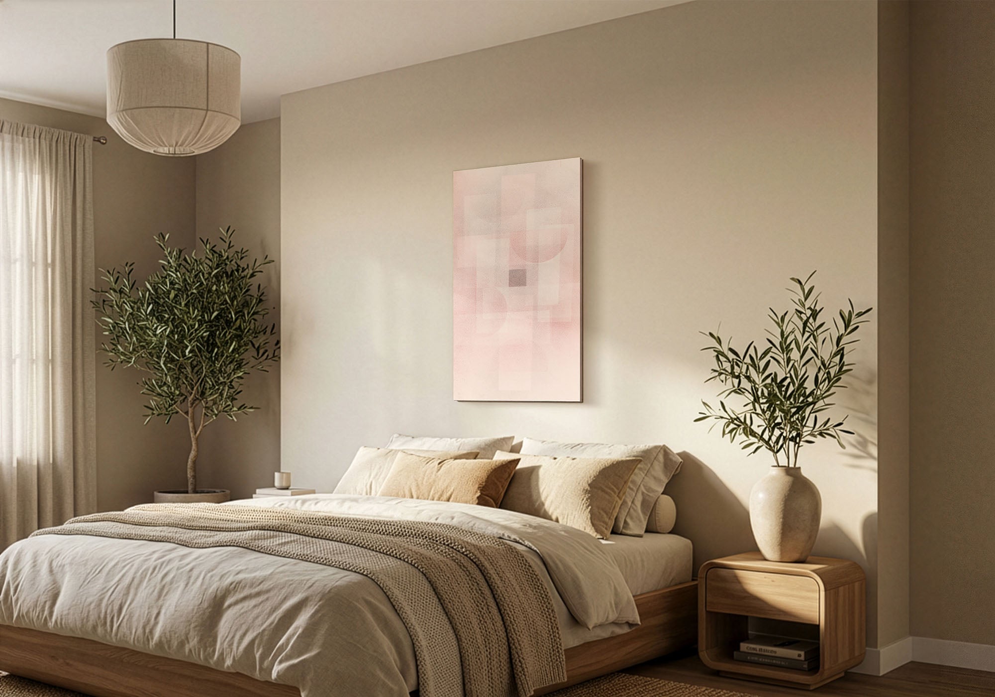
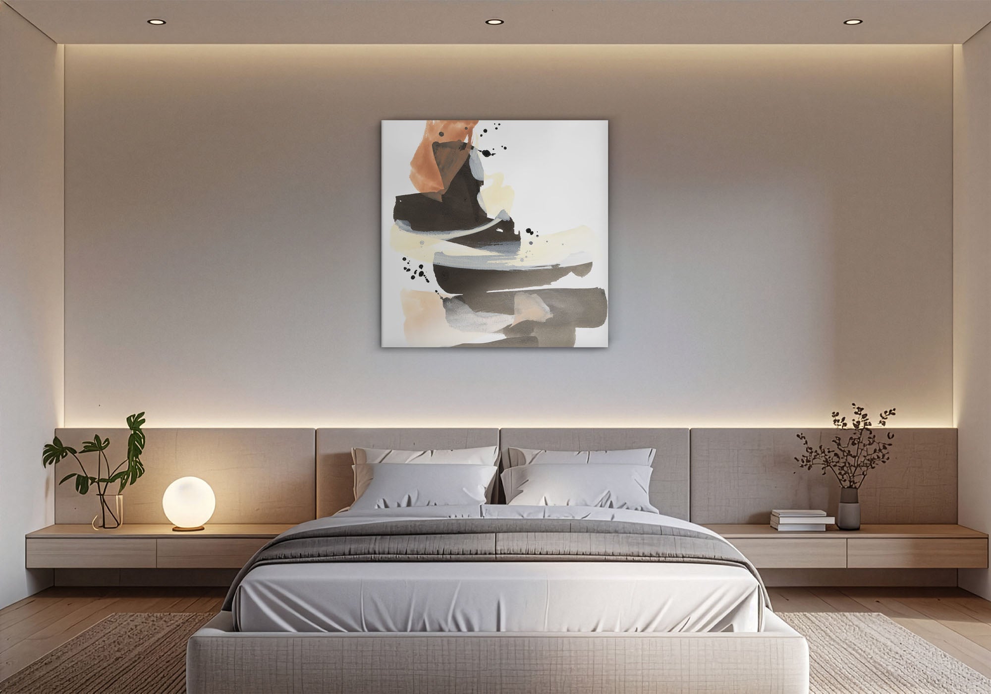
Choose texture so neutral isn’t flat. The most common neutral mistake is a piece with nothing to it. A visible canvas weave, soft brushwork, or a subtle tonal shift gives the eye somewhere to rest — that texture is what separates serene from blank.
Keep the contrast low above the bed. This is the wall you study as you fall asleep, so save any darker, higher-contrast piece for another wall. Above the bed, tonal and soft is what reads restful.
Blend, don’t match. Art that exactly repeats your duvet color disappears. Let the piece sit one step warmer, cooler, or lighter than the bedding so it still registers as art, not wallpaper.
Scale it to the bed, then stop. Span about two-thirds to three-quarters of the headboard and hang it 6–10 inches above it. For the full method, see the Bedroom Wall Art Guide and our Wall Art Size Guide.
Neutral pieces live or die on undertone and scale, so check both first. Use View in Your Room on any product page to see the exact piece on your wall at true size, or tape the dimensions above the headboard and live with the outline for a day.
Why these six pieces work
A few from our Calming Neutrals collection that earn their place above a bed — each chosen for the calm it brings, not just the way it looks. Every piece is hand-made to order in your size and finish.

A hazy forest in soft greys and greens — it reads as calm texture rather than a busy scene, so it settles a bedroom instead of energizing it.

A pale magnolia on light grey — a tonal floral that blends with neutral bedding while still giving the wall something quiet to hold.

An abstract built entirely from soft neutrals and texture — the palette does the calming, which is exactly the point of the style.

A single botanical form on a quiet ground — organic and restful, with just enough line to keep the neutral palette from going flat.

A rose dissolved into soft neutral washes — romantic in subject but tonal in palette, so it stays serene above a bed.

Layered greige and stone tones with visible brushwork — proof that “neutral” can still carry depth and movement.
Every piece is designed in California and hand-made to order, backed by free U.S. shipping over $100, 90-day returns, and a 1-year warranty.
Common mistakes (and the fix)
- Matching the bedding too exactly. A piece the same color as the duvet disappears. Fix: sit one step warmer, cooler, or lighter so it still registers.
- Choosing a flat, lifeless print. Neutral with no texture reads as blank wall. Fix: real canvas texture or soft brushwork gives it depth.
- Mixing warm and cool neutrals. A cool-grey piece in a warm room feels subtly wrong. Fix: match the room’s undertone first.
- Too much contrast above the bed. A sharp, high-contrast piece works against winding down. Fix: keep it tonal and low-contrast over the headboard.
- Going too small. A modest piece over a wide bed looks lost. Fix: span about two-thirds of the headboard, and size up when in doubt.
Frequently asked questions
What is calming neutral wall art?
It’s art chosen for a soft, low-contrast palette — whites, beige, greige, taupe, soft grey — so the piece quiets a room rather than commanding it. The subject can be anything from an abstract to a landscape; what defines the style is the muted, tonal color and the restful feeling it creates.
What size should bedroom art be above the bed?
Span about two-thirds to three-quarters of your headboard width and hang it 6 to 10 inches above the headboard, centered around 57 to 60 inches from the floor. That puts a 48×32 over a queen and a 60×40 over a king. When you’re between sizes, size up. The Bedroom and Size guides have the full method.
What colors count as calming neutrals?
Warm whites, ivory, beige, sand, greige, taupe, and soft greys — plus the quiet, dusty versions of colors like sage, blush, and pale blue. The test is low contrast and low saturation: if a color stays soft and recedes rather than pops, it belongs.
What’s the difference between Calming Neutrals, Cozy Minimalism, and Hygge?
They overlap, but each leads with a different thing. Calming Neutrals is about the palette — soft, tonal color. Cozy Minimalism is about the composition — one simple piece with lots of space. Hygge is about a cultural aesthetic — a specifically Nordic, candle-soft coziness. Pick the one that matches what you care about most, and you’ll rarely go wrong.
Should the art match my bedding?
It should relate, not match. Art that copies the duvet exactly tends to vanish. Let the piece share an undertone with the room and pull that tone through a pillow or throw instead — related rather than identical is what makes a neutral bedroom feel designed.
Will neutral art look boring?
Only if it has no texture. The fix isn’t more color — it’s depth: a visible canvas weave, soft brushwork, or a subtle tonal shift gives a neutral piece quiet interest, so it reads as serene rather than empty.
How do I keep neutral art from feeling flat?
Choose texture and a little tonal variation. A piece that moves from light to slightly deeper neutral, or carries real brushwork and canvas grain, holds the eye without adding color. One soft organic note — a leaf, a bloom, a horizon — is usually all it takes.
Neutral isn’t the absence of color — it’s a deliberate one. Choose the tone that lowers the room’s volume, and the calm takes care of itself.
Leave a comment
This site is protected by hCaptcha and the hCaptcha Privacy Policy and Terms of Service apply.