
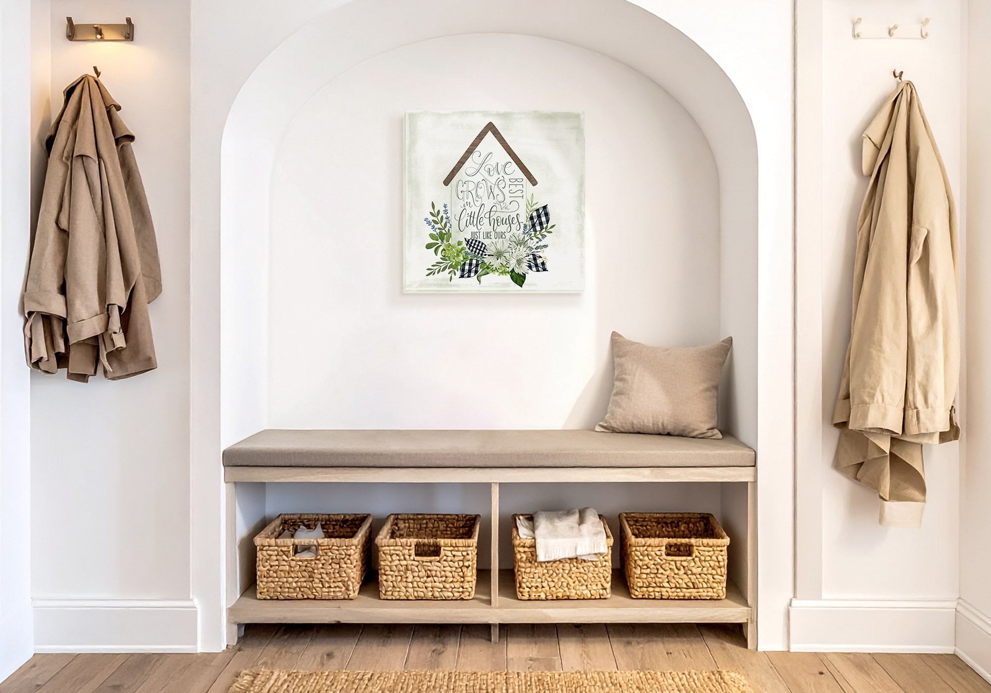
Family Moments Entryway Wall Art: The Wall That Says Whose Home This Is
You do not need a wall of family photos to make an entry feel like your home. One piece that captures the feeling of togetherness — the bond itself, or a shared place your family loves — says whose home this is the moment someone walks in, and it stays designed and legible in a way a photo collage never can. Choose something that means something to your family specifically, share an anchor with the rooms it opens onto, and the entry feels personal without feeling cluttered.
When people want an entry to feel like family, the reflex is a gallery of photos — a dozen frames crowding the wall by the door. It comes from the right place. It also tends to become visual clutter: hard to take in at a glance, quick to date, and closer to a scrapbook than a welcome.
An entry is met standing and in passing, so it rewards one clear idea over many small ones. A single piece that captures togetherness — or the place where your family makes its memories — can say "this is our home" more warmly, and more lastingly, than fifteen mismatched frames. So choose the one piece that means something to your family, and let it speak for all of them.
Everything here is Designed in California and hand-made to order by Fine Art Canvas — making canvas art since 1989, with free 90-day returns and a 1-year warranty on every piece.

Family Moments at a Glance
- What it is really about: Making the entry say whose home this is — with one meaningful piece, not a crowded photo wall
- Works best in: Family homes where you want the first wall to feel warm and personal, not neutral
- The core decision: One clear piece that means something to your family vs. a cluttered collage that means everything and nothing
- Two ways in: The bond itself (togetherness, a family word or scene), or the shared places your family's memories live (the lake, the shore, the reunion)
- What to avoid: A crowded photo wall, default slogans that could hang in anyone's home, and personal pieces that clash with the rooms around them
When Family Art Is the Right Answer
This is the right direction when you want the entry to feel personal above all — to tell anyone who walks in, gently, that a family lives here and loves it. It suits family homes, homes full of people who gather, and anyone who wants the first wall to feel warm and their own rather than neutral.
There are two honest ways to get there. One is the bond itself — a piece about togetherness, a family word that actually means something to you, a scene of people together. The other is the places your family shares — the lake you return to, the shore where the summers happen — the settings that hold the memories. If it is the place itself you most want to celebrate, more than the togetherness, that is Travel Adventure. And if you want a mood before a subject, start with a feeling: Welcoming Vibes, Elegant Entry, or Modern Simplicity.
✓ Works Well When
- You want the entry to say, quietly, "this is our family's home"
- You value personal warmth over a neutral first impression
- You want to celebrate togetherness, or a place your family shares
- You would rather one meaningful piece than a wall of photos
✗ Consider Something Else If
- You want a mood first, whatever the subject — see Welcoming Vibes or Elegant Entry
- You want it clean and understated — see Modern Simplicity
- You care more about the place than the togetherness — see Travel Adventure
The same togetherness can arrive warm and sunlit (Welcoming Vibes), soft and refined (Elegant Entry), or clean and graphic (Modern Simplicity). Decide what the wall is of here, then decide how it should feel.
How to Recognize a Piece That Works
Family art earns its place in an entry when it feels like yours and still looks designed. Three things tell you a piece will work.
1. It means something specific to you
A family word, scene, or place that reflects your people — not a default slogan that could hang in anyone's hallway. Specific reads as personal; generic reads as filler.
2. It reads in one glance
One clear piece, not a crowded collage. An entry is passed, not studied, so legibility is what makes the wall feel intentional rather than cluttered.
3. It still belongs to the home
Personal does not mean it clashes. A piece that shares a color or tone with the rooms it opens onto looks designed, not pinned-up — the difference between "our family's wall" and "the busy wall by the door."
A piece that means something to you, reads at a glance, and shares one tone with the next room will make an entry feel personal and finished at once. That is the whole job, and one good piece does it.
Ask what you would want a first-time guest to feel, not just what you would recognize. A photo wall speaks mostly to the people already in it; a piece about togetherness, or a place you all love, speaks to everyone who walks in — and still means the most to your family. That is the piece to hang by the door.
Five Moves That Work
1. Let one piece carry it
Choose the single piece that says the most, and let it stand for the whole family. One clear wall beats a crowded one at the door.
2. Choose meaning over the default slogan
Skip the phrase you have seen a hundred times and choose the word, scene, or place that is actually true for your family. That is what makes it read as yours.
3. If you want a set, keep it coordinated
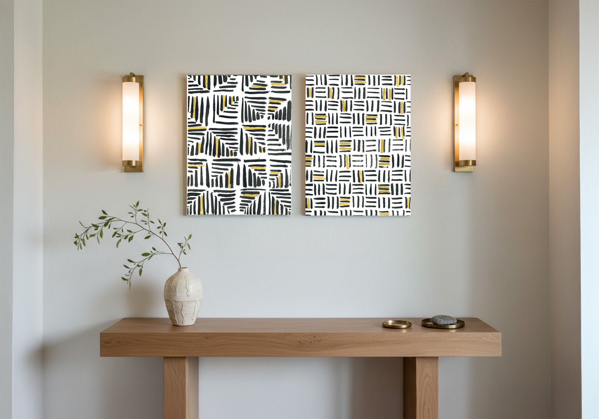
A matched trio in one palette — evenly spaced — gives you more than one note without tipping into collage. Order is what separates a set from a scrapbook.
4. Tie it to the home's palette
Pull one color from the room the entry opens onto so the personal piece looks designed into the home, not stuck on after.
5. Size it for standing eyes
Art spans roughly two-thirds of the wall or the furniture below it, hung a touch higher than a seated room because an entry is met standing. See the Wall Art Size Guide for the full method.
| Your entry wall | A good approach |
|---|---|
| Above a console or bench | One warm, worded or scene piece spanning about two-thirds of the furniture — a natural spot for "home" and "family" pieces. |
| Slim wall beside the door | One tall, personal piece — a family word or an upright scene — sized to hold the wall on its own. |
| Bare entry wall, no furniture | Go larger than you think with a single piece, or a coordinated trio, so it reads as finished rather than pinned-up. |
| Long hallway | A coordinated set in one palette — a "family gallery" done as an ordered row, not a random cluster. |
Six Family Pieces Worth Hanging
Every piece below is hand-made to order from the Family Moments collection — most about togetherness, one about the places a family shares. Each is available as gallery-wrapped canvas, framed canvas, or framed print, with pricing live at each product page.


Common Mistakes and the Fix
A dozen frames by the door becomes visual clutter that is hard to take in at a glance. Fix: let one meaningful piece stand for the whole family — an entry is passed, not studied, so one clear wall wins.
Stock phrases read as filler, not family. Fix: pick the word, scene, or place that is actually true for your people, so it reads as yours rather than anyone's.
A piece chosen in isolation can feel stuck-on rather than designed. Fix: tie it to one color from the next room, so personal still looks intentional.
Mismatched frames and sizes read as a scrapbook, not a design choice. Fix: if you want several, coordinate them — a matched set in one palette, evenly spaced.
A tiny piece on a big wall reads as uncertain, not personal. Fix: size the piece to hold the wall — personal should still look finished.
Hang What Means Something
Browse the full Family Moments collection — hand-made to order, Designed in California, with free 90-day returns on every piece.
Shop Family Moments ArtFrequently Asked Questions
How do I make my entryway feel personal?
Choose one piece that means something specific to your family (a family word, a scene, or a place you share) rather than a neutral or default one. Keep it to a single clear piece so it reads at a glance, and tie it to one color from the room the entry opens onto. That combination feels personal and looks designed at the same time.
Should I hang family photos in the entryway?
You can, but a crowded photo wall tends to read as clutter at a door that is met in passing, and it dates quickly. One piece that captures the feeling of togetherness, or a place your family loves, often says whose home this is more warmly and more lastingly. If you do want photos, keep them to a small, coordinated set rather than a sprawling cluster.
What art says family without being a cliche?
Art that is specific to you. A scene tied to a real memory, a family word that is actually yours, or a shared place like a lake or shore reads as personal, while a stock slogan reads as filler. Choose the piece you could explain to a guest in one sentence, and it will feel like your family rather than anyone's.
Why are beach and coastal pieces in a family collection?
Because a family is not only faces and the word family; it is also the places you are together. The lake, the shore, and the summer coast are where many families make their memories, so those scenes carry the same togetherness from a different angle. If the place matters more to you than the togetherness itself, the Travel Adventure guide leans further that way.
What size family art for an entry wall?
Generally about two-thirds of the wall or the furniture beneath it, hung a touch higher than a seated room because an entry is met standing. A console wall suits a wider worded or scene piece; a slim wall suits a tall one. See the Wall Art Size Guide for the full measuring method.
Is one piece or a gallery better for a family entry?
One well-chosen piece is usually the stronger first impression, because an entry is seen quickly and one clear idea lands better than many. If you want more than one, coordinate a small set in a single palette and space it evenly, so it reads as an ordered family gallery rather than a random cluster.
You do not need a wall of photos — one piece about togetherness, or a place your family shares, says whose home this is the moment someone walks in.


Leave a comment
This site is protected by hCaptcha and the hCaptcha Privacy Policy and Terms of Service apply.