
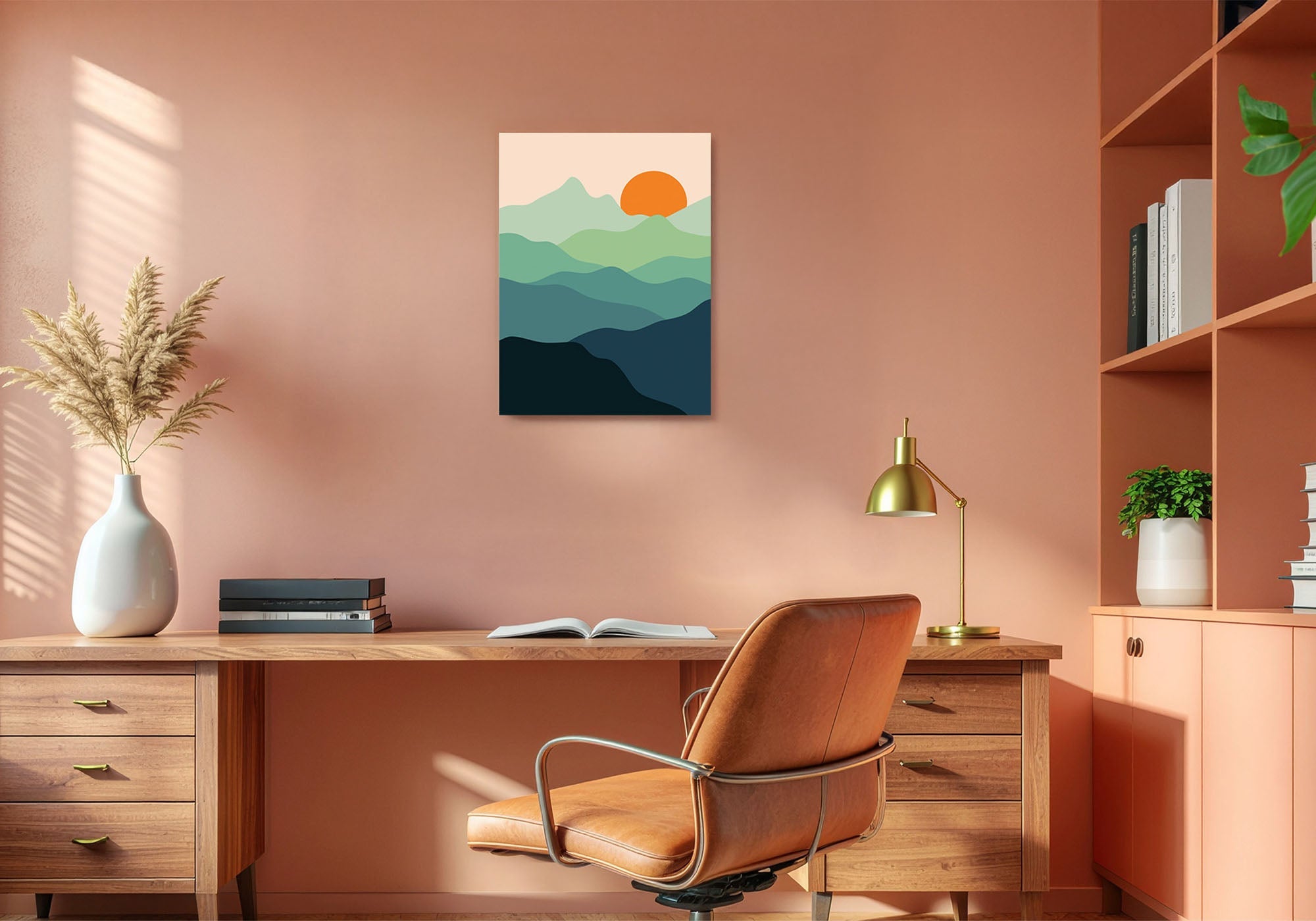
Mid-Century Workspace Wall Art: An Honest Style Guide
Mid-Century Workspace art is an era and a palette, not a cognitive strategy. Choose it for the warm wood tones, restrained color, and organic-meets-geometric forms that define the look — and let the rest of the room (desk, chair, shelving) carry the era through, since art alone will not make a room read as mid-century.
A Style Decision, Told Honestly
Unlike some of the other collections in this guide, there is no research to cite here, and we are not going to manufacture any. Mid-Century Modern is a design era — roughly 1945 to 1969 — defined by clean lines, organic forms, and an optimistic use of warm materials. Choosing it for your office is a taste decision, the same way choosing a desk or a chair in that style is. That is a complete reason on its own.
Every piece from Fine Art Canvas is designed in California and hand-made to order — making canvas art since 1989, with free 90-day returns and a 1-year warranty.

At a Glance
- Style: Warm wood tones, organic-meets-geometric forms, earthy palettes — mustard, teal, burnt orange, olive
- Best for: Offices already furnished in mid-century style — walnut, teak, tapered legs, warm materials
- Look for: Art that picks up your furniture colors — the visual thread makes the era read as intentional
- Not for: Function-first choices — if you need art for focus, creativity, or motivation, see the hub guide
- Start with: 20″×24″ to 24″×36″ on the primary wall, coordinated with existing furniture tones
When This Style Is Right for You
If what you actually need is a wall that supports a specific kind of thinking — sustained focus, generative work, or reconnecting with purpose — the Home Office Wall Art Guide walks through those decisions with real research behind each one. This collection is for when the answer to "what do I want on my wall" is an era and a palette you simply love.
How to Recognize It
The pieces in this collection share a visual language tied to the mid-century era: warm, earthy palettes, organic shapes alongside clean geometry, and a sense of restrained confidence.
| Quality | What to Look For |
|---|---|
| Color | Warm, earthy tones — mustard, burnt orange, teal, olive — often balanced against neutral backgrounds |
| Form | Organic shapes alongside clean geometry; nothing ornate or fussy |
| Subject | Often abstract or botanical, sometimes architectural — rarely literal or photographic |
| Best for | Offices already furnished with warm wood tones and clean-lined furniture, where the art should complete the era rather than introduce it alone |
✓ This Style Is for You If
- Your office furniture is already mid-century in spirit — warm wood, tapered legs, clean lines
- You want art that completes an era you are already building, not introduces it from scratch
- You prefer warm, earthy color palettes — mustard, teal, burnt orange, olive
- You respond to organic shapes alongside clean geometry, not ornate or fussy forms
✗ Look Elsewhere If
- You need art to support sustained focus — try Calm Focus
- You want contemporary bold geometry without an era reference — try Abstract Modern
- You want visually rich art for generative creative work — try Creative Energy
- You want art that connects to purpose and meaning — try Motivational
If your office furniture is already mid-century in spirit (walnut desk, tapered legs, warm wood tones), choose art that picks up one or two of those same colors. The visual thread between furniture and wall art is what makes the era read as intentional rather than incidental.
How to Use It Well
- Primary wall, including camera-visible positions: warm, well-composed mid-century pieces read well in person and on camera.
- Size: 20″×24″ to 24″×36″ works well as a primary-wall anchor. See the Wall Art Size Guide for room-specific sizing.
- Coordinate with furniture, not just walls: the strongest version of this look pulls color from the desk, chair, or shelving into the art — or vice versa.
Made to order. Every Fine Art Canvas piece is designed in California and hand-made to order. Choose from gallery-wrapped canvas, framed canvas with a black floater frame, or framed fine-art prints with a slim white mat. Free 90-day returns and a 1-year warranty on every order.
Our Picks for Mid-Century Workspaces

Contemporary Nature II — Tava Studios
Shop this piece →

Contemporary Nature I — Tava Studios
Shop this piece →

Dripping Gold I — Tom Reeves
Shop this piece →

Palm Springs — Sisi Seb
Shop this piece →

Blue Abstract — Simon Addyman
Shop this piece →

Round Diamonds I — Willowbrook Fine Art
Shop this piece →
Common Mistakes with Mid-Century Workspace Art
Hanging a single mid-century-style print on the wall and expecting the room to read as mid-century. The era is carried by materials and form throughout the room — walnut, teak, tapered legs, warm color — more than by any one piece of art. Art completes the look; it does not create it alone.
Choosing art with colors that do not connect to anything else in the room. The visual thread between furniture and wall art is what makes the era read as intentional rather than incidental. If your desk is walnut and your art is cool-toned grey, the two exist in different worlds — even if both are individually beautiful.
Picking a literal, photographic image for a style that favors abstraction and organic form. Mid-century art leans toward abstract, botanical, or architectural subjects — not photographic realism. A photograph of a mid-century house is not the same as a piece of art that carries the mid-century visual language.
Ready to find the right piece for your workspace?
Shop Mid-Century Workspace ArtFrequently Asked Questions
What defines mid-century modern wall art?
Mid-Century Modern art reflects the design era of roughly 1945 to 1969: clean lines, organic forms, and warm, earthy color palettes like mustard, teal, and burnt orange, often set against neutral backgrounds. It favors abstract or botanical subjects over literal, photographic imagery.
Will one piece of mid-century art make my office look mid-century?
Not on its own. The era is carried more by furniture and materials — walnut or teak wood tones, tapered legs, warm upholstery — than by a single piece of wall art. Art completes a mid-century-styled room; it does not create the look by itself.
What colors pair well with mid-century office art?
Warm wood tones (walnut, teak, oak), mustard, burnt orange, teal, and olive all pair naturally with this style. The strongest results come from echoing one or two of these colors between your furniture and your wall art.
Some choices are about era and taste, not function — and that is a perfectly good reason to choose them. Let the art complete a look you are already building, rather than asking it to create one on its own.
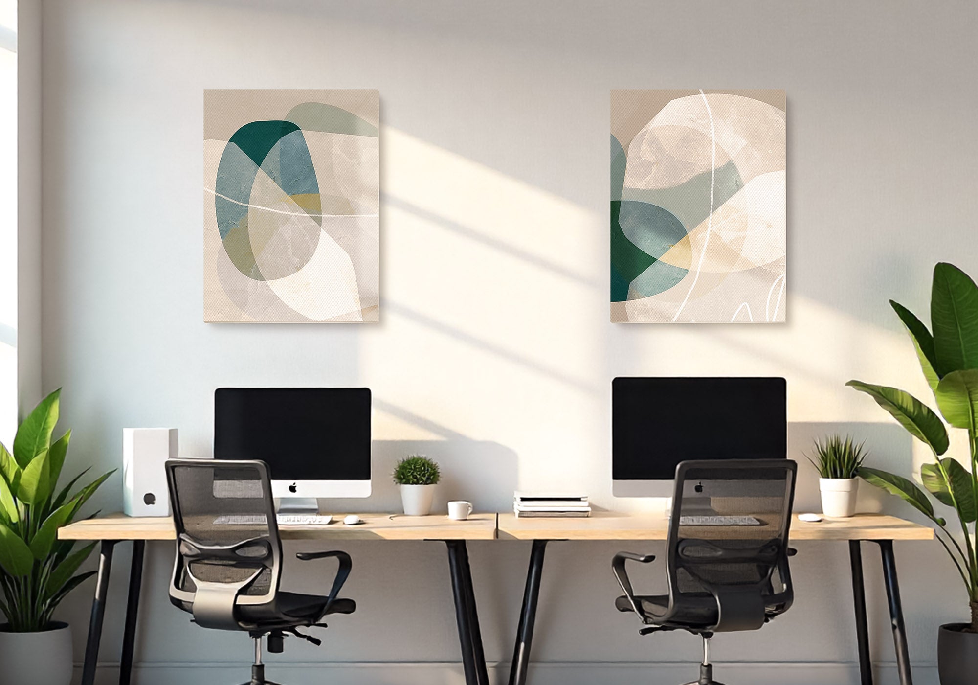
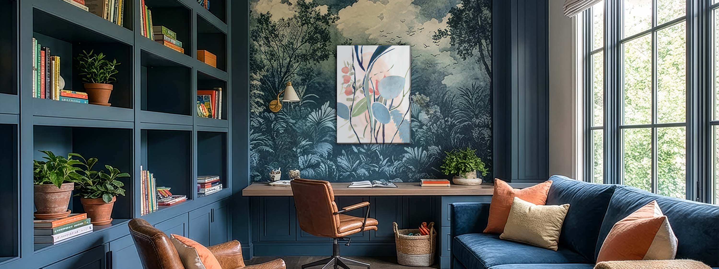


Leave a comment
This site is protected by hCaptcha and the hCaptcha Privacy Policy and Terms of Service apply.