
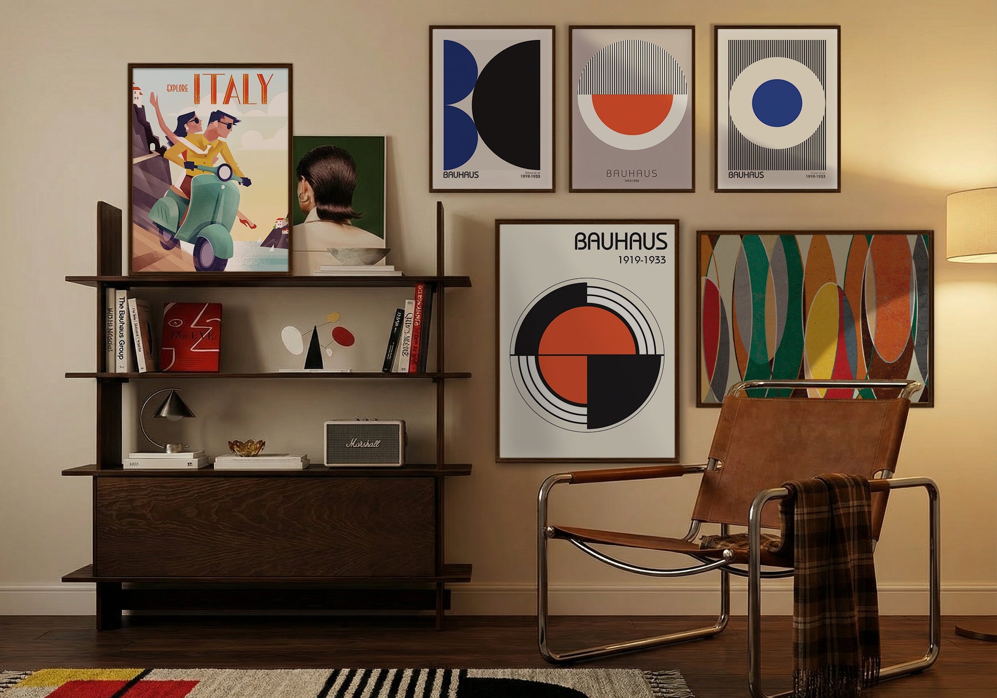
Retro and Vintage Wall Art for Man Caves: How to Build a Curated Collection, Not a Nostalgia Pile
Retro & Vintage Wall Art
The short answer: Retro and vintage wall art works when it commits to a specific era — not to nostalgia in general. A room that says 1950s says something. A room that says “vintage” says nothing. Pick the decade, build around its visual language, and the art creates a time and place rather than just a feeling of oldness.
In This Guide

Picture two man caves, both going for the same vintage atmosphere.
In the first room, a large mid-century bar scene hangs above the leather sofa — the colors are warm amber and deep green, the figures are dressed in a way that puts the decade precisely. On the side wall, a moody urban photograph in the same warm palette. The room doesn't announce its era. It inhabits it. Spend five minutes in the room and you know exactly where you are in time.
In the second room, a retro beach poster hangs beside a vintage magazine cover, beside a sepia-toned cityscape, beside a distressed-look sports print. All of it gestures at the past. None of it commits to a specific past. The room feels nostalgic the way a grocery store feels festive in December — themed, not genuine.
Both owners love vintage style. One room has a point of view about what that means. The other just has vintage-looking things.
This guide is about building the first room.
The Curated Collection vs. the Nostalgia Pile
Retro and vintage is the style category with the highest risk of accidental incoherence, because everything in it has the same surface quality — oldness — without necessarily sharing any deeper connection.
A 1920s Art Deco print and a 1970s rock poster are both “vintage.” So is a 1950s diner illustration, a Victorian advertisement, and a sepia-toned travel photograph from the early 1900s. Hang all five together and you have a nostalgia pile — every piece authentic to its era, none of them in conversation with each other.
The curated collection solves this by choosing an era rather than an aesthetic. Not “vintage,” but 1950s. Not “retro,” but mid-century modern, or Art Deco, or the visual language of a specific decade. When you commit to an era, the pieces start talking to each other — same color palette, same typography conventions, same quality of illustration or photography. The room has a time and a place rather than just a patina.
The nostalgia pile happens when each piece is chosen for its individual vintage quality without asking whether it belongs in the same room as the others. The pieces are all good. The room they make together is confused. The commitment required isn't strict — you don't need to authenticate every piece to a five-year window. But the room needs a governing era that functions as a filter: does this piece feel like it belongs to that time, or does it feel like a different time?
Three Ways to Build a Curated Collection
Rooms that land the retro and vintage aesthetic consistently use one of three approaches. Each provides a different kind of era anchor.
Commit to a Decade
The most direct approach: choose a specific decade and build the room's visual identity around it.
Each decade has a distinct visual language that extends across illustration, photography, graphic design, advertising, and fine art. The 1920s has Art Deco geometry and glamour. The 1940s has a warm, painterly realism influenced by wartime illustration. The 1950s has clean lines, optimistic color, and a specific quality of American confidence. The 1960s has bold graphic experimentation and psychedelia. The 1970s has warm earth tones, photography that feels slightly overexposed, and a different relationship to leisure.
When you choose a decade, you're choosing all of that — not just a style but a complete visual vocabulary that extends from the art itself into the colors you choose for walls, the furniture you select, and the objects you keep in the room. The art and the room reinforce each other because they're drawing from the same source.
The discipline: when a piece from a different decade catches your eye, ask whether it belongs to the room or just to your taste. Your taste can expand; the room's era shouldn't.
Commit to a Place and Time
A variation that's slightly more flexible: anchor the room to a specific place in a specific era rather than a decade alone.
Parisian cafés in the 1920s. American diners in the 1950s. Jazz clubs in New York in the 1940s. Czech cities in the interwar period. Each of these combinations has a visual identity precise enough to function as a design anchor, but broad enough to include multiple artists and media without losing coherence.
Place-and-time rooms work especially well when you have genuine affection for a particular city, culture, or social scene. The specificity of your interest comes through in the selection, and that specificity is what makes the room feel collected rather than assembled. Visitors may not be able to name the era, but they'll feel that someone who knew what they were looking for made these choices.
Commit to a Visual Medium
The third approach anchors on a type of vintage imagery rather than a specific era: vintage illustration, vintage advertising, vintage photography, vintage graphic design.
Rooms built around vintage illustration, for example, can span multiple decades because they're unified by the visual conventions of commercial illustration — hand-lettering, specific color relationships, the particular warmth of work made before digital reproduction. The era may vary; the medium gives the room its coherence.
This approach requires the most careful curation because the anchor is less obvious to a casual viewer. But it gives you the most flexibility in subject matter — a room built around vintage illustration can include sports, travel, food, urban scenes, and portraiture without those subjects working against each other, as long as they all share the medium's visual conventions.
Commit to a decade if you already know the era that speaks to you — if you find yourself drawn to the same visual period again and again. Commit to a place and time if you have genuine affection for a particular city, culture, or social world. Commit to a visual medium if your taste spans multiple eras but centers on a specific kind of image-making. All three produce a curated collection. The nostalgia pile happens when you skip the commitment.
Three Questions Before You Browse
Before You Browse Retro and Vintage Art
- What's your era? A specific decade, a specific place-and-time combination, or a specific visual medium. Not “vintage” — the one period or style that will hold the room together.
- What's the visual language? Every era carries characteristic palettes, typography, and illustration conventions. Name them before you browse — they're the filter that keeps the room coherent.
- What's the anchor piece? The primary wall needs one strong image that establishes the room's era with confidence. Everything else is supporting art once you've found the piece that does that job.
Featured Retro and Vintage Art
These are among the strongest-selling pieces in the Retro & Vintage collection — each chosen to anchor a zone, not just fill a wall. Butterfly Kiss Art Deco Woman anchors a specific 1920s moment through a single stylized silhouette and period ornament alone. Twilight-primary creates urban atmosphere that's unmistakably of its era. Prague IV anchors a place-and-time commitment with architectural specificity. Couture demonstrates how vintage illustration unifies a room through visual convention rather than subject matter.


Every piece is handcrafted to order — Designed in California. Hand-made to order. We've been making canvas art since 1989, with free 90-day returns and a 1-year warranty on every piece.
Size Guide for Retro & Vintage Wall Art
Vintage rooms often benefit from a mix of sizes rather than a single dominant piece — the layered, collected quality of a genuine room is hard to achieve with one large canvas. But the mix still needs a hierarchy. A 24×36 anchor surrounded by two or three smaller supporting pieces often reads as more authentically collected than a single large statement piece — the hierarchy of sizes mimics how a real collection develops over time.
| Canvas Size | Best Use | Typical Wall |
|---|---|---|
| 8×10 or 11×14 | Supporting pieces in a gallery arrangement, detail accent | Beside shelving, in a grouped arrangement, above a side table |
| 16×20 or 18×24 | Mid-weight anchor, fits smaller rooms or gallery walls well | Above a console, beside a window, end-wall accent |
| 24×36 | Primary anchor — establishes the era for the whole room | Main feature wall, above seating, above a bar or credenza |
| 36×48 or larger | Dominant statement — use with care in vintage rooms | Full feature wall only; can overwhelm the collected quality if too large |
For room-specific sizing guidance, see the Wall Art Size Guide.
Frequently Asked Questions
How do I know which vintage era my room should commit to?
Start with what you already have — furniture, rugs, objects. Most rooms already have a period leaning they haven't consciously named. If your furniture tends toward clean mid-century lines, you're already in the 1950s-60s. If you have darker wood and warmer, heavier textures, you may be in the 1940s or earlier. Let the existing room tell you its era, then choose art that confirms it rather than art that fights it. If your room has no period leaning yet, choose the era you find most interesting and build from there.
Can I mix pieces from different decades in a vintage room?
Yes, but with discipline. The question isn't whether the pieces are from the same decade — it's whether they share a visual language. A 1940s painting and a 1950s illustration can share a room if they're both warm in palette, realistic in approach, and similar in scale. A 1920s Art Deco print and a 1970s psychedelic poster can't share a room effectively, even though both are authentic vintage — they speak completely different visual languages. Test each candidate piece against the governing era, not against a calendar.
Is sepia tone the same as vintage?
No — sepia is a processing technique that signals age without locating you in a specific era. It's the photographic equivalent of the nostalgia pile: it says “old” without saying where or when. Pieces with specific period color palettes — the particular green-golds of the 1940s, the Kodachrome saturation of the 1960s, the warm earth tones of the 1970s — create a much more precise sense of era than sepia does. Use sepia photography sparingly, and anchor the room with pieces whose color tells you specifically when they're from.
What's the difference between retro and vintage in wall art?
Technically, “vintage” refers to work from its original era — a genuine 1950s poster, a real 1920s illustration. “Retro” refers to contemporary work made in the style of an earlier period. In practice, both work for decorating purposes because both commit to a visual era. What matters isn't the age of the work but whether it accurately represents a specific period's visual language. A well-executed contemporary illustration in a 1950s style belongs in a 1950s room; a poorly researched “vintage-inspired” piece that mixes elements from multiple eras doesn't.
Should vintage art frames match each other?
Canvas prints don't require frames — the canvas edge is the finish. If you're mixing canvas prints with framed pieces, keep the frame profiles consistent (thin and simple, or thick and ornate, but not both) while allowing the frame colors to vary slightly. Consistent profile with varied color reads as collected; varied profile with matched color reads as matched-set. Vintage rooms generally benefit from the collected quality, which means profile consistency matters more than color uniformity.
Find the piece that establishes your era. Every canvas is handcrafted to order — Designed in California. Hand-made to order.
Shop Retro & Vintage Art


Leave a comment
This site is protected by hCaptcha and the hCaptcha Privacy Policy and Terms of Service apply.