
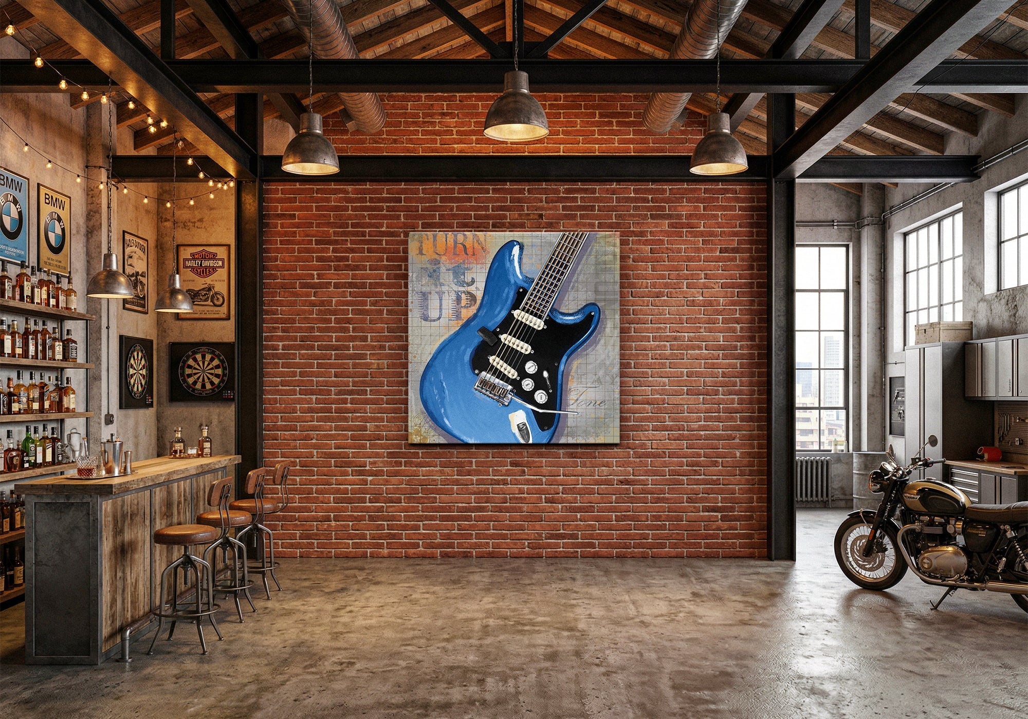
Industrial Style Wall Art for Man Caves: How to Build an Urban Loft, Not a Warehouse
Industrial Style Wall Art
The short answer: Industrial wall art creates an urban loft atmosphere when it treats raw materials as subjects worth celebrating — not as background texture. The difference between a warehouse and a loft is intention. Art that looks deliberately chosen makes the room feel curated. Art that just references metal and rust makes the room feel unfinished.
In This Guide

Picture two man caves with the same raw bones: exposed brick, concrete floors, dark metal shelving.
In the first room, a large canvas of a rusted vintage Chevrolet hangs above the workbench. On the adjacent wall, three prints of vintage amplifiers — same artist, same palette, slightly different subjects. The whole room feels like a collector's workshop. Everything in it was chosen. The raw materials feel deliberate.
In the second room, there's a neon sign that says WORK HARD, a motivational quote printed on reclaimed wood, and a black-and-white cityscape poster from a big-box retailer. The room has industrial elements. It doesn't have an industrial point of view.
The difference isn't the furniture or the finishes — it's what the art communicates about why the room exists. The first room says: someone who cares about craft and materials lives here. The second room says: someone bought things labeled "industrial style."
This guide is about getting to the first room.
The Urban Loft vs. the Warehouse
Industrial design has a specific problem that other styles don't: it's easy to look unfinished instead of intentional.
Raw materials — exposed metal, aged wood, worn surfaces — read as incomplete unless something signals that they were chosen. In architecture, that signal comes from carefully controlled lighting and spatial proportion. In a man cave, it has to come from the art.
The urban loft uses industrial elements as a design vocabulary. Every raw surface is there because it contributes to a specific feeling: honest materials, visible craft, unpretentious functionality. The art reinforces this — it tends to show things made by hand, machines in their working lives, materials with history. The room feels like it was built by someone with a point of view about how things should be made.
The warehouse accumulates industrial elements without a governing idea. Dark metal because it looks tough. Exposed brick because it was cheaper than drywall. Gear and tool imagery because it fits the theme. The result is a room that references industrial style without inhabiting it.
What separates the urban loft from the warehouse is the same thing that separates every room that works from every room that doesn't: a perspective. The urban loft knows what it believes about materials and craft. The warehouse just knows what it looks like.
Three Ways to Build an Urban Loft
Rooms that land the industrial aesthetic consistently use one of three approaches. Each anchors the room's identity differently.
Celebrate the Object
The most direct approach: find subjects made from raw materials and treat them as worthy of serious attention.
A rusted vintage car is just a car until someone paints it in a way that makes you notice the quality of the rust — the gradations of color, the texture of oxidized steel, the history recorded in the surface. That's when it becomes art rather than reference material. The subject hasn't changed; the attention has.
Industrial rooms built around object celebration tend to anchor on vehicles, machinery, or tools — things that are made from the same materials as the room itself. When the art and the room share a material vocabulary, the space achieves coherence that no amount of accessorizing can manufacture.
The key discipline here is quality of observation. Low-resolution stock photography of gears or generic rust textures will always look like decoration. Art that shows careful looking at a specific object — this car, this amplifier, this particular quality of worn metal — creates the sense of intention that makes a room feel designed rather than assembled.
Honor the Equipment
A variation on object celebration, but with a specific category of subject: the tools and equipment of making things.
Amplifiers, transmitters, broadcast equipment, workshop machinery — these objects share a quality that makes them particularly effective as industrial art subjects. They were made to do something. The form follows function in ways that are legible without explanation. A vintage amp looks like a vintage amp because of what it does, not because of how someone decided it should look. That authenticity reads in a painting of it.
Equipment-focused rooms work especially well in spaces that double as functional workshops or studios. When the art on the wall shows vintage equipment and the shelf holds current equipment, the room develops a conversation between eras.
The same artist across multiple equipment pieces creates a particularly strong effect. Same palette, same scale, same quality of observation — suddenly three pieces become a suite, and the room has a visual anchor that no single large piece could provide.
Capture the Urban Texture
The third approach pulls back from specific objects and captures the visual texture of urban and industrial environments — the layering of surfaces, the quality of light through factory windows, the geometry of steel and concrete.
Abstract works in this mode don't depict any particular object but evoke the feeling of being in a well-made industrial space. Collage and mixed-media pieces that incorporate raw material textures can work especially well, because they don't just represent industrial materials — they use them.
Texture-based rooms give you more flexibility in composition. A strong abstract piece can anchor an entire wall without requiring the room to commit to a specific subject matter. The discipline shifts from "what does this show?" to "what does this feel like?" — which is actually harder to get right, but when it works, the room has an atmosphere that purely representational art rarely achieves.
Celebrate the object if you have specific things you care about — a particular car, a type of machine, a category of tools. Honor the equipment if your room has a functional purpose and you want the art to acknowledge it. Capture the urban texture if you want atmosphere without committing to a specific subject. All three make a room. The warehouse happens when you skip the approach entirely.
Three Questions Before You Browse
Before You Browse Industrial Art
- What's the material story? Rusted steel, aged wood, worn leather, raw concrete — which materials define this room? The art should celebrate the same vocabulary the room is built from.
- Object, equipment, or texture? Choose one organizing approach and commit to it. Rooms that mix all three lose the coherence that makes industrial spaces feel intentional rather than unfinished.
- What's the anchor piece? The primary wall needs one strong image that establishes the room's point of view. Three mid-size pieces by the same artist often anchor better than one large piece by a different artist — coherence matters more than scale in visually complex rooms.
Featured Industrial Style Art
These are among the strongest-selling pieces in the Industrial Style collection — each chosen to anchor a zone, not just fill a wall. The Rusted Chevrolet demonstrates object celebration at its best — Hutchison paints the rust itself as something worth studying. Amp it Up, On the Air, and Turn it Up form a three-piece suite by Jim Baldwin that creates visual coherence no single piece could replicate.


Every piece is handcrafted to order — Designed in California. Hand-made to order. We've been making canvas art since 1989, with free 90-day returns and a 1-year warranty on every piece.
Size Guide for Industrial Wall Art
Industrial spaces often have more wall real estate than other room types — higher ceilings, longer walls, fewer architectural interruptions. This changes the sizing calculus. Three mid-size pieces by the same artist often create a stronger statement than one large piece by a different artist — coherence matters more than scale in rooms where the architecture is already making a bold statement.
| Canvas Size | Best Use | Typical Wall |
|---|---|---|
| 8×10 or 11×14 | Suite pieces in a multi-print arrangement, detail accent | Narrow walls, beside shelving, workshop bench area |
| 16×20 or 18×24 | Individual statement in compact spaces; one piece in a three-piece suite | Between windows, above a workbench, end-wall accent |
| 24×36 | Primary anchor in average-height rooms | Main feature wall, above seating or workstation |
| 36×48 or larger | Dominant statement — scales to loft-height ceilings | Full feature wall, requires clear sightlines and distance |
For room-specific sizing guidance, see the Wall Art Size Guide.
Frequently Asked Questions
What makes wall art look industrial rather than just rough or unfinished?
Intention. Raw materials look designed when they're treated as subjects worth examining — not as background texture. Art that studies something made from metal, wood, or worn surfaces in detail (rather than just depicting "industrial stuff" generically) signals that the rawness was chosen, not defaulted to. The difference is the same as the difference between a patina that developed over decades and one applied yesterday: authenticity of attention.
Can industrial wall art work in a room that isn't actually a loft or workshop?
Yes — the industrial aesthetic is a visual language, not an architectural requirement. What the room needs is internal consistency: if the art says "raw materials handled with care," the rest of the room should echo that. Concrete-colored paint, dark metal fixtures, and natural wood tones provide enough material vocabulary to make industrial art read as intentional rather than incongruous, even in a standard-height finished basement.
Should all the art in an industrial man cave be the same style?
Not necessarily the same style, but the same visual register. Industrial spaces tend to be visually complex — lots of texture, strong lines, warm metallics. Art that's quiet and contemplative competes with that complexity rather than working with it. Pieces that have their own visual weight and deliberateness tend to hold their own in these environments better than delicate or highly detailed work. One artist across multiple pieces is a reliable way to maintain consistency without requiring everything to be in the same style.
How do I hang art in a room with exposed brick or concrete?
Use anchors rated for masonry — standard drywall anchors will fail in concrete and brick. For brick, drill into the mortar joints rather than the brick itself (easier to patch and less likely to crack). Canvas prints are lighter than framed works, which reduces the load requirements significantly. If you're hanging multiple pieces as a suite, lay them out on the floor first to establish spacing before marking the wall — industrial rooms tend to have strong horizontal lines that make crooked arrangements more noticeable.
Is black-and-white art a good choice for industrial spaces?
It can be, but it's the default choice rather than the best choice. The risk with black-and-white in industrial spaces is that it reinforces the "unfinished warehouse" reading rather than the "urban loft" reading. The materials in an industrial room — rust, aged wood, worn metal — carry a lot of warm color that black-and-white art doesn't pick up or respond to. Pieces with warm sepia tones, amber highlights, or muted earth palettes tend to integrate better with industrial materials than pure monochrome, which can feel cold in spaces that are otherwise warm in tone.
Find the piece that anchors your workshop. Every canvas is handcrafted to order — Designed in California. Hand-made to order.
Shop Industrial Style Art



Leave a comment
This site is protected by hCaptcha and the hCaptcha Privacy Policy and Terms of Service apply.