
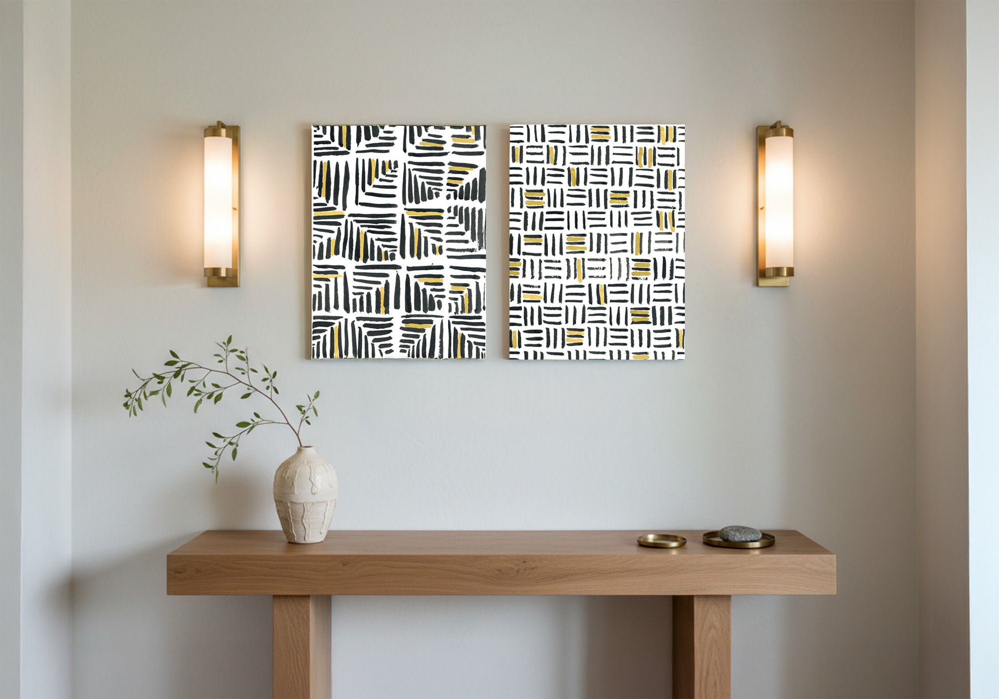
Modern Simplicity Entryway Wall Art: Minimal, Not Empty
Minimal is a deliberate choice, not an empty wall. A modern entry looks clean and intentional when you hang one well-scaled piece — clear lines, a pared-back palette (a single crisp color is fine), a simple form — and let the space around it work on purpose. Scale it to hold the wall, share an anchor with the rooms on either side, and the simplicity reads as confident design, not a wall you forgot to finish.
Modern and minimal are easy to get wrong in an entry, and the mistake usually runs one direction: not too much, but too little. A tiny frame on a wide wall, or a bare wall left "clean," reads as unfinished — as if the decision were skipped rather than made.
Real simplicity is the opposite of skipping the decision. It is one confident, clean piece, scaled to hold its wall, with negative space working for it instead of by accident. The restraint is the design. So choose deliberately, size it right, and let the architecture do some of the talking. Minimal should look intentional, never forgotten.
Everything here is Designed in California and hand-made to order by Fine Art Canvas — making canvas art since 1989, with free 90-day returns and a 1-year warranty on every piece.

Modern Simplicity at a Glance
- What it is really about: Minimal as a deliberate choice — one clean, well-scaled piece with intentional space, not a bare wall
- Works best in: Contemporary, clean-lined homes where you want the architecture to lead and the art to match that hand
- The core decision: Intentional simplicity vs. an unfinished wall — the difference is scale, placement, and purpose
- What to look for: Clean lines, a simple form, a pared-back palette (one crisp color is fine), and enough space to let it breathe
- What to avoid: Under-scaling, assuming minimal means colorless, and leaving a bare wall and calling it done
When Modern Simplicity Is the Right Answer
This is the right direction when your home leans contemporary — clean lines, open space, a pared-back palette — and you want the entry to match that hand rather than fight it. It suits anyone who prefers one strong, simple piece to a busy wall, and who wants the doorway to feel calm, current, and uncluttered.
Simple does not have to mean quiet, either. A clean modern piece can still carry a real charge — the boldness rides on the simplicity, not against it — which is why some of these pieces also live in the Statement Art collection. If you want warmth instead of clean lines, see Welcoming Vibes; if you want soft, tonal refinement, see Elegant Entry.
✓ Works Well When
- You live in a contemporary, clean-lined home
- You prefer one strong, simple piece to a busy wall
- You want the entry to feel calm, current, and uncluttered
- You like clean form and a pared-back palette, with or without a bold color
✗ Consider Something Else If
- You want a warm, cozy hello — see Welcoming Vibes
- You prefer soft, tonal refinement — see Elegant Entry
- You want the wall to be about a specific subject first — see Family Moments or Travel Adventure
It pairs with whatever you want on the wall, handled cleanly. A modern map or a graphic sense of place lives in Travel Adventure; a clean, contemporary take on the people you love lives in Family Moments. The treatment sets the look; the subject gives it something to be about.
How to Recognize a Piece That Works
Modern simplicity is recognizable the moment you know what to look for. Three qualities carry it, and any piece can be checked against them fast.
1. Clean lines and a simple form
A clear shape, an uncluttered composition, one idea done well. Modern pieces say a single thing clearly rather than many things at once.
2. A pared-back palette (which can still have color)
Few colors, used with intent. That might be quiet neutrals, or one crisp, confident color against a calm ground. Minimal is about restraint, not the absence of color.
3. Intentional space
The negative space around and within the piece is part of the design. A modern piece needs room, and the right scale, to read as deliberate rather than sparse.
A clean-lined piece in a pared-back palette, scaled to hold its wall, will make an entry look current and considered. Tie one color to the room next door, and the modern feel belongs to the whole home.
Before you decide a modern wall needs "more," step back to where you actually pass it. Minimal art is judged from a distance and in motion, not up close. From ten feet away, one clean, well-sized piece almost always looks more finished than a cluster — trust the space you are leaving empty.
Five Moves That Work
1. Go bigger than feels obvious
The most common minimal mistake is under-scaling. One large, clean piece looks deliberate; a small one on a wide wall looks lost. When in doubt, size up.
2. Let the negative space be part of the design
Do not rush to fill the wall. Clear space around a clean piece is what makes minimal read as a choice rather than an oversight.
3. Use one crisp color as the whole accent
A single confident color against a calm ground gives a minimal entry life without clutter. Let that be the only color that raises its voice.
4. Try a clean pair or a simple grid
Two matching pieces, or a tidy grid, reads as modern and considered — an easy way to hold a wider wall without a busy gallery.
5. Size it for standing eyes
Art spans roughly two-thirds of the wall or the furniture below it, hung a touch higher than a seated room because an entry is met standing. See the Wall Art Size Guide for the full method.
| Your entry wall | A good approach |
|---|---|
| Above a console or bench | One clean, well-scaled piece (or a wide panoramic) spanning about two-thirds of the furniture, with space around it. |
| Slim wall beside the door | One upright, simple piece sized to hold the wall — resist going small. |
| Bare entry wall, no furniture | Go large and singular, or a clean pair or grid; let intentional space do the rest. |
| Long hallway | A clean series or a simple grid in one palette, evenly spaced — order reads as modern down a long wall. |
Six Pieces That Work
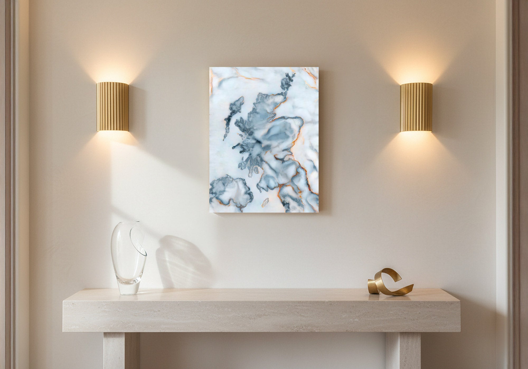
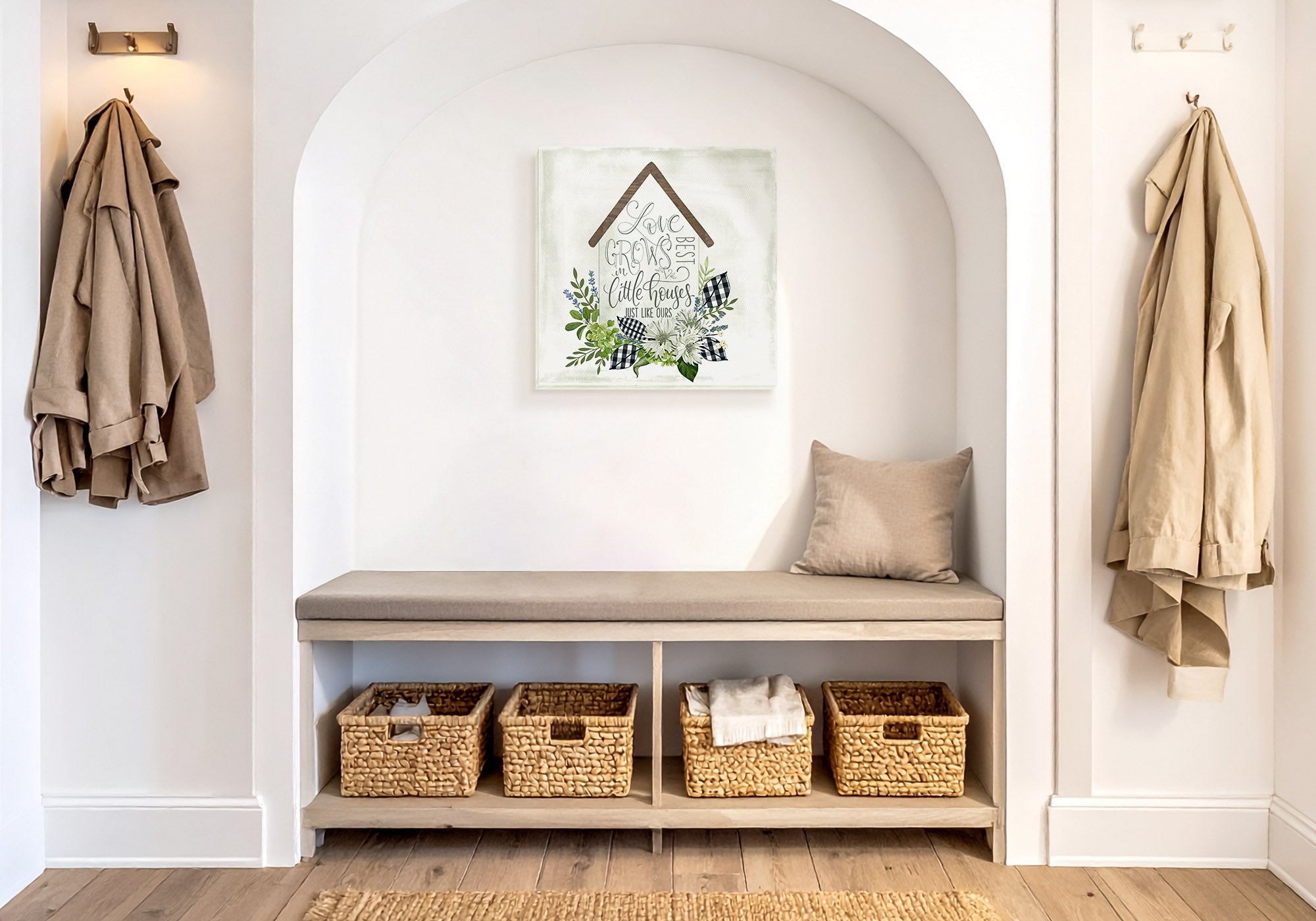
Every piece below is hand-made to order from the Modern Simplicity collection — each a different way simplicity stays intentional. Each is available as gallery-wrapped canvas, framed canvas, or framed print, with pricing live at each product page.


Common Mistakes and the Fix
Minimal is a deliberate choice, not an empty wall. Fix: hang one clean, well-scaled piece so the simplicity looks intended rather than forgotten.
A small piece on a large wall reads as lost, not restrained. Fix: go bigger than feels obvious — one large clean piece reads as confident, not sparse.
Minimal is about restraint and intent, not the absence of color. Fix: use one crisp, confident color as the whole accent — the rule is one voice raised, not none.
Adding more to a minimal wall undoes the design. Fix: let the negative space stay — clear space is what makes minimal read as intentional.
A detailed, decorative piece fights the architecture instead of matching it. Fix: match the piece to the home — one simple form belongs where many do not.
Choose the Clean Piece
Browse the full Modern Simplicity collection — hand-made to order, Designed in California, with free 90-day returns on every piece.
Shop Modern Simplicity ArtFrequently Asked Questions
What art goes in a modern or minimalist entryway?
One clean, well-scaled piece with a simple form and a pared-back palette. Clear lines and intentional space are what make a modern entry read as current and considered. Keep the composition uncluttered, size it to hold the wall, and share one color with the room the entry opens onto so it belongs to the whole home.
How do I keep a minimalist entry from looking empty?
Scale up and choose deliberately. The empty look almost always comes from a piece that is too small, not from too little on the wall. One large, clean piece with intentional space around it reads as designed, while a tiny frame on a wide wall reads as unfinished. Minimal is a decision, not a blank.
Can minimalist art have color?
Yes. Minimal is about restraint and intent, not the absence of color. A single crisp, confident color against a calm ground is very much within modern simplicity, and often the thing that gives a clean entry its life. The rule is one voice raised, not none.
What size art for a modern minimalist entry?
Generally about two-thirds of the wall or the furniture beneath it, and hung a touch higher than a seated room because an entry is met standing. With minimal art especially, lean larger, since under-scaling is the usual mistake. See the Wall Art Size Guide for the full measuring method.
Is one large piece or a grid better for a modern entry?
Both are modern; the wall decides. One large, clean piece is the simplest confident choice, while a tidy grid or a matched pair holds a wider wall while still reading as ordered and calm. Keep either option in one palette and give it space, and both will look intentional.
What modern art works in a hallway?
Clean, legible pieces that read at a glance, since a hallway is seen standing and in motion. A clean series or a simple grid in one palette, spaced evenly, turns a long wall into calm modern rhythm. Where doorways or switches interrupt the run, treat each clean segment as its own simple composition.
Minimal is a deliberate choice, not an empty wall — hang one clean, well-scaled piece and let the space around it do the rest.


Leave a comment
This site is protected by hCaptcha and the hCaptcha Privacy Policy and Terms of Service apply.