
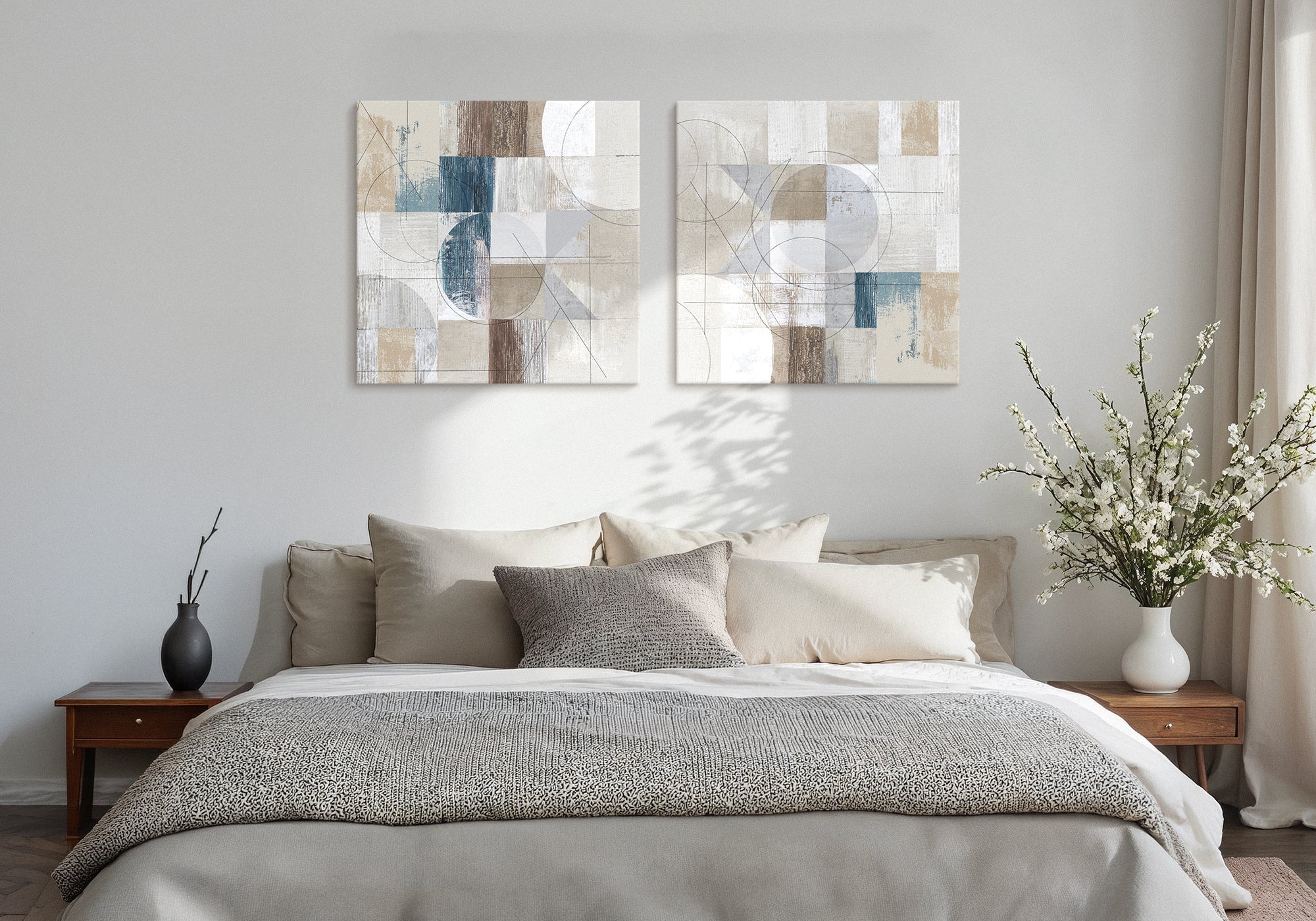
Relaxed Neutral Guest Bedroom Wall Art
A neutral guest bedroom feels calm when the neutral is warm and chosen — and flat when it’s just the absence of color. Calm and empty look almost identical in a photo, but they come from opposite places. Calm neutral has a deliberate warmth (honey, cream, soft sand, warm taupe) that reads as alive. Empty neutral is what’s left when no warmth was chosen at all. The right neutral wall art is warm on purpose, and that’s the whole difference.
The difference between a room that feels calm and one that just feels empty is intention.
- The feeling: warm, easy, quietly composed — calm, never cold
- The core move: choose the temperature of the neutral on purpose; warmth is the decision
- Best for: guest rooms that should feel soft and restful without leaning on strong color
- Palette: warm beiges, cream, oatmeal, honey, soft taupe — undertones you can feel
- The trap to avoid: treating “neutral” as no decision at all, which is how calm slips into flat
Neutral is the most reached-for choice in a guest bedroom, and the most misunderstood. The reach makes sense: soft, quiet, unlikely to clash with anything. But there’s a reason so many neutral rooms end up feeling flat rather than restful — and it isn’t a lack of texture, or pattern, or a pop of color, which is what most advice will tell you to add. It’s that “neutral” got treated as the absence of a decision instead of a decision in its own right.
Here is the thing worth understanding before you choose anything. A calm neutral room and an empty neutral room can look nearly identical at a glance — both quiet, both low on color, both soft. But they come from opposite places. A calm room got its warmth on purpose: someone chose honey over gray, cream over stark white, a soft taupe with a warm undertone over a flat, cool beige. An empty room is what’s left when that choice never happened — neutral by default, warmth by accident, and usually none. The art on the wall is where that choice shows most clearly.
At Fine Art Canvas, we’ve been making canvas art since 1989. Designed in California. Hand-made to order. Every piece comes with free 90-day returns and a 1-year warranty, so you can choose with confidence. This guide is about choosing a neutral that reads as calm, not empty — and knowing the difference before it’s on the wall.
Calm and empty are not the same neutral
The most useful shift you can make is to stop thinking of neutral as “no color” and start thinking of it as a temperature. Every neutral leans somewhere. Warm neutrals carry honey, sand, clay, and cream undertones — they hold light and feel soft. Cool or undertone-less neutrals lean gray and stark — they can read crisp in the right room, but in a bedroom they easily tip into cold and unfinished.
Calm comes from warmth chosen on purpose. Empty comes from warmth skipped. That’s why adding texture or a throw pillow only half-fixes a flat neutral room — you’re compensating for a temperature decision you didn’t make. Get the temperature right first, in the largest quiet element on the wall, and the room reads as restful before you add a single cushion.
When relaxed neutral is the right answer
This style is the right call when you want a guest room to feel soft and welcoming without committing to a color story — somewhere a visitor settles into easily, whatever they brought with them. It suits rooms with warm wood, linen, and natural light, where you want the art to deepen the calm rather than introduce a statement. And it’s ideal when you like quiet but have been burned by quiet going cold: the fix isn’t more stuff, it’s warmer neutral.
Relaxed neutral isn’t the safe non-choice it’s often mistaken for. Done with intention, it’s one of the warmest, most forgiving rooms you can make.
How to recognize it
Relaxed neutral art shares a few consistent traits. They’re what keep it on the calm side of the line rather than the cold one:
- Warm undertones. Honey, cream, oatmeal, clay, warm taupe. The neutral leans warm, not gray.
- Layered, not flat. Several soft tones working together — a warm beige beside a deeper taupe — rather than one uniform wash.
- Texture you can feel. Visible brushwork, soft grain, or gentle depth gives a quiet piece something to hold the eye.
- Calm subjects. A soft landscape, a distant tree line, a quiet abstract — restful imagery in a warm key.
How to tell warm neutral from flat neutral
Most guides warn that neutral can feel “boring” and then tell you to add pattern or a color pop. That’s treating the symptom. The real question is simpler and comes earlier: is this neutral warm, or is it just gray? Here is how to tell before it’s on your wall.
It’s a matter of undertone — an established idea in color and design. Set the piece against a sheet of pure white paper. A warm neutral will suddenly show its honey, cream, or clay leaning; a flat neutral will look gray, cool, or slightly lifeless by comparison. The same test works for the room: hold the art against your bedding and wall. If the tones warm each other, you have a calm room. If they turn each other gray, the neutral was never chosen — it defaulted.
Warmth is the decision. Once you can see it, you can’t unsee it, and choosing calm over empty becomes easy.
Is relaxed neutral right for your guest room?
- You want the room soft and warm without a strong color story
- You have warm wood, linen, or natural light to build on
- You like quiet but want to be sure it lands as calm, not cold
- You’d rather deepen a mood than make a statement
- You want the room to look current and of-the-moment — see Modern Refresh
- You want one spare, decided statement piece — see Simple Minimalist
- You like cool, open water and sky imagery — see Coastal Calm
- You want the art to actively signal personal care — see Warm Welcome
If you’re deciding between styles: Simple Minimalist is the closest cousin and the one to compare against — it also risks looking like “you didn’t decorate,” but its fix is composition (one piece, correctly scaled), while relaxed neutral’s fix is temperature (warm, not flat). Modern Refresh is the “looks” to relaxed neutral’s “feels” — one keeps the room current, the other keeps it warm. And Coastal Calm reaches calm through cool, open nature if warm neutral feels too soft for your room. When in doubt, start at the Guest Bedroom hub, which routes you to the right style by feeling.
How to use it well
Five moves keep relaxed neutral warm rather than flat:
- Choose the temperature first. Decide warm before you decide anything else. A warm neutral piece sets the key for the whole room.
- Layer your neutrals. Pair a warm beige with a deeper taupe or soft clay. Contrast within the palette is what keeps it from going flat.
- Let texture do the work. Visible brushwork and soft grain add life a uniform wash can’t.
- Scale it to the wall. Size the piece to span roughly two-thirds to three-quarters of the bed width so the warmth has presence.
- Echo one tone nearby. Pull a single warm note from the art into the bedding or a throw so the room reads composed, not coincidental.
For exact dimensions by bed size and wall, see the Wall Art Size Guide. The short version: measure the wall, aim for two-thirds to three-quarters of its width, and center the piece around 57–60 inches from the floor.
| Where it hangs | Recommended piece | Best orientation |
|---|---|---|
| Above a queen or king bed | Wide or paired piece, 40–60″ across | Horizontal / landscape |
| Above a twin or narrow wall | Single piece, 24–36″ across | Vertical or square |
| Standalone feature wall | One large warm piece, 30″+ across | Square or landscape |
Made to order, in your size. Designed in California. Hand-made to order. You choose the exact scale your wall needs, so a warm neutral can set the tone for the whole room. Backed by free 90-day returns and a 1-year warranty, making canvas art since 1989.
Why these six pieces work
Each of these is a neutral with warmth chosen on purpose — quiet, but never flat. Read them as six ways a neutral can read calm instead of empty.

Honeybloom Lake Views
Carol Robinson
Warmth you can see. Honey and cream tones over a calm lake — the clearest proof that a neutral can be soft and alive at once, not gray and quiet.
Shop this piece ›
Buoyant Neutral
Mike Schick
A neutral with life. Soft, layered tones with gentle movement — the very thing a flat neutral lacks. Proof that quiet doesn’t have to mean still.
Shop this piece ›
Distant Forest
Julia Purinton
Quiet depth. A soft, faraway tree line in muted warm tones — calm imagery that layers its neutrals rather than flattening them.
Shop this piece ›
Tree Study
Nancy Crowell
Botanical calm. A quiet study in soft, warm neutrals — restful and grounded, the kind of piece a guest’s eye settles on without effort.
Shop this piece ›
Fall Grasses No. 2
Ramona Murdock
Sand and wheat warmth. Soft grasses in the textbook warm-neutral palette — gentle texture and honeyed color that read as cozy, not cold.
Shop this piece ›
Calm Reflections II
Studio Arts
Soft and atmospheric. Gentle reflections in a warm, quiet key — the calmest register of neutral, still holding its warmth.
Shop this piece ›See the full range in the Relaxed Neutral Wall Art collection to find the piece that fits your wall.
Common mistakes (and the fix)
Mistake: Treating “neutral” as the safe non-decision and grabbing any beige or gray.
Fix: Choose the temperature on purpose. Warm neutral reads as calm; undertone-less neutral reads as empty.
Mistake: A flat room feels off, so you keep adding pillows, throws, and pattern.
Fix: Fix the temperature first. Warm the largest quiet element — the art — and the room settles before you add anything.
Mistake: One uniform wash of a single neutral across the whole room.
Fix: Layer your neutrals. A warm beige beside a deeper taupe gives the eye somewhere to rest.
Mistake: Choosing a cool gray “neutral” and wondering why the room feels cold.
Fix: Use the paper test. Against pure white, a warm neutral shows its honey; a cool one shows its gray. Warmth is the decision — make it on purpose, and the room follows.
Frequently asked questions
Why does my neutral bedroom feel empty instead of calm?
Because calm and empty are different neutrals that happen to look alike. Calm comes from warmth chosen on purpose — honey, cream, soft taupe with a warm undertone. Empty is what’s left when no warmth was chosen and the neutral defaulted to gray or stark. The fix usually isn’t more texture or a color pop; it’s warming the largest quiet element in the room, starting with the art.
Is neutral wall art boring?
Only when it’s flat rather than warm. A neutral with layered, warm undertones and visible texture reads as calm and inviting, not boring. What feels boring is an undertone-less, uniform neutral with nothing for the eye to hold. Choose warmth and depth and neutral becomes one of the most restful, forgiving choices for a guest room.
What’s the difference between warm and cool neutral tones?
Warm neutrals lean toward honey, cream, sand, and clay; cool neutrals lean toward gray and stark white. An easy way to tell is to set the color against pure white paper — a warm neutral shows a honey or clay leaning, while a cool one looks gray by comparison. For a restful guest bedroom, warm neutrals almost always read as calmer and cozier.
What kind of neutral art works best in a guest bedroom?
Calm subjects in warm, layered tones: a soft landscape, a distant tree line, a quiet abstract, or gentle grasses in sand and wheat colors. Look for visible texture and more than one neutral shade working together, rather than a single flat wash. These read as warm and composed, which is exactly what makes a guest room feel restful.
How big should neutral art be over a guest bed?
Aim for a piece that spans about two-thirds to three-quarters of the width of the bed below it, centered roughly 57 to 60 inches from the floor to the middle of the piece. Giving a warm neutral enough scale lets it set the tone for the room. Because every Fine Art Canvas piece is made to order, you can choose the exact size your wall needs.
How do you make a neutral guest room feel cozy?
Start with warmth, then layer. Choose art and a palette with warm undertones (honey, cream, taupe), combine a few neutral shades rather than one uniform tone, and add soft texture through linen, wool, and wood. When the temperature is warm and the neutrals are layered, the room feels cozy on its own, without needing bold color to rescue it.
Neutral isn’t the absence of a decision — it’s a temperature.


Leave a comment
This site is protected by hCaptcha and the hCaptcha Privacy Policy and Terms of Service apply.