
Kitchen Wall Art: The Complete Guide
Kitchen wall art works best when you stop choosing by theme and start choosing by moment. A kitchen is the one room you live in on your feet — cooking, passing through, pouring the first coffee, leaning on the counter mid-conversation. Find where your kitchen naturally pauses — the coffee station, the sink window, the breakfast nook, the open-plan sightline — and you've found where the art goes. Size it to that spot, keep it clear of heat and steam, and let the style follow.
Most kitchen wall art advice is a list of themes — coffee, wine, fruit, a quote about gathering — or a list of spots to try. That's why so much of it feels chosen last, in a rush. The trouble is that the kitchen is the one room where you can't really start from what you like, because the room's real job has already claimed the walls. Cabinets, the backsplash, the range hood, the window over the sink, the appliances — they take the prime surfaces first. What's left, and what sits safely away from heat and steam, is usually one or two specific spots. The good news is that those spots are exactly where your eye already goes.
At Fine Art Canvas, every piece is designed in California and hand-made to order — we've been making canvas art since 1989, and we hand-stretch each canvas before it ships with free U.S. shipping over $100, free 90-day returns, and a 1-year warranty. That's the lens we bring to a kitchen: not "what looks kitchen-y," but where a real piece will live well, last, and reward you every time you walk past.

Kitchen Wall Art — At a Glance
- First decision: Find where your kitchen pauses — the coffee station, the sink window, the breakfast nook, or the open-plan sightline. The spot chooses the art before you do.
- Keep it safe: Three to four feet from the cooktop and out of the sink's splash line. Run your range hood while you cook — that single habit protects the art, the cabinets, and the walls.
- Size to the spot: About two-thirds the width of the wall or the furniture beneath it. Go vertical between cabinets, larger on the open wall.
- Hang a touch higher: Center around 60 inches — you mostly see kitchen art standing and moving, not seated. Over a nook, hang lower for seated viewing.
- Six styles below: Food & Beverage, Coastal Nautical, Clean Contemporary, European Style, Tuscan Charm, and Cottage Core — each one a different route to a kitchen that feels considered.
In This Guide
Start Here: Find Where Your Kitchen Pauses
“My morning starts with coffee.”
Your pause is the coffee or bar station. Hang one calm vertical piece at eye level beside it — something you're happy to look at before the day starts. It's away from the hob, so canvas is perfect here.
“I linger at the sink, looking out.”
Your pause is the wall beside or above the sink — not in the splash line. Choose something restful for your eyes to land on. Keep it a hand's width clear of the splashback and out of direct spray.
“We have an eat-in nook or island stools.”
Your pause is the table. This is the closest a kitchen gets to a dining room: one piece about two-thirds to three-quarters the width of the table or banquette, hung a little lower because you view it seated.
“Our kitchen opens to the living or dining room.”
Your pause is the sightline wall everyone sees from the sofa. Go larger and calmer, and tie it to the next room rather than theming it to food. More on this below.
“It’s a galley, or fully cabineted, with no real wall.”
That's a real answer, not a failure. Put the art on the adjoining dining or hallway wall and let the kitchen breathe. A blank wall beats a piece squeezed where it can't hold.
Notice what just happened: you chose the wall before the art. In every other room you start with a feeling and find a wall for it. The kitchen flips that — and once the spot is set, the size and the style get much easier.
Can You Hang Canvas Art in a Kitchen?
Yes — and canvas is one of the better choices for a kitchen, as long as you keep it out of the splash zone. The poly-cotton weave breathes, the matte surface doesn't fog the way glass can, and a barely damp cloth wipes it clean. The rule that matters most is distance: keep any piece about three to four feet from the cooktop and out of the direct line of the sink, and run your range hood while you cook. That single habit protects your art, your cabinets, and your walls.
Within about a metre of the hob, grease and steam eventually settle into anything — so if a spot that close is genuinely your only option, hang something small you won't mind refreshing, or choose a framed piece under glass that wipes at the surface. Everywhere else in the kitchen, a hand-stretched canvas on a solid wood frame will hold its shape and color for years. (Unframed paper prints are the one thing to avoid in a working kitchen — they ripple in the steam.)
What Size, and How High
Size to the spot, not to the room. Aim for a piece about two-thirds the width of the wall or the furniture beneath it — small art on a big wall looks stranded, and oversized art crowds a kitchen that's already busy with lines and hardware. A few quick rules for the spots you'll actually use:
| The spot | Orientation & size | Height |
|---|---|---|
| Between two cabinets | Go vertical — fill most of the gap, leaving even margins | Centered in the open run |
| Over a breakfast nook or banquette | One piece, about two-thirds to three-quarters the table width | Lower — you view it seated |
| Coffee or bar station | One vertical piece, or a tidy pair | Eye level, standing |
| Open-plan sightline wall | One larger piece, about two-thirds of the wall width | Center around 60″ |
Because you mostly see kitchen art standing and moving — and often from across an island — hang it a touch higher than you would in a living room, with the center around 60 inches, and make sure it reads clearly from where you actually stand. For the full room-by-room breakdown, see our Wall Art Size Guide.
Art for an Open-Plan Kitchen
If your kitchen opens onto the living or dining room, your most important piece isn't really "kitchen art" at all — it's the piece that ties the two spaces together. It's seen from the sofa as often as from the stove, so it should belong to the whole sightline, not announce that this end of the room is where the cooking happens. Pull a color from the adjoining room, go a size up from what feels obvious, and skip the literal food theme here. If you're styling the connected space too, our Living Room Wall Art Guide and the Dining Room Wall Art Guide are the natural next stops.
Six Kitchen Styles, and Which Fits Yours
Once you know the spot and the size, the style is the easy part. Here are the six we curate for the kitchen, each with the kind of kitchen it suits best — follow any one through to its full style guide.

Food & Beverage
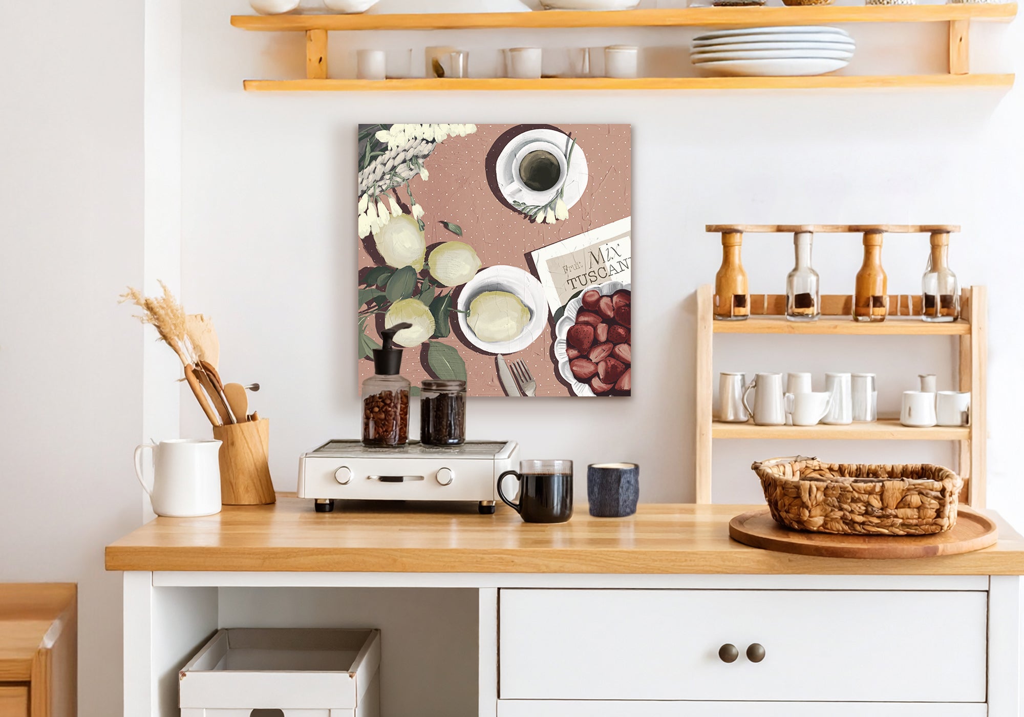
The kitchen looking like a kitchen — without the cliché. A citrus still life, a coffee study, a glass of something, chosen for the image rather than the slogan.
Explore Food & Beverage →
Coastal Nautical
Soft water tones and easy light for bright, breezy kitchens — the view you wish were outside the window, calm enough to read across an open-plan room.
Explore Coastal Nautical →
Clean Contemporary
For sleek, modern kitchens — abstracts and quiet shapes that pull their colors from your cabinets and backsplash and settle the room rather than compete with it.
Explore Clean Contemporary →
European Style
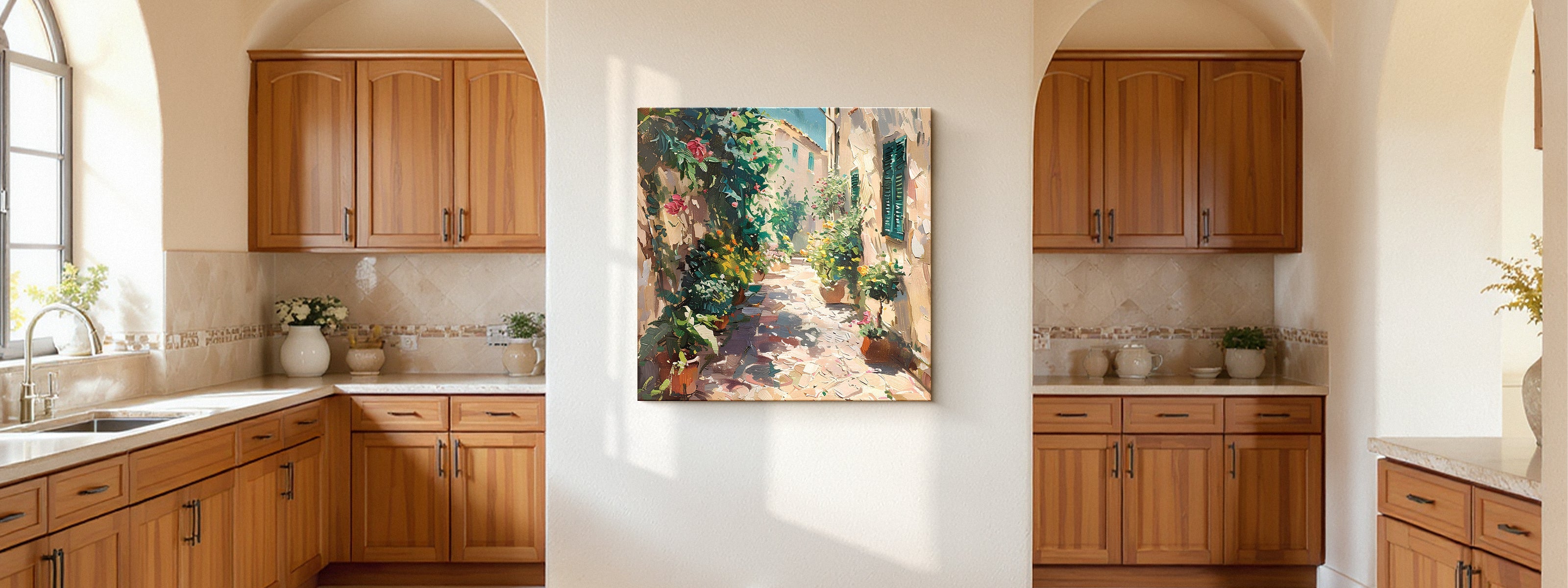
Café terraces and Mediterranean streets — a place, not just a palette, for the cook who lingers over the meal.
Explore European Style →
Tuscan Charm
Golden-hour countryside light for warm kitchens built around a long, unhurried table — the light, not the grapes-and-roosters kitsch.
Explore Tuscan Charm →
Cottage Core
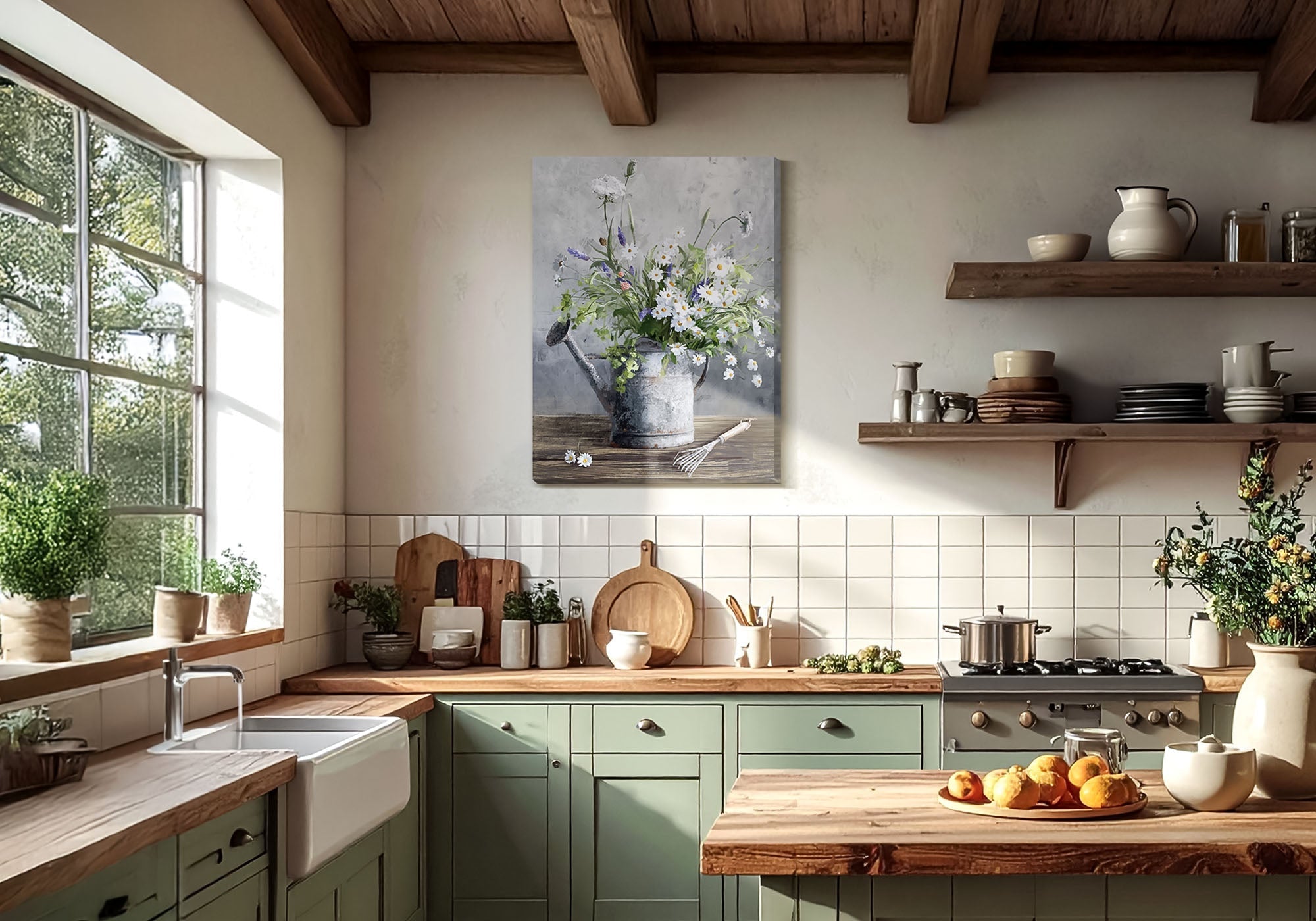
Soft, gathered florals and garden scenes — pieces that look hand-picked rather than packaged, for farmhouse and cottage kitchens.
Explore Cottage Core →When you're unsure of the style, a botanical or a soft still life is the most forgiving choice in a kitchen. It nods to the room's purpose without spelling it out, handles almost any palette, and has enough detail to reward a closer look while you wait for the kettle.
Every piece is made to order, so it's worth getting the choice right. Take your time, picture it in the actual spot, and remember it's backed by free U.S. shipping over $100, free 90-day returns, and a 1-year warranty — room to live with your decision.
Common Mistakes (and the Fix)
Choosing by theme instead of by image. A "coffee" sign tells you what you already know — you're standing in the kitchen. Pick the piece you'd want to look at for years, then let the subject be food if it happens to be.
Hanging in the splash zone. Directly over the hob or beside the sink is the one place to avoid. Shift to the next wall over and you keep the warmth without the wear.
Going too small on the sightline wall. In an open-plan kitchen, a small piece on the big shared wall looks lost. Size up — it's read from the sofa, not just the stove.
Over-filling an already busy room. Cabinets, hardware, and tile already carry a lot of line and pattern. One considered piece almost always beats a themed cluster here.
Matching too literally. You don't need to repeat the backsplash. Pull one color from the room and let the art bring something the kitchen doesn't already have.
Ready to find the right piece for your kitchen? Browse the full collection — every piece is made to order, with free U.S. shipping over $100.
Shop Kitchen Wall ArtKitchen Wall Art Questions, Answered
What kind of wall art is best for a kitchen?
The best kitchen art is chosen by moment, not by theme. Decide where your kitchen naturally pauses — the coffee station, the sink window, the breakfast nook, the open-plan sightline — then pick a piece you'd genuinely want to look at there. Botanicals, considered food still lifes, and calm abstracts that echo your cabinets or backsplash all work well; the key is to choose for the image, not because it ticks a "kitchen" box.
Where should you hang art in a kitchen?
Hang it where you pause and away from heat and water: a coffee or bar station, the wall beside the sink window, over a breakfast nook, the end of a cabinet run, or the open wall everyone sees in an open-plan layout. Keep art about three to four feet from the cooktop and out of the sink's splash line. If the kitchen has no good wall, the adjoining dining or hallway wall is a perfectly good answer.
Can you hang canvas art in a kitchen — will grease or steam ruin it?
Yes, canvas works well in a kitchen when it's placed thoughtfully. The weave breathes and wipes clean with a barely damp cloth, and away from the hob and sink it will last for years. Within about a metre of the cooktop, grease and steam settle into anything over time, so keep that zone for small, refreshable pieces or framed art under glass — and run your range hood while you cook.
How high should you hang kitchen art?
Aim for the center around 60 inches from the floor — a touch higher than you'd hang in a living room, because you mostly view kitchen art standing and moving. Over a seated nook, hang lower so it sits at seated eye level. The real test is simple: it should read clearly from where you actually stand or sit.
What size art should I get for a breakfast nook?
One piece about two-thirds to three-quarters the width of the table or banquette is the sweet spot. The nook is the most dining-room-like moment in a kitchen, so you can treat it that way — a single confident piece, hung a little lower for seated viewing, rather than a scatter of small frames.
What art works in an open-plan kitchen?
In an open plan, your key piece is seen from the living or dining area as much as from the kitchen, so let it belong to the whole sightline. Go a size up, pull a color from the connected room, and skip the literal food theme — a calm landscape, a soft abstract, or a coastal scene ties the spaces together better than anything that announces "kitchen."
In a kitchen, the wall chooses the art before you do — so find the moment the room pauses, and let everything else follow from there.


Leave a comment
This site is protected by hCaptcha and the hCaptcha Privacy Policy and Terms of Service apply.