
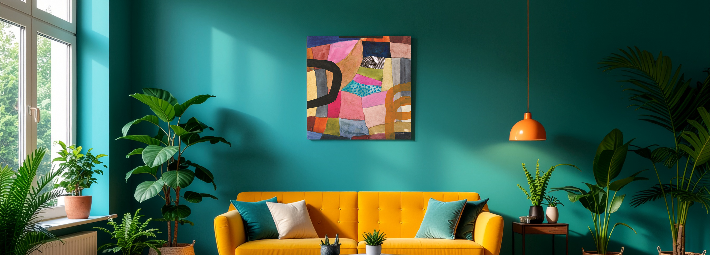
Living Room Wall Art: The Complete Guide
The easiest way to choose living room wall art is to start with the wall, not the art. Decide which wall you are filling first — above the sofa, an empty feature wall, above a console, or a gallery wall — and the right size and shape follow from there. Above a standard sofa, choose a horizontal piece that spans about 60–75% of the sofa's width (a 48×32 over most sofas, a 60×40 over a sectional) and hang it 6–10 inches above the back. Every piece is designed in California and hand-made to order, so you can match the exact size and format to your wall.
Most people don't go looking for living room art on a calm afternoon. They look because something is bugging them: a blank wall above a new sofa, a room that feels unfinished, a piece that turned out too small once it was up, or a TV that swallows the whole wall. The good news is that the living room rewards a clear method. Get the wall and the scale right, and the rest — style, color, subject — becomes the fun part instead of the stressful one.
This guide walks you through the way a designer actually makes the call, so you finish more certain about what belongs on your wall — not buried in fifty ideas. Designed in California. Hand-made to order. Fine Art Canvas has been making canvas art since 1989, and every piece comes with free 90-day returns and a 1-year warranty.

At a Glance
- Start with the wall, not the art — which wall, and what is that wall's job?
- Width: span 60–75% of the furniture below
- Height: 6–10 inches above the sofa, center around 57–60 inches from the floor
- Center on the furniture, not the wall — your eye reads art-to-sofa
- Seven styles to explore — from modern minimalist to maximalism and coastal calm
The reason living room art feels overwhelming is that most people start by asking "what's my style?" — an enormous, open question. Designers start somewhere narrower and far easier: which wall, and what is that wall's job? The wall decides the scale and shape; the scale and shape narrow the field to a handful of pieces; only then does style choose between them. It's a method you can reuse in every room — identify the wall first, and let everything else follow.
In This Guide
Start Here: What's Your Wall?
"There's a blank wall above my sofa."
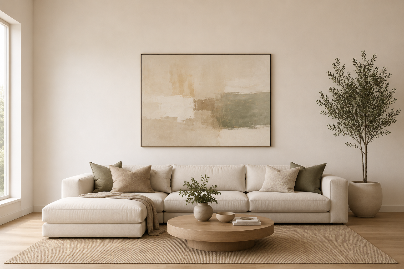
Go horizontal, and go bigger than feels obvious. Aim for a piece that spans about 60–75% of the sofa's width — a 48×32 over most sofas. A wide sofa carries a lot of visual weight, so a horizontal piece balances it; a small or vertical piece floats above it and looks disconnected. This is the most common living room wall, and the most common mistake here is going too small.
"My room feels unfinished — it needs a focal point."
Choose one larger piece for the wall your eye lands on first. One confident focal point quiets a room; several small competing pieces make it feel busier, not fuller. A 48×32 anchors most feature walls, and a 60×40 commands a tall or wide one.
"My TV dominates the wall."
Don't try to out-shout the TV. Balance it instead — art on the wall beside it, or a horizontal piece on a different main wall so the eye has somewhere else to rest. The goal is a room with two centers of gravity rather than one black rectangle.
"I have a big, empty feature wall."
This is your one wall with no rules to fight. Go large — a 48×32 or 60×40 — or build a gallery wall. With no furniture below to match, all orientations are fair game, so let the wall's shape lead: tall wall, taller piece.
"It's above a console or sofa table."
Scale to the furniture, not the room. A piece around 70% of the console's width — roughly a 30×20 over a standard console — looks intentional. Horizontal or square keeps the proportion clean above a wide, low surface.
"I want a gallery wall."
Plan it as one shape. A gallery wall works when the whole grouping reads as a single composition with even spacing — and falls apart when it's a scatter of mismatched frames. Treat the outer edges as if they were one large piece, and size that imaginary rectangle to the wall the same way you'd size a single canvas.
How to Get the Size Right
Scale is the single biggest reason a wall looks "off," so it's worth getting deliberate about. Three rules cover almost every living room:
Width: span 60–75% of the furniture below. Measure the sofa or console, not the wall, and aim for art that covers roughly two-thirds to three-quarters of it. That proportion keeps the piece anchored to the furniture instead of stranded above it. For a typical 72-inch sofa, that lands on a 48×32; for an 84-inch-plus sectional, a 60×40.
Height: hang it close to the furniture. Leave 6–10 inches between the top of the sofa and the bottom of the art, which usually puts the center around 57–60 inches from the floor — average eye level. Hanging art too high is the most common placement error; it makes the piece feel like it's drifting toward the ceiling, disconnected from the room.
Center on the furniture, not the wall. Above a sofa, the art should be centered over the sofa even if the sofa isn't centered on the wall. Your eye reads the relationship between the art and the furniture, not the art and the drywall.
One more designer habit worth borrowing: above wide furniture, favor horizontal or square pieces and skip verticals. A sofa, a bed, or a console is a wide, horizontal shape, and a tall narrow piece above it leaves awkward gaps on either side and looks unanchored. Save verticals for tall, narrow walls where their shape matches the space.
Not sure a size will work? Use View in Your Room on any product page to see the exact piece on your actual wall, at true scale, on your phone — before you decide. The old-school version works too: cut painter's tape or paper to the size you're weighing and outline it on the wall. Either way, you're checking scale before you commit, not after.
Living Room Size Chart
A quick reference for the most common placements. These are the sizes we'd recommend first; sizing up is almost always safer than sizing down.
| Placement | Furniture width | Best fit | Statement size | Shape |
|---|---|---|---|---|
| Above a standard sofa | 60–84 in | 48×32 | 60×40 | Horizontal or square |
| Above a large or sectional sofa | 84 in and up | 60×40 | 48×48 | Horizontal or square |
| Above a loveseat or small sofa | under 60 in | 36×24 | 48×32 | Horizontal or square |
| Empty feature wall | any | 48×32 | 60×40 | Any orientation |
| Above a console or sofa table | 36–48 in | 30×20 | 36×24 | Horizontal or square |
Prefer to size straight from your sofa's width? Aim for the middle of each range, and size up when you're between sizes.
| Sofa width | Ideal art width (about ⅔ to ¾) | Closest FAC size |
|---|---|---|
| 72 in (6 ft) | 43–54 in | 48×32 |
| 84 in (7 ft) | 50–63 in | 60×40 |
| 96 in (8 ft) | 58–72 in | 60×40, or a two-piece set |
If those numbers still feel abstract, picture them against things you already know: a 48×32 is about as wide as a loveseat, and a 60×40 spans roughly the width of a 65-inch TV. And a reliable rule of thumb — when a size feels slightly too big on paper, it's usually right on the wall.
Want the full room-by-room breakdown, plus how to size a multi-panel set or a gallery wall? See our Wall Art Size Guide for the complete sizing reference.
Real Living Rooms: Sectionals, TV Walls, and Fireplaces
A few living room walls come up again and again. Here's how to handle the trickiest ones.
Above a Sectional
A sectional reads as one very wide piece of furniture, so it needs more visual weight than a standard sofa. Anchor the long wall — usually the back of the longer section — with a single large horizontal piece (a 60×40), or a balanced pair, and center it on that run of seating rather than the corner. The corner itself can stay quiet; crowding art into it only fights the L-shape.
The TV Wall
The television is already a strong rectangle, so the aim is balance, not competition. Flanking the TV with a matched pair, or placing a horizontal piece on an adjacent main wall, gives the room a second focal point and stops the screen from being the only thing the eye finds. Keep the art's tones calm here — a busy piece next to a busy screen is a lot.
The Fireplace Wall
A mantel is a built-in focal point, which makes it one of the best spots for a single confident piece. Size the art to the firebox or mantel opening — roughly the width of the mantel's usable span — and hang it close above the mantel so the two read as one composition. One strong piece almost always beats a cluster here.
Don't try to match your art to your sofa. Pulling one accent color from the artwork into the room — through a pillow, a throw, or a book stack — ties everything together far more naturally than buying a piece that repeats the couch. Art that "matches" too literally tends to disappear; art that picks up a color and answers it makes a room feel designed.
One Statement Piece or a Gallery Wall?
Both work — they solve different problems. Reach for one large statement piece when you want calm and a clear focal point, especially above a sofa or on an uncluttered wall; it's the simplest way to make a room feel finished and intentional. Reach for a gallery wall when you want movement, personality, or a way to fill a very large wall — but only commit to it if you'll plan it as a single composition with consistent spacing. A gallery wall succeeds when it reads as one shape and fails when it reads as clutter, so if you're unsure, a single oversized piece is the lower-risk, higher-impact choice.
There's a middle path worth knowing: a two- or three-panel set spans the same width as one big piece but adds a little rhythm — handy above a wide sofa or sectional where a single canvas would be enormous or hard to source. Size the whole set as one shape: add up the panels plus the 1–2 inch gaps between them, and fit that total to the same two-thirds rule. If that's your direction, browse our two-piece sets.
Find Your Style
Once the wall and size are settled, style is the enjoyable part. Each living room style creates a different feeling — browse the ones that speak to you, or explore them all.

Modern Minimalist
A calm, uncluttered room where one piece does the work of five. Soft neutrals, generous space, and real canvas texture — warmth without noise. When less is more, what you choose has to be exceptional.
Explore the Complete Guide →
Warm & Earthy
Late-afternoon light, golden ochre, and the quiet richness of nature's own palette. Earthy warmth stays when you let it glow rather than go heavy — one warm tone leading, texture doing the rest.
Explore the Complete Guide →
Bold & Eclectic
A room that looks collected, not coordinated — personality on the walls, a thread holding the mix together. This is art chosen by someone with a point of view, not someone who matched the couch.
Explore the Complete Guide →
Biophilic Nature
The calm of a forest walk, brought indoors. Greens, natural light, and the quiet of open space — not a theme of nature, but the feeling of it. One strong piece brings the whole outdoors in.
Explore the Complete Guide →
Dopamine Décor
Color as pure joy — bright, playful, and uplifting. The trick is room to breathe: one joyful piece against calm surroundings makes the color sing instead of shout.
Explore the Complete Guide →
Maximalism
Abundance with order — layered, colorful, alive. The richest rooms are also the most governed: a controlling palette, a recurring motif, and one anchor that holds the density together.
Explore the Complete Guide → Pathway Through the Dunes — Georgia Janisse
Coastal
The calm of the shore, not its souvenir shop. Soft horizons, sandy warmth, and driftwood texture — atmosphere over props, sunlit over cold blue. The rooms that age best capture the feeling, not the theme.
Explore the Complete Guide →Designer Picks for the Living Room
A few best-selling pieces that work beautifully above a sofa or on a feature wall — all horizontal, all easy to scale to your space. Every piece is hand-made to order in your chosen size and format.

Blue Rain
Ekaterina Ermilkina

Symphony of the Sea
Nan

Beach Driftwood
Nan

Red Boats at Argenteuil
Claude Monet

White Geraniums
Danhui Nai

Trois Beauties
Carol Robinson
Browse the Living Room Collection
Common Mistakes (and the Fix)
A small piece above a wide sofa looks lost. Fix: span 60–75% of the furniture width, and size up when you're between sizes.
Art drifting toward the ceiling feels disconnected. Fix: 6–10 inches above the sofa back, center near 57–60 inches from the floor.
The eye reads art-to-sofa, not art-to-wall. Fix: center over the sofa, even if the sofa isn't centered on the wall.
Too-literal matching makes the piece vanish. Fix: pull one color through accessories instead — a pillow, a throw, a book stack.
It leaves gaps and looks unanchored. Fix: go horizontal or square above wide furniture; save verticals for tall, narrow walls.
About Fine Art Canvas. Every piece in this guide is designed in California and hand-made to order. We've been making canvas art since 1989. Every order ships with free 90-day returns and a 1-year warranty — so you can see the piece on your wall before you commit.
Available as canvas, framed canvas, or framed print. Custom sizes available on most pieces.
Every piece is hand-made to order in your chosen size and format.
Shop Living Room Wall ArtFrequently Asked Questions
How big should wall art be over a couch?
Aim for a piece that spans about 60–75% of the sofa's width. For a typical 72-inch sofa that's around a 48×32; for an 84-inch-plus sectional, step up to a 60×40. When you're between sizes, size up — too small is the more common regret.
How high should I hang art above a sofa?
Leave 6–10 inches between the top of the sofa and the bottom of the art. That usually puts the center of the piece around 57–60 inches from the floor, which is average eye level. Resist hanging it higher to "fill" the wall — that's what makes art look like it's floating.
What kind of wall art is best for a living room?
Start with shape and scale rather than subject: a horizontal piece sized to your sofa works in almost any living room. From there, choose a style that matches the feeling you want — calm and minimal, warm and earthy, coastal, or bold — and let one color in the art echo something already in the room.
Should wall art be centered on the wall or over the sofa?
Center it over the sofa, even if the sofa isn't centered on the wall. The eye reads the relationship between the art and the furniture beneath it, so anchoring to the sofa looks more intentional than centering on the wall.
Is one large piece or a gallery wall better above a sofa?
A single large piece is the easier, calmer choice and the simplest way to make a room feel finished. A gallery wall adds movement and personality, but only if you plan it as one composition with even spacing. If you're unsure, go with one statement piece.
Do I have to match my wall art to my furniture?
No — and matching too literally usually makes the art disappear. Instead, pull one color from the artwork into the room through a pillow or throw. The art and the furniture should feel related, not identical.
Start with the wall, not the art — and the right piece will find you.


Leave a comment
This site is protected by hCaptcha and the hCaptcha Privacy Policy and Terms of Service apply.