
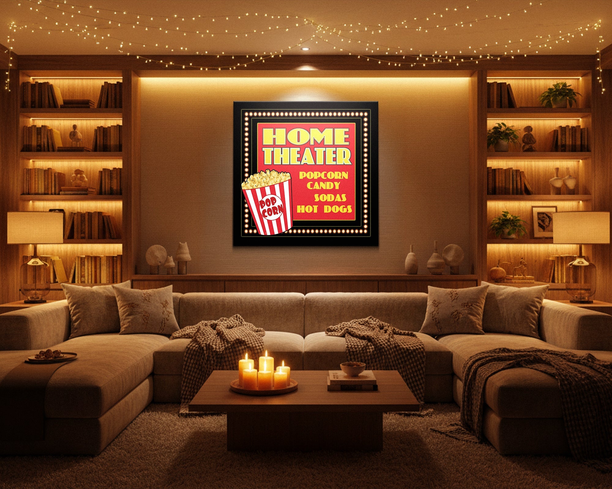
Cinema Style Wall Art - Atmosphere for the Dedicated Viewing Room
The best cinema style wall art serves attention rather than competing with it. Choose pieces that create the atmosphere of a great screening — immersive, expectant, dramatically composed — that establish how the room feels before the film begins and step gracefully into the background once it does. Art in a cinema room should be felt, not noticed.
A room built for serious film viewing has one job while the film is running: get out of the way. The lights go down, the screen comes alive, and every element of the room should support the experience rather than compete with it. Art that demands attention during the film has failed its most important test - not because it is bad art, but because it is in the wrong relationship with the room's primary purpose.
This does not mean cinema rooms should have bare walls. It means the art's job is more specific here than in any other entertainment space. Before the film, the walls set the atmosphere - they establish the room as a place where something significant is about to happen, where attention is gathered, where the ordinary day gives way to something else. After the film, the walls hold that mood, keep the room from immediately snapping back to the mundane. During the film, the walls are simply present - felt rather than noticed.
Everything here is Designed in California and hand-made to order by Fine Art Canvas - making canvas art since 1989, with free 90-day returns and a 1-year warranty on every piece.

Cinema Style at a Glance
- Emotional destination: Quiet immersion, anticipation
- Works best in: Dedicated home theaters, media rooms where film is the primary use, screening rooms where serious viewing is the point
- The core decision: Art that serves the viewing experience vs. art that competes with it
- What to look for: Dramatic compositions with strong focal points, dark or moody palettes that work in low light, cinematic subject matter handled as art rather than as promotion
- What to avoid: Movie posters and promotional materials that function as advertising; art so visually active it pulls focus once the film begins; anything that makes the room feel like a lobby
Art That Serves Attention
Cinema rooms have an attention problem that no other room in the house shares. In most rooms, the art on the walls is the most interesting visual thing present - it anchors the room, establishes character, draws the eye when people are in the space. In a cinema room, something far more powerful than any piece of art arrives the moment the film starts. The screen wins every time.
This changes what art is supposed to do. It is not the anchor. It is the frame - the environment that makes the screen's content land with more weight and more presence. Art that understands its supporting role creates immersion. Art that insists on its own attention competes with the experience it is supposed to serve.
A movie poster answers one question: what are you watching? A cinematic artwork answers a different one: how does this room feel? Both can reference the same films and feature the same icons. What separates them is their relationship to the viewer — the poster communicates, the canvas creates atmosphere. The same subject matter can serve either purpose depending on how it is treated. A dramatically composed portrait of a cinema icon contributes to the room. A promotional graphic of the same icon competes with it.
This is also why the best cinema room art tends not to be the most obviously cinematic. Film reels, clapperboards, popcorn iconography - these announce the room's purpose the same way a restaurant sign announces a restaurant. The rooms that feel genuinely immersive are the ones where the atmosphere is created through dramatic palette, bold composition, and subject matter that carries cinema's weight without describing cinema's furniture.
The Difference Between Cinematic Art and Movie Memorabilia
This distinction matters enough to spend a section on it, because the Cinema Style collection is built almost entirely around specific films - and that requires an honest explanation of what separates those pieces from the movie memorabilia they might be confused with.
Movie memorabilia - posters, promotional prints, licensed merchandise - answers the question "what are you watching?" or "what do you love?" It is an expression of fandom and loyalty. Its success is measured by recognition: does the viewer know the film, the actor, the franchise? The more recognisable the better.
A cinematic artwork is asking a different question: how should this room feel? An artist's rendering of Clint Eastwood as a subject - with genuine compositional thinking, a palette built for the wall it will occupy, a treatment that conveys presence and character rather than advertising a film - is not memorabilia. It is a portrait. The subject happens to be a cinema icon; the object is a piece of wall art. The test is whether it holds the wall on visual terms alone, contributing to the room's atmosphere regardless of whether the viewer has seen the films.
The test for any piece in a cinema room: does it make the room feel more like a place where film matters, or does it make the room feel more like a place that is announcing its love of film? The first is atmosphere. The second is display. The distinction sounds subtle but it is immediately visible when you walk into the room - one makes you settle in; the other makes you read the walls.
When Cinema Style Is the Right Direction
Cinema style art works in rooms where film viewing is a genuine priority - not just occasional but central to the room's purpose. The atmosphere it creates is specific: quiet, anticipatory, dramatically composed. That atmosphere works beautifully for dedicated viewing but can feel too still for rooms that also host gaming sessions, parties, or casual multi-use social events.
✓ Works Well When
- Film viewing is the room's primary use - serious viewing, not just background TV
- The room has dark walls or a deliberately moody palette - cinema atmosphere requires the right color register to land
- You want the room to feel like an event before the film even starts - the expectant quality that a great screening creates
- The room is dedicated rather than multi-use - the atmosphere it creates serves one purpose exceptionally well
- You love cinema as a subject - the icons, the visual world, the dramatic compositions - and want that love reflected in the room without it feeling like a lobby
✗ Consider Something Else If
- The room is genuinely multi-use - gaming, sports viewing, parties, family gatherings all need different atmospheric registers. Cinema style's quiet immersion can feel subdued for those occasions. See the Entertainment Room guide for multi-use rooms
- The room has light walls or a bright, casual palette - cinema style's dramatic palette and moody compositions need the right environment to create immersion rather than simply looking heavy
- Bold contemporary energy is the goal rather than quiet atmosphere - Modern Neon or Gamer Aesthetic serve those rooms better
Five Moves That Work
The practical decisions that separate a cinema room where the art deepens the experience from one where it just decorates the walls.
1. Place art on side walls and behind seating - not near the screen
In a cinema room, the screen wall is already the most important visual element in the space. Art placed directly adjacent to or above the screen competes with the viewing sightline and creates distraction during the film. Side walls and the wall behind seating are the correct placements: they establish atmosphere when the viewer is looking around the room and become peripheral once the film begins. The art should frame the experience, not share its center.
2. Choose palette for how the room operates, not how it photographs
Cinema rooms typically operate in low to no ambient light. Art that looks strong in a well-lit photograph may disappear entirely in viewing conditions. The pieces that work best have strong internal contrast - dark backgrounds against which a focal point reads clearly, or bold compositional masses that hold their structure in dim light. Deep blues, rich blacks, warm golds against dark fields - these palettes hold their presence in the conditions the room actually creates. Soft pastels and fine detail both disappear when the lights go down.
3. Choose subject matter for atmosphere, not for recognition
A piece that rewards the viewer who recognises the reference is doing something different from a piece that creates atmosphere for anyone in the room. The best cinema room art works on visual terms alone: strong composition, dramatic presence, the weight of something significant. If the piece only works for people who have seen the specific film, it is expression of fandom rather than room design. If it holds the wall on its own terms - and the subject also happens to be someone or something from cinema's history - it is doing both jobs at once.
4. Size for dramatic presence, not for comfortable proportion
Cinema rooms tend to operate at larger scale than other entertainment rooms - bigger screens, more seating, higher ceilings in dedicated setups. Art needs to scale to match. Pieces that would feel generous in a living room can look tentative in a dedicated screening space. Aim for pieces that establish genuine visual weight: 36 inches wide at minimum on a side wall; 48 inches or larger on a feature wall behind seating. The art should feel like it belongs to a room where significant things happen. See the Wall Art Size Guide for complete sizing guidance.
5. Use restraint as a design principle, not a compromise
One or two well-chosen pieces in a cinema room create the immersive atmosphere that five or six competing pieces undermine. A wall covered in film references reads as a collection - it makes the viewer look at the walls rather than settle into the room. A single dramatic canvas on a dark side wall establishes the room's character with conviction. Restraint in a cinema room is not emptiness; it is the same principle that makes great films work: every element present serves a purpose, and nothing competes with what matters most.
Six Pieces From the Collection
Every piece below is hand-made to order from the Cinema Style collection. Each is an artist's interpretation of its subject - dramatic compositions with strong presence rather than promotional materials. All are available as gallery-wrapped canvas, framed canvas, or framed print - pricing live at each product page.


Common Mistakes and the Fix
Movie posters, promotional prints, and licensed merchandise answer the question "what do you love?" - they express fandom. In a cinema room, that fandom declaration becomes noise during the experience itself. Every time a viewer's eye lands on a poster, it reads a message rather than absorbs an atmosphere. Fix: choose pieces that answer the question "how does this room feel?" - created as art, with compositional thinking and a palette built for the wall, not for recognition.
Film reels, clapperboards, popcorn graphics, director's chairs, typography signs - these declare the room's purpose rather than creating its atmosphere. Fix: choose subject matter for what it evokes rather than for what it labels. The room's purpose is already established by the screen and seating. The art should deepen the feeling rather than announce the function.
Art near the screen pulls visual attention toward the wrong focal point during viewing and makes the room feel visually busy at exactly the point where it should feel clear. Fix: keep the screen wall and immediate surrounds free of competing visual elements. Side walls and the wall behind seating are the correct placements for cinema room art. The screen is the center; everything else frames it.
A cinema room covered in film references reads as a collection rather than a designed space. The viewer looks at the walls rather than settling into the room. Fix: one or two strong pieces on side walls, chosen for genuine visual weight rather than for completeness of reference. The room should feel curated - like every element was placed with intention. Restraint is the technique, not the compromise.
Ready to Set the Scene?
Browse the full Cinema Style collection - hand-made to order, Designed in California, with free returns on every piece.
Shop Cinema Style Wall ArtFrequently Asked Questions
What is cinema style wall art?
Cinema style wall art refers to pieces that create the atmosphere of a great screening room rather than simply decorating a space that happens to have a screen. The best pieces use dramatic composition, moody palettes, and cinematic subject matter to establish the feeling of a room where film matters - where the experience of watching is taken seriously. They are distinct from movie memorabilia and promotional materials, which express fandom rather than creating room atmosphere.
What is the difference between cinema style art and movie posters for a home theater?
Movie memorabilia answers the question "what are you watching?" or "what do you love?" A cinematic artwork answers a different question: "how does this room feel?" Both can reference the same films and icons; what separates them is their purpose. Memorabilia communicates. A cinematic canvas creates atmosphere. The same subject matter can serve either purpose depending on whether it was made to be recognised or made to contribute to a room.
Where should you hang art in a home theater?
Side walls and the wall behind seating are the correct placements for cinema room art. The screen wall and its immediate surrounds should remain visually clear - art near the screen competes with the viewing sightline and creates distraction during the film. Side walls establish atmosphere when the viewer is looking around the room before and after the film, and step into the background once the viewing begins. The art should frame the experience, not interrupt it.
What colors work best for home theater wall art?
Palettes that hold their presence in low or no ambient light. Cinema rooms typically operate in conditions where soft pastels and fine detail both disappear. Pieces with strong internal contrast perform best: dark backgrounds against which a focal point reads clearly, deep rich tones that hold their structure in dim light, bold compositional masses that remain visually present when the lights go down. Deep blues, rich blacks, warm golds against dark fields, and dramatic tonal contrast are the palette registers that work best in serious viewing environments.
What size canvas works in a home theater or media room?
Larger than you'd typically choose. Cinema rooms often operate at greater scale than living rooms - bigger screens, more seating, dedicated viewing distances. Art needs to scale proportionally to create genuine visual presence rather than looking like decoration in an otherwise serious space. On side walls, aim for 36 inches wide at minimum; 48 inches or larger creates the dramatic presence appropriate to a room built for an immersive experience. For complete sizing guidance by wall type and room configuration, see the Wall Art Size Guide.
Can you use specific film art in a home theater without it feeling like a fan room?
Yes, with the right approach. The distinction is between pieces that answer "how does this room feel?" and pieces that answer "what do you love?" An artist's interpretation of a film subject - dramatically composed, with a palette built for the wall rather than for recognition - is creating atmosphere rather than displaying loyalty. The test: does the piece contribute to the room regardless of whether the viewer knows the film? If yes, it is cinematic artwork. If it only lands for people who share the specific fandom, it is memorabilia.
Art in a cinema room should be felt, not noticed. The best piece you hang is the one that deepens the room's atmosphere before the film begins and steps gracefully into the background once it does — still present, still contributing, but no longer asking for attention.


Leave a comment
This site is protected by hCaptcha and the hCaptcha Privacy Policy and Terms of Service apply.