
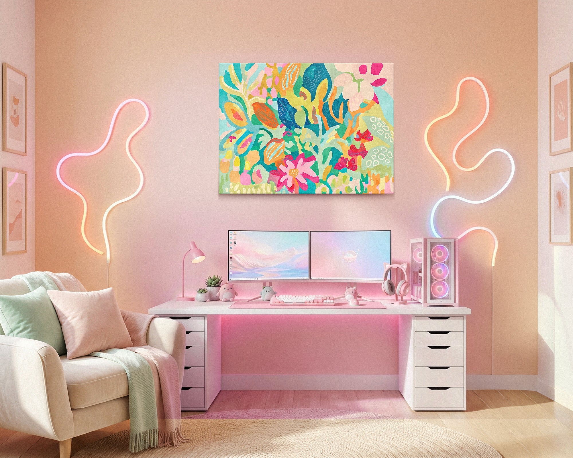
Modern Neon Wall Art - When Bold Lighting Works as Art
Modern neon wall art works when it creates atmosphere rather than announcing energy. The most effective neon-aesthetic pieces carry neon's color and visual charge through saturated palette and bold composition - not through actual light-up signs that compete with the room. One well-chosen piece that glows in the room's palette does more than a wall of LED displays. The principle: glow, not glare.
Neon has a genuine visual power. Saturated color, electric energy, the sense of light radiating from within - it creates an atmosphere that other approaches simply do not. When it works in a room, the space feels alive. When it doesn't, it looks like a bar that got lost on the way to a house.
The difference between those two outcomes is restraint - specifically, understanding what kind of neon element creates atmosphere and what kind announces it. Actual light-up signs broadcast. They say: look at this, this is neon, this is what this room is about. Art that carries neon's palette and energy through composition says something more interesting: this is how the room feels. The result of the first approach is a commercial venue. The result of the second is a room with genuine contemporary energy.
Everything here is Designed in California and hand-made to order by Fine Art Canvas - making canvas art since 1989, with free 90-day returns and a 1-year warranty on every piece.

Modern Neon at a Glance
- Emotional destination: Contemporary energy, without commercial feel
- Works best in: Entertainment rooms, gaming setups, media rooms, any space where bold energy is wanted without the venue aesthetic
- The core decision: Neon as atmospheric layer vs. neon as primary design statement
- What to look for: Saturated, electric color palettes - magentas, electric blues, acid greens, vivid yellows - applied through painting or photography rather than through actual light-emitting hardware
- What to avoid: Multiple competing light sources; commercial signage aesthetics; neon as the room's primary identity rather than one atmospheric element within a larger design
The Difference Between Glow and Glare
Neon's visual appeal is specific and real. The color temperature of neon gas - that saturated, slightly luminous quality - is genuinely distinctive, and it carries associations with nightlife, urban energy, creative spaces, and a certain kind of alive-after-dark feeling. These are legitimate atmospheres to want in a room.
The problem with pursuing that feeling through actual neon signs and LED installations is that they are primary visual elements, not atmospheric ones. A glowing sign demands attention. It announces itself. In a home environment, that announcement tends to read as commercial - the room feels like a bar, a brand experience, or a retail concept rather than someone's carefully considered space.
Neon as atmosphere: the room has electric energy in its palette, the colors feel charged and alive, there is a sense of luminosity even without anything actually glowing. Neon as announcement: a sign on the wall tells you what the room is, what to feel, or what the owner is into. The first creates an experience. The second creates a display. The art in the Modern Neon collection pursues the first approach through saturated pigment, bold composition, and the kinds of color relationships that carry neon's charge without requiring a power source.
This is why the strongest pieces in the Modern Neon collection are not photographs of neon signs or reproductions of neon typography. They are bold-palette canvases - vivid portraits, saturated abstracts, urban photography with electric color - where the neon quality lives in the paint or the image rather than in the hardware. The room gets the feeling without the commercial read.
When Modern Neon Is the Right Direction
This approach works for rooms where energy and boldness are genuine priorities - spaces that should feel charged and alive rather than quiet and restrained. It is distinct from the other spokes in this cluster: where Gamer Aesthetic is about elevating a gaming space beyond its equipment, and Cinema Style is about deepening immersion, Modern Neon is about bringing a specific color energy and visual charge to a room that can carry it.
✓ Works Well When
- The room already has dark walls or a moody palette - neon color against a deep background creates genuine luminosity rather than visual noise
- You want bold, contemporary energy but the room is a home space, not a venue - the atmosphere should feel lived-in and personal, not commercial
- The room serves multiple entertainment modes and needs art that holds energy across all of them without being too specific to any one use
- You are drawn to urban aesthetics, contemporary portraiture, or vivid abstract work - neon palette is a register that these subjects naturally inhabit
- A single bold statement piece is the goal - something that immediately establishes the room's visual character when you walk in
✗ Consider Something Else If
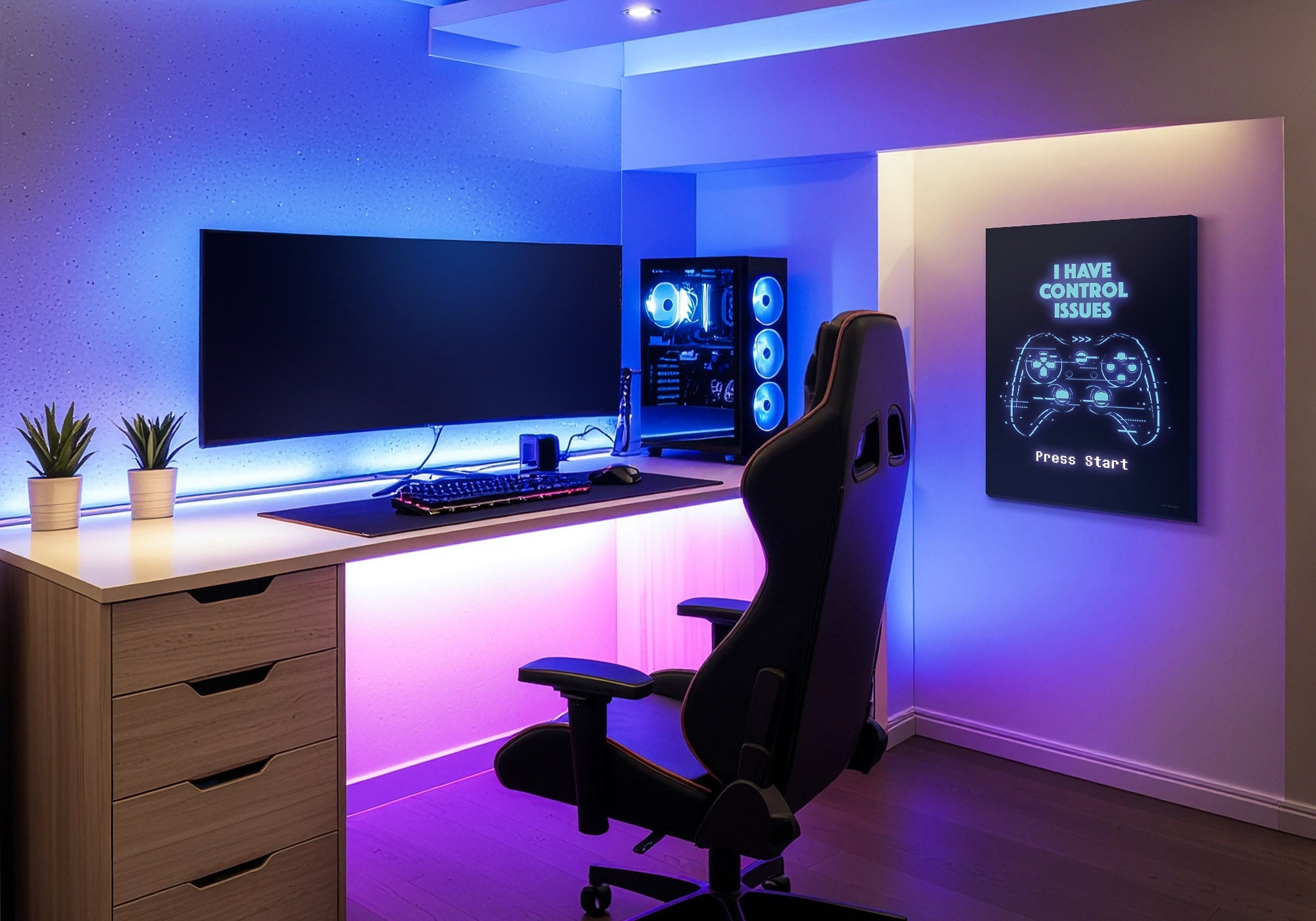
- The room is already visually busy with gaming equipment, RGB lighting, or multiple screens - adding neon color on top of that creates competition rather than atmosphere. See the Gamer Aesthetic guide for how to handle that environment
- The room's primary purpose is serious cinematic viewing - neon's electric energy works against the quiet, anticipatory atmosphere that cinema rooms need. See the Cinema Style guide instead
- The room has light walls or a neutral, restrained palette - neon color needs contrast to create luminosity; in a bright room it reads as bold rather than electric
Neon palette works best as a contrast relationship, not a saturation relationship. One vivid piece against a dark or neutral wall creates genuine electric energy - the color appears to glow. Multiple vivid pieces on the same wall compete and cancel each other out; the room reads as busy rather than charged. The decision is not "how much neon?" but "where does the energy need to land?" Choose the wall, choose the placement, and let one piece do the work of ten.
Five Moves That Work
The practical decisions that separate a neon-aesthetic room that feels designed from one that looks like a commercial venue that lost its signage budget.
1. Use neon as accent, not foundation
The rooms where neon-palette art works best are rooms where it is one element among several rather than the organizing principle of the whole space. A single vivid canvas on a dark side wall creates electric atmosphere. A room where every element is competing for neon's register - signs, posters, art, LED strips, colored lighting - produces noise rather than energy. The restraint is what makes the bold piece land. Give neon the room it needs to breathe.
2. Let dark walls do the amplifying work
Neon color is defined by contrast. The same electric blue that reads as vivid and luminous against a deep charcoal wall reads as simply bold against a white one. If neon atmosphere is the goal, the wall color is as important as the art choice. Dark walls - navy, deep charcoal, soft black - amplify the color in the canvas the same way a night sky amplifies actual neon. The art does not have to work as hard; the environment does the amplifying.
3. Choose palette over product category
The most effective modern neon pieces are not neon signs translated into canvas. They are pieces where the color relationships - saturated complementaries, high-contrast darks and vivids, that slightly luminous quality in the pigment - carry neon's visual charge through paint or photography. A vivid portrait where magenta meets deep blue. An abstract where acid yellow meets electric green. Urban photography where streetlight saturates the frame. These pieces bring the feeling without the commercial association.
4. Treat neon as a primary wall, not a secondary one
In rooms where a bold neon-palette piece is the right choice, it belongs on the room's primary visual wall - the one that is seen first, that anchors the space, that gets the most reading time. Putting it on a secondary wall or above a piece of furniture as an afterthought wastes the energy it brings. One well-placed vivid piece on the primary side wall, sized to genuinely hold the space, is the correct move. See the Wall Art Size Guide for specific sizing guidance for entertainment rooms.
5. Know when to stop
Neon palette is a strong register. One piece establishes the room's energy. Two pieces on the same wall usually compete. Three creates visual chaos. The stopping point for most rooms is a single anchor piece - sized large enough to hold the wall, placed to be seen immediately when entering the room, and given enough clear wall around it to breathe. The art works by contrast with the quieter elements around it; removing that contrast removes what makes it work.
Six Pieces From the Collection
Every piece below is hand-made to order from the Modern Neon collection. Note that these are not neon signs - they are bold-palette canvases where neon's color energy lives in the pigment and composition. Each is available as gallery-wrapped canvas, framed canvas, or framed print - pricing live at each product page.


Common Mistakes and the Fix
A room with a neon sign, LED strip lighting, neon-palette posters, and RGB accent lights reads as visual chaos rather than electric atmosphere. Each element competes for the same visual register and none of them wins. Fix: choose one element to carry the neon energy and let everything else recede. The sign, the art, or the lighting - not all three on the same wall or in the same visual zone.
Neon typography signs - city names, brand-style lettering, commercial format text - read as commercial even in residential contexts. They locate the room in a bar or restaurant rather than in a home. Fix: choose pieces where neon's color energy comes from palette and composition rather than from signage conventions. A vivid portrait or a saturated abstract carries the feeling without the venue association.
Saturated color on a light or white wall reads as bold, not luminous. The apparent glow that neon creates in the right environment requires contrast - the eye needs the dark field to read the vivid color as electric rather than simply bright. Fix: if neon atmosphere is the goal, treat the wall color as part of the choice. Deep charcoal, soft black, or dark navy amplify what the canvas brings.
A small neon-palette piece on a large wall creates a decorative accent rather than atmosphere. Neon's energy needs scale to fill a room - a 12-inch vivid canvas disappears in an entertainment room; a 36-inch one changes how the space feels. Fix: go large on the primary wall. The goal is not to add a colorful element but to shift the room's entire visual atmosphere. That takes scale. See the Wall Art Size Guide for specific sizing by wall type.
Ready to Bring the Energy?
Browse the full Modern Neon collection - hand-made to order, Designed in California, with free returns on every piece.
Shop Modern Neon Wall ArtFrequently Asked Questions
What is modern neon wall art?
Modern neon wall art refers to canvas pieces that carry neon's color energy - saturated magentas, electric blues, vivid yellows, acid greens - through bold palette and composition rather than through actual light-emitting hardware. The best pieces in this category create the same atmospheric charge as neon signage without the commercial or venue aesthetic that actual neon signs tend to produce in residential spaces. The effect is atmosphere rather than announcement.
How do you use neon wall art without the room looking like a bar?
The key is restraint and placement. One vivid, bold piece on a primary side wall creates atmosphere. Multiple neon elements competing on the same wall - signs, lighting, art, LED strips - create a commercial look. Choose canvas pieces that carry neon's color through palette rather than through signage conventions. And give the piece contrast: dark walls amplify neon color in a way that light walls do not, creating the luminous glow rather than simply adding brightness.
What wall color works best with neon wall art?
Dark walls consistently produce the best result. Deep charcoal, soft black, dark navy, or deep burgundy create the contrast relationship that makes saturated color appear luminous. On light or white walls, the same vivid canvas reads as bold but not electric. The wall color is as much a part of the neon atmosphere as the art itself; if the room's existing walls are light, a single dark accent wall behind the primary art placement can do the same work.
Can neon wall art work in a gaming room?
Yes, with care. Gaming rooms already have significant visual energy from screens, RGB lighting, and equipment. Neon-palette canvas art can add genuine atmosphere without adding more hardware to manage. The important distinction is placement: side walls rather than above the primary monitor, and canvas rather than actual LED signs which add a competing light source. For specific guidance on art in gaming setups, see the Gamer Aesthetic guide.
What size neon art works best in an entertainment room?
Go large. Neon's atmospheric effect requires scale to shift a room's visual register. A small vivid piece on a large wall reads as a decorative detail rather than an atmospheric statement. On side walls in entertainment and media rooms, aim for 36 inches wide at minimum; 48 inches or larger creates genuine atmospheric impact. One correctly sized piece on the primary wall does more than three small pieces distributed around the room. For complete guidance, see the Wall Art Size Guide.
How is modern neon wall art different from retro arcade or gamer aesthetic art?
Modern neon is defined by its color register - saturated, electric, luminous palette - rather than by its subject matter or cultural reference. Retro arcade art celebrates the analog era through the visual language of vintage gaming culture. Gamer aesthetic art elevates a current gaming setup by giving it visual identity beyond the equipment. Modern neon can overlap with both in terms of energy and boldness, but its defining characteristic is color temperature and atmospheric charge rather than cultural identity or gaming context.
One piece that glows does more for a room than ten that shout. Accent, not overload. Glow, not glare.


Leave a comment
This site is protected by hCaptcha and the hCaptcha Privacy Policy and Terms of Service apply.